A cut through the label corpus
Woodcut beer labels
37 labels in the register read as woodcut. Every one was described by us from the filed artwork — the TTB records what a label says, never what it looks like.
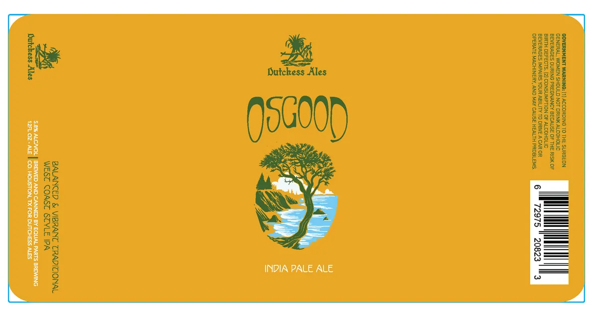 OsgoodDUTCHESS ALES OSGOODA landscape vignette dominates the center, framed in a rounded shield shape and rendered in teal, cream, and blue: a gnarled tree with spreading branches grows from rocky terrain overlooking water, with forested hills in the background and sky above. The beer name "OSGOOD" appears in large, organic lettering above the vignette in teal; below it, "INDIA PALE ALE" is set in refined sans-serif capitals in cream. The Dutchess Ales emblem—a palm tree and sunrise—sits at the top center in teal. The entire composition is centered on a golden-yellow field with a thin cyan border.gold · teal · cream · blue
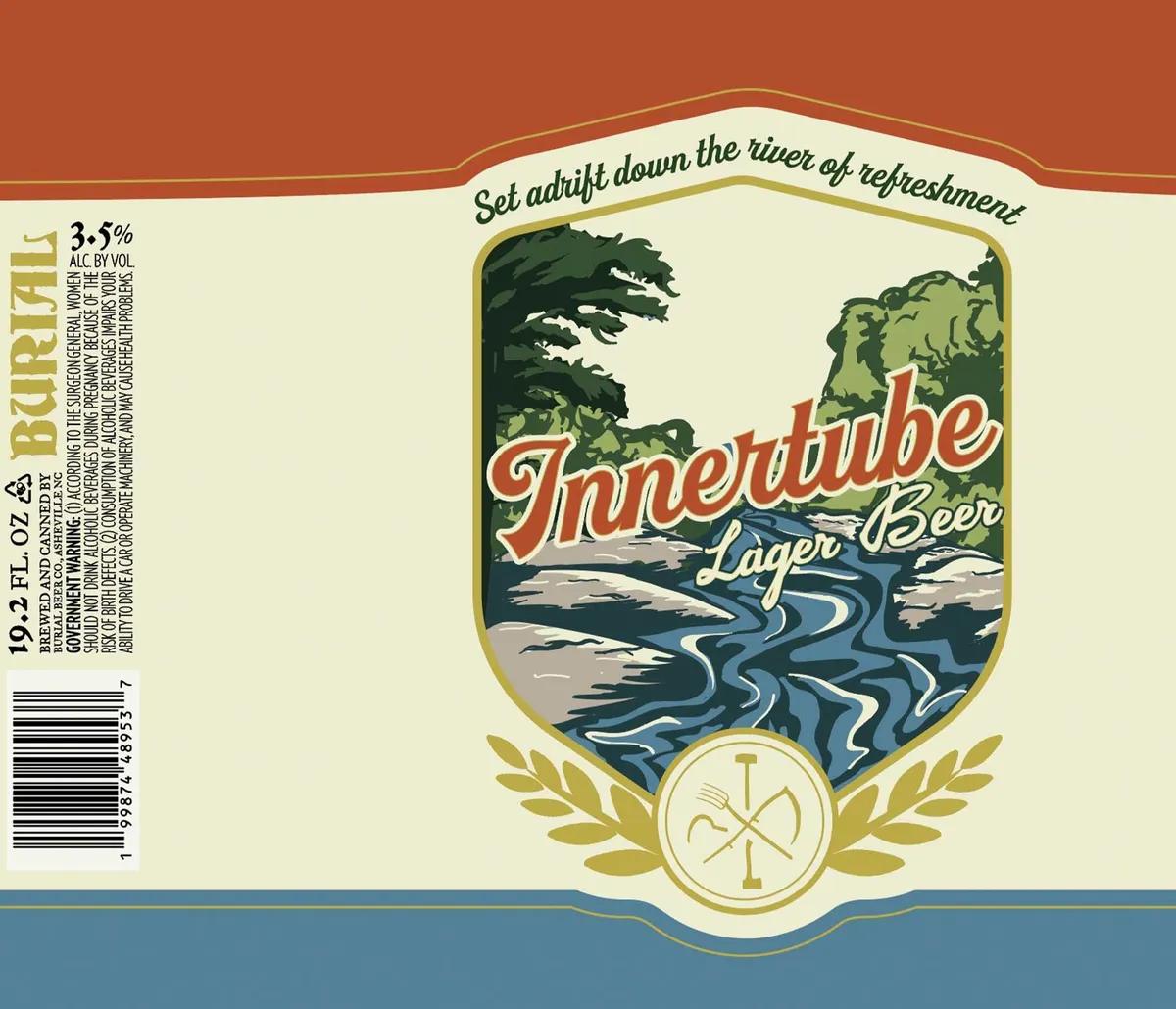 InnertubeBURIAL BEER CO.A landscape vignette dominates the label, framed by a gold-outlined shield and flanked by decorative laurel wreaths at the base. The scene depicts a river winding through a forested valley beneath wind-swept evergreens and distant hills, rendered in woodcut style with bold outlines and flat colour planes in forest green, slate blue, cream, and grey. The beer name appears in a large red script across the water, with "Lager Beer" in smaller italic lettering below. Above the vignette, a hand-lettered script banner reads "Set adrift down the river of refreshment." The label field is cream, bounded by rust-orange and blue horizontal bands top and bottom.cream · rust-orange · forest green · slate blue
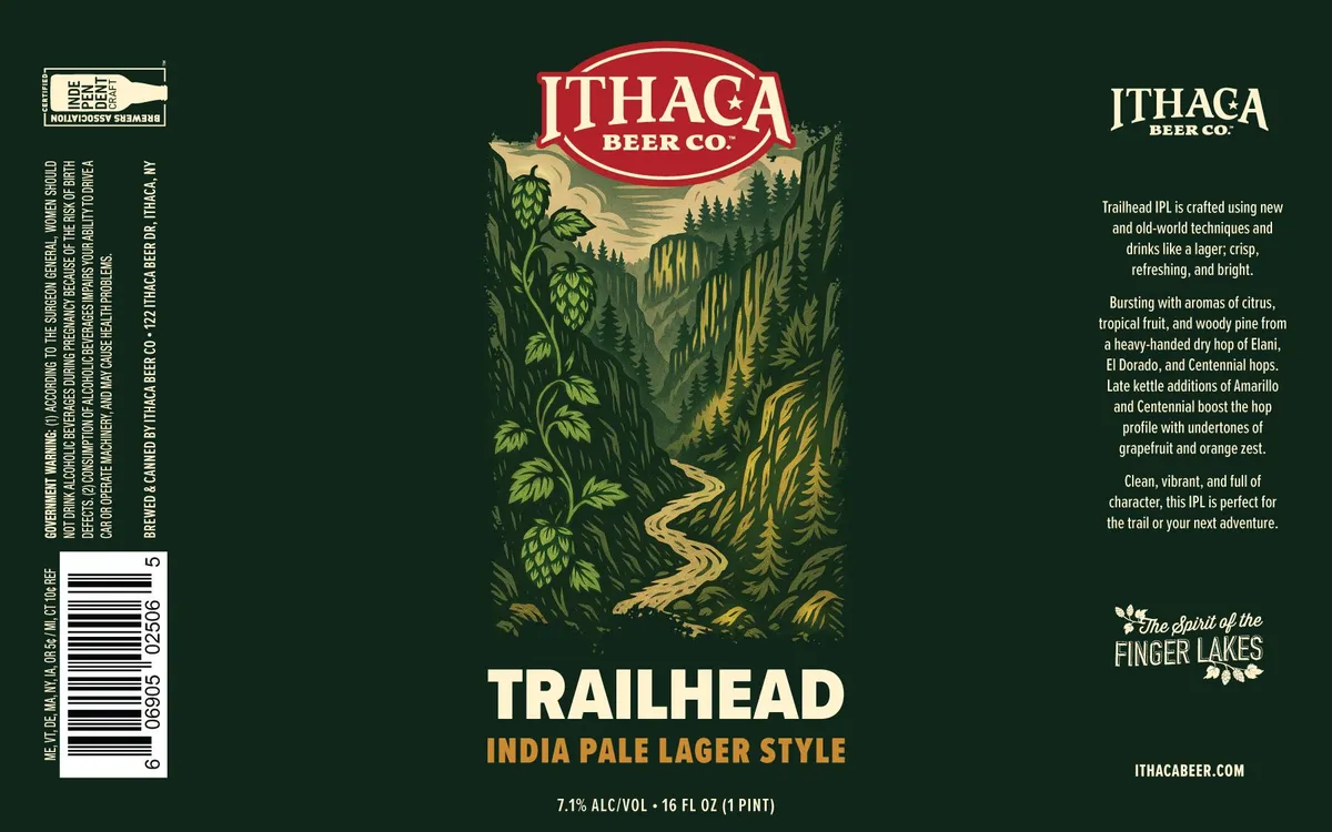 TrailheadA woodcut-style landscape dominates the center of the label, depicting a winding path through a forested valley with hop bines climbing the left edge and evergreen trees framing a distant vista of mountains and sky in cream and pale yellow tones. The composition is symmetrical and framed vertically, with the brewery's red oval badge at the top and the beer name in cream serif type at the bottom, set against a dark forest-green ground. The palette is restricted to cream, pale yellow, dark green, and red, with the illustration rendered in the characteristic bold lines and tonal separation of traditional relief printing.dark green · cream · pale yellow · red
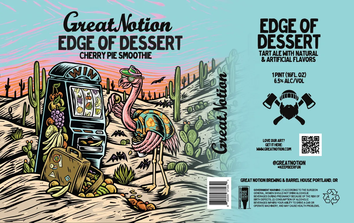 Edge of DessertGREAT NOTIONA woodcut-style desert scene dominates the front label, depicting an ostrich operating a slot machine amid saguaro cacti, scattered fruit, and gaming paraphernalia in a surreal landscape rendered in bold black line work with hand-applied colour washes in cream, tan, pink, yellow, and green. The composition spans the full bleed width with the beer name and style set in heavy hand-lettered sans-serif caps across the upper portion. A secondary landscape vignette in muted blue-green tones occupies the right panel, with regulatory type and brewery mark arranged below. The finish is matte with visible paper texture throughout.cream · tan · pink · yellow-green
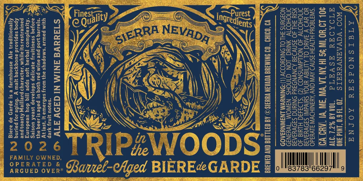 Trip in the Woods Barrel-Aged Bière de GardeSIERRA NEVADAA woodcut-style illustration dominates the center, depicting a bearded man's face emerging from a dense forest of stylized trees and foliage, rendered in gold on a dark navy ground. The composition is framed by an ornamental art-nouveau border with scrollwork corners and banner cartouches reading "Finest Quality" and "Purest Ingredients" at the top. The beer name appears in two registers below the central image—"TRIP in the WOODS" in large letters with "Barrel-Aged BIÈRE de GARDE" in script beneath—while decorative botanical elements and vintage ornamental flourishes fill the corners and margins.navy · gold · cream
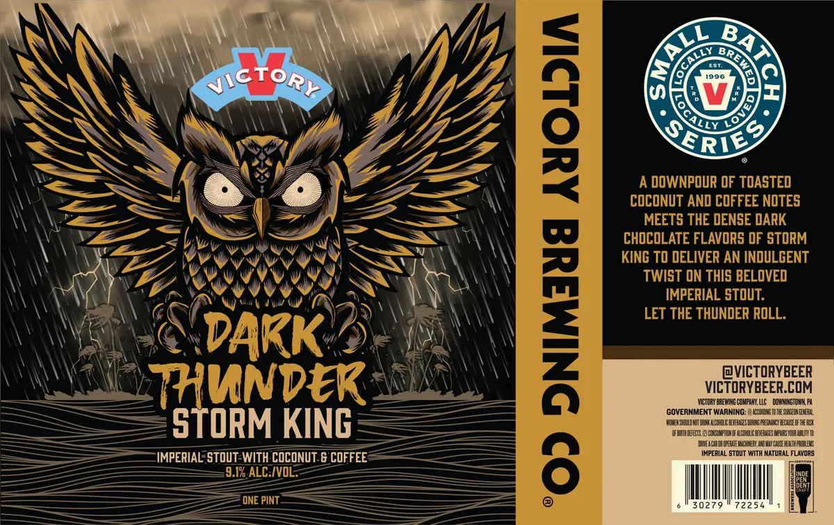 Dark Thunder Storm KingVICTORYA wood-engraved owl with spread wings dominates the front label, rendered in black and gold with fine cross-hatching and detail work against a stormy background of rain and lightning. The bird's round, staring eyes and intricately feathered body occupy the full height of the composition, with the beer name set in bold gold lettering across the lower third. The palette is restricted to gold, black, cream, and storm-grey, creating a high-contrast nocturnal mood heightened by diagonal rain lines and atmospheric marks behind the central figure.gold · black · cream · grey
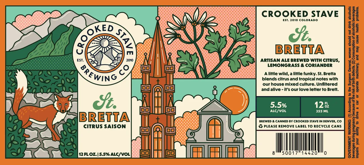 St. Bretta Citrus SaisonCROOKED STAVEA multi-panel composition in the style of a comic strip or illuminated manuscript, divided into three vertical sections with distinct scenes. The left panel shows a red fox standing in green undergrowth with stylized white clouds and turquoise sky. The centre panel features a Gothic-revival church with a tall steeple, flanked by botanical illustrations of flowering plants rendered in black ink against a salmon-pink dotted ground. A large sun disc in orange sits at the horizon. The right panel is cream-coloured and contains type-only regulatory information. All sections use bold black outlines with hand-drawn lettering, rendered in a woodcut-influenced style. The palette — turquoise, cream, salmon, orange, green, and oxblood — is applied in flat fields with no shading or gradation.turquoise · cream · salmon · orange
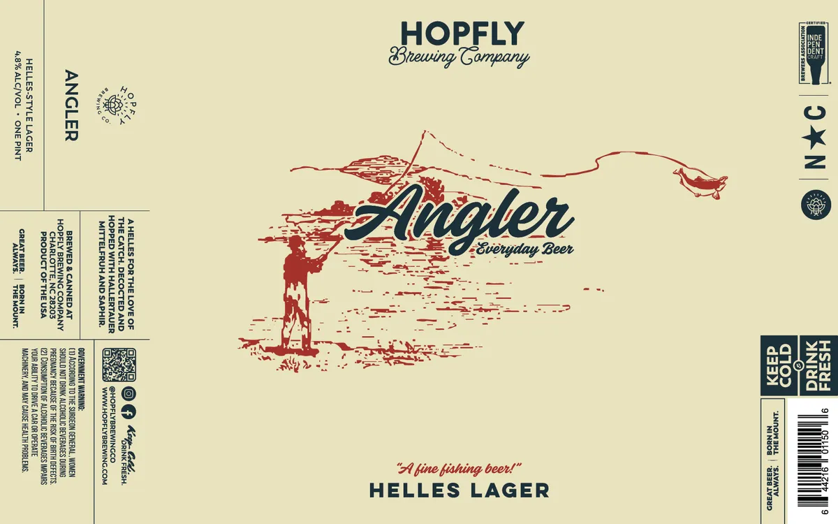 AnglerHOPFLY BREWING COMPANYA woodcut-style illustration of a fisherman casting a line dominates the center of the label, rendered in oxblood red against a cream background. The figure stands beneath a sketchy landscape of hills and water, with the beer name "Angler" in script lettering overlaid across the composition. Below, the style designation "Helles Lager" and tagline appear in dark caps and italic script respectively.cream · oxblood · navy
![Periodic Motion [Private Reserve '26] label art — FONTA FLORA BREWERY](/img/26194001000627/0.card.webp) Periodic Motion [Private Reserve '26]FONTA FLORA BREWERYA black-and-white woodcut of a diving bird silhouette occupies the upper half of the circular label, set against a large red sun rendered in bold curves. The bird's head and neck extend into the sun disk, creating a stark graphic division between the red background and the black water below. Type runs along the outer rim in a months-of-the-year date wheel format, with the beer name and series information centered above the bird, and the brewery name and address centered below in script and sans-serif lettering.red · black · white · cream
Periodic Motion [Private Reserve '26]FONTA FLORA BREWERYA black-and-white woodcut of a diving bird silhouette occupies the upper half of the circular label, set against a large red sun rendered in bold curves. The bird's head and neck extend into the sun disk, creating a stark graphic division between the red background and the black water below. Type runs along the outer rim in a months-of-the-year date wheel format, with the beer name and series information centered above the bird, and the brewery name and address centered below in script and sans-serif lettering.red · black · white · cream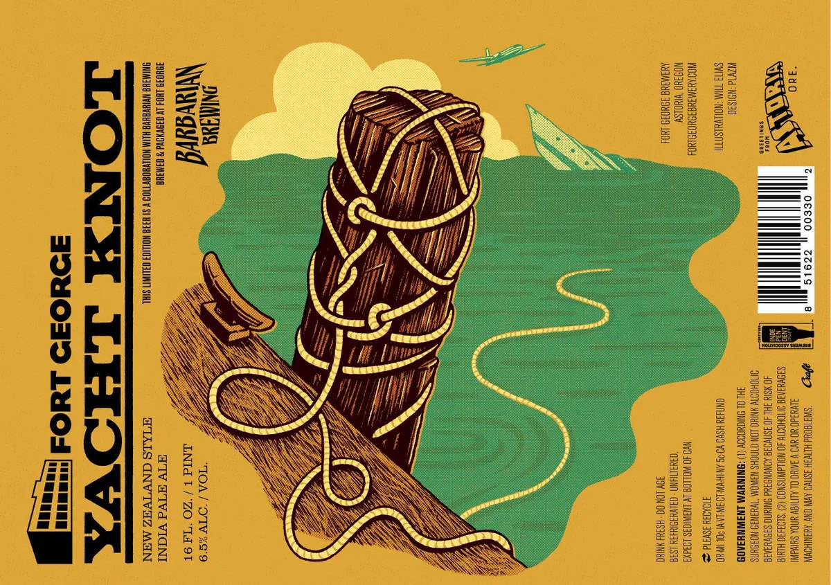 Yacht KnotFORT GEORGEA woodcut-style illustration of a wooden post wrapped in a gold rope knot dominates the centre, rendered in brown linework against a split landscape of pale yellow clouds above and sage green terrain below. A biplane sketched in teal flies across the upper right, while a winding golden line curves through the green field beneath. The beer name appears in bold black sans-serif capitals down the left edge, with the brewery mark—a stylised fort structure—positioned at the foot of the left margin.gold · sage · brown · cream
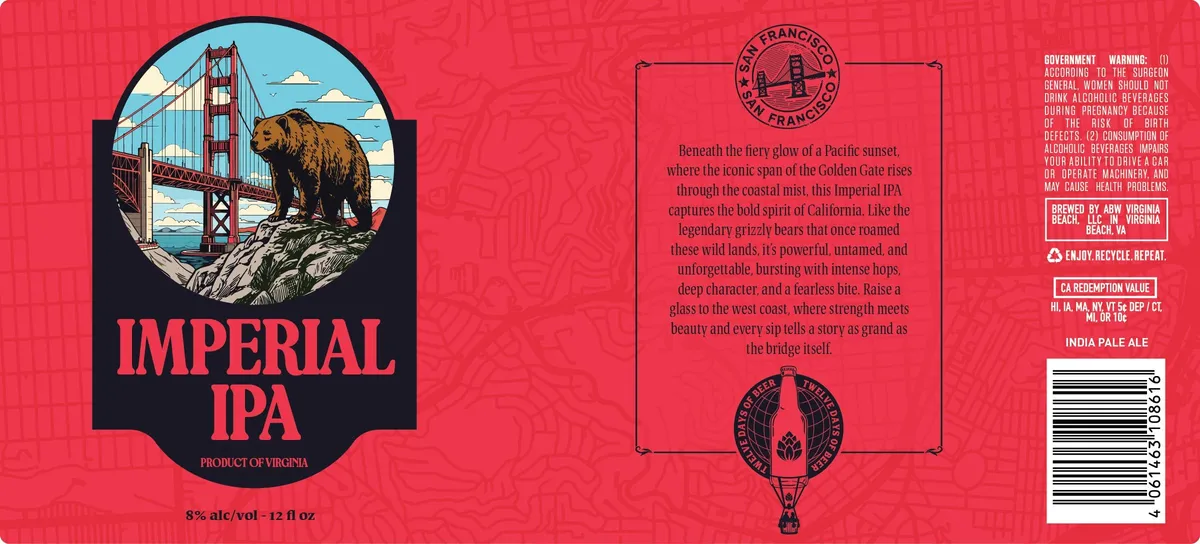 Imperial IPAABW VIRGINIA BEACH, LLCA brown grizzly bear stands on a rocky outcropping before the Golden Gate Bridge beneath a pale sky, rendered in a woodcut style within a circular vignette. The bear and bridge occupy the upper two-thirds of a black shield-shaped cartouche centred on the label, with the beer name in large condensed caps below. The composition sits against a bright coral-red background with subtle repeating ornament, and the regulatory and descriptive text anchors the right panel.coral-red · black · brown · cream
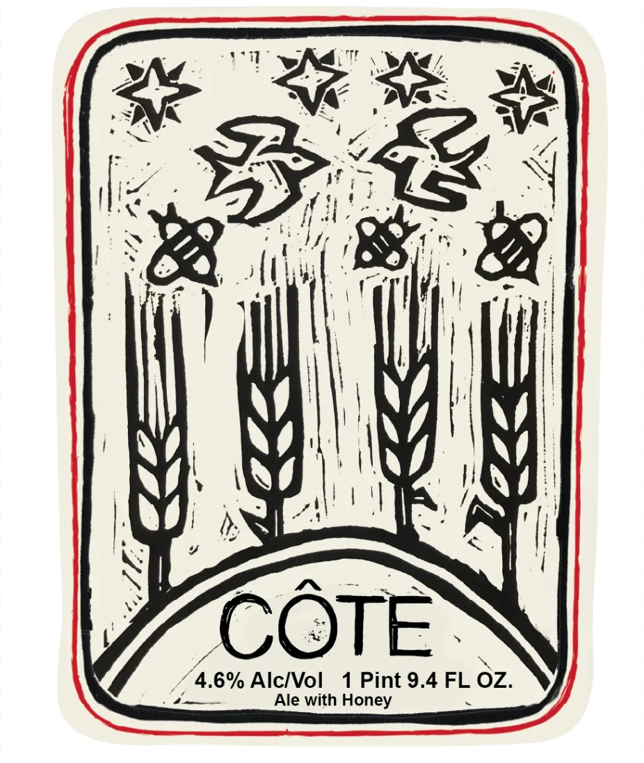 CôteAUVALFour sheaves of wheat rise from the bottom of the label in a woodcut style, rendered in bold black lines with fine hatching. Above them float five four-pointed stars and three orbiting atoms scattered across a cream ground, with two stylized angular letterforms—likely a monogram—centred at the top. The entire composition is framed by a thick black border with a rounded cartouche at the base holding the beer name in outlined capitals, all printed in black ink on cream stock with a red border.cream · black · red
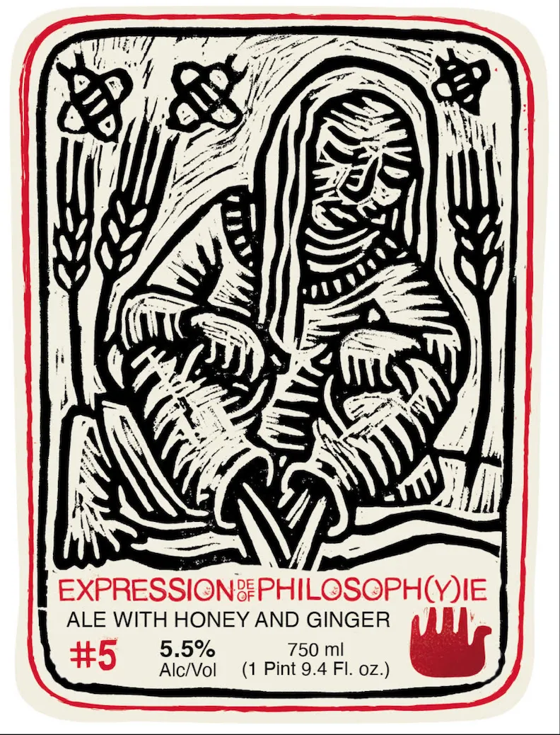 Expression of Philosophy #5AUVALA woodcut-style figure in medieval or Renaissance dress holds a vessel and stands among wheat sheaves and symbolic icons, rendered in bold black lines on cream with a red border frame. The composition fills the upper two-thirds of the front label with the figure centered, flanked by grain stalks and paired celestial or alchemical symbols at the top corners. Typography in red and black sits below the illustration; a red hand emblem appears in the lower right. The back panel is text-heavy, cream with red and black type, bordered in red with a red logotype at top center.cream · red · black
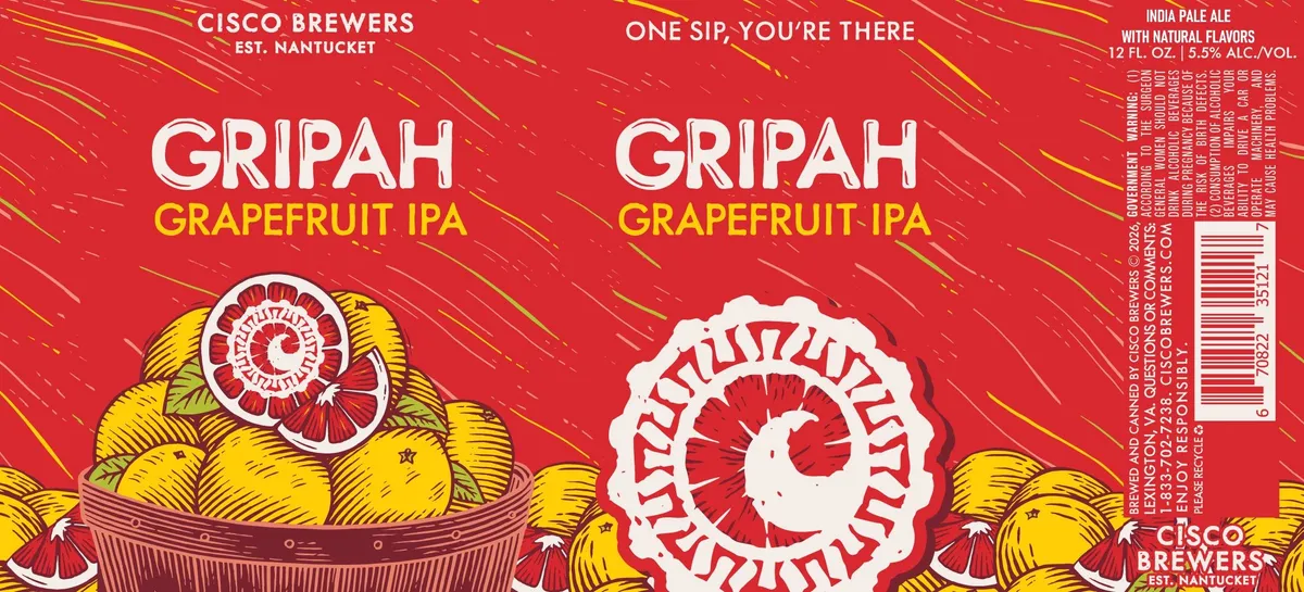 GripahCISCO BREWERSA woodcut-style grapefruit dominates the left side of the label, rendered in yellow and deep red with cross-hatching and bold linework, nestled in a woven basket with a red spiral motif at its crown. The right panel features an enormous close-up cross-section of grapefruit flesh, cut into red and white in a concentric spiral pattern. Both panels sit on a bright red ground with diagonal yellow striations suggesting motion or energy.red · yellow · white · brown
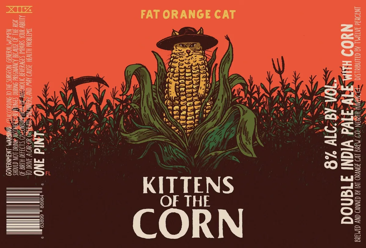 Kittens of the CornFAT ORANGE CATA corn cob wearing a black wide-brimmed hat and grinning stands centered in a cornfield, rendered in a woodcut style with bold outlines in yellow, green, and deep brown against an orange-to-burgundy gradient field. Corn stalks fill the background in silhouette, their angular forms echoing the central figure's features. The beer name appears in white serif capitals below the illustration, with the brewery name "FAT ORANGE CAT" in gold capitals at the top.orange · yellow · green · burgundy
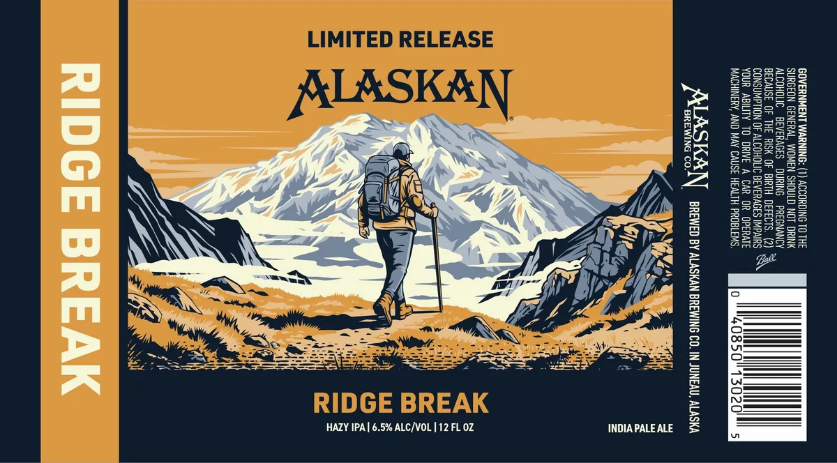 Ridge BreakALASKANA solitary backpacker stands in alpine terrain facing a snow-capped mountain peak, rendered in a woodcut or linocut style with bold line work and discrete colour blocking. The figure wears a tan and charcoal pack and hiking poles, positioned in the lower-left third of the composition against golden tundra grasses and dark rocky outcrops, with the massive white peak dominating the upper background. The scene occupies the central panel against an orange-gold field, flanked by navy vertical bands carrying the brewery name and regulatory text. The palette is limited to cream, navy, tan, and gold across the full-bleed landscape and type-only side panels.gold · cream · navy · tan
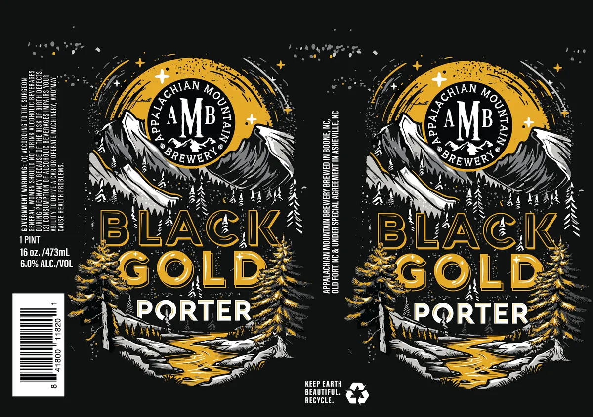 Black Gold PorterAPPALACHIAN MOUNTAIN BREWERYA woodcut-style alpine landscape dominates the label, with two snow-capped peaks flanking a central circular emblem containing the brewery's initials and name. The composition layers a gold circular seal at the top, a deep valley with evergreen trees and a golden stream in the foreground, and scattered stars and sparkles throughout. The palette is restricted to black, gold, and cream on a solid black ground, with all imagery rendered in bold linear hatching and high-contrast silhouette typical of relief printmaking.black · gold · cream
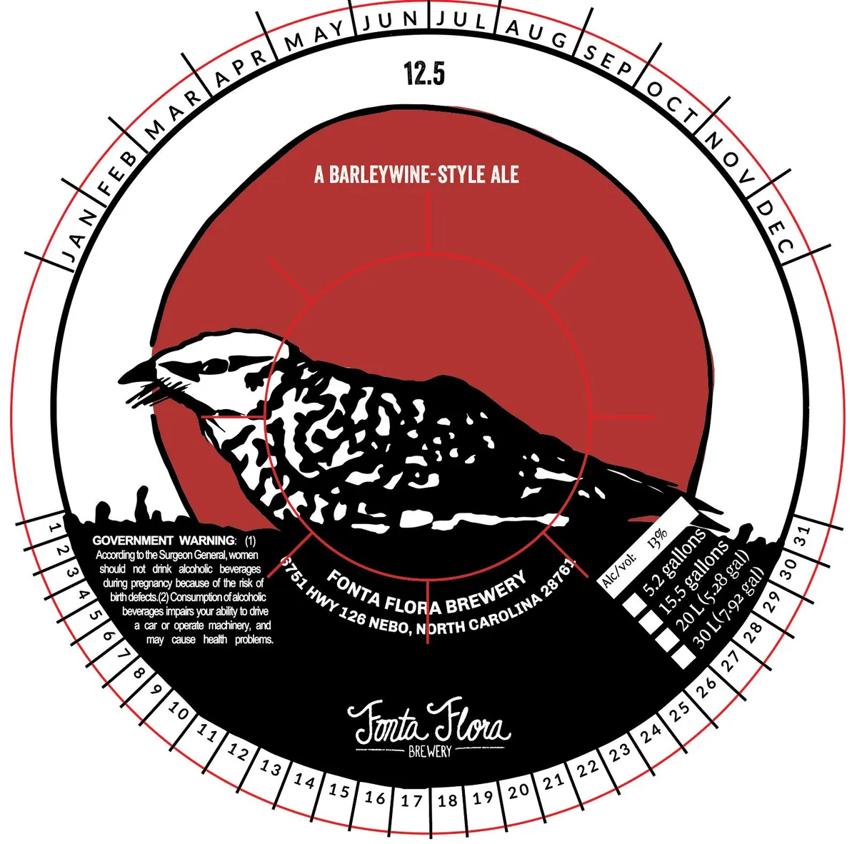 12.5FONTA FLORA BREWERYA black-and-white woodcut of a shorebird in flight silhouetted against a large red sun occupies the central roundel. The bird's body and wings are rendered in stark black with white highlight accents, while the sun fills the background in solid red. Surrounding the central image is a cream-coloured circular border printed with month names and degree markings in black, forming a calendar wheel. The brewery name appears in script lettering at the bottom of the label against a black ground.red · black · cream
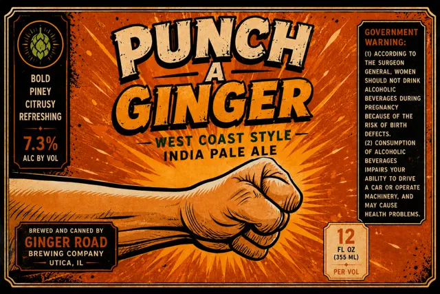 Punch A GingerA woodcut-style fist punches through a radiating orange background, rendered in bold black lines with hatching across a mustard-gold field. The beer name appears in large, distressed serif capitals above the fist, with the style descriptor below in smaller type. A hop cone emblem sits in the upper left corner, and the brewery name and specifications occupy the lower left and right quadrants in condensed sans-serif and serif typography respectively.orange · gold · black · cream
 Spiced Dark LagerTOPPLING GOLIATH BREWING CO.A silhouetted deer grazes in a snowy winter landscape rendered in a woodcut style, framed by a decorative border of pinecones, evergreen branches, and stars in cream and rust tones. The scene features stylized evergreen trees, bare branches, and falling snow against an orange-toned sky, with the beer name centered in white bold capitals. The label is predominantly black, cream, and rust-orange, with a framed vignette composition and an ornamental perimeter of seasonal botanical elements.black · cream · rust-orange · white
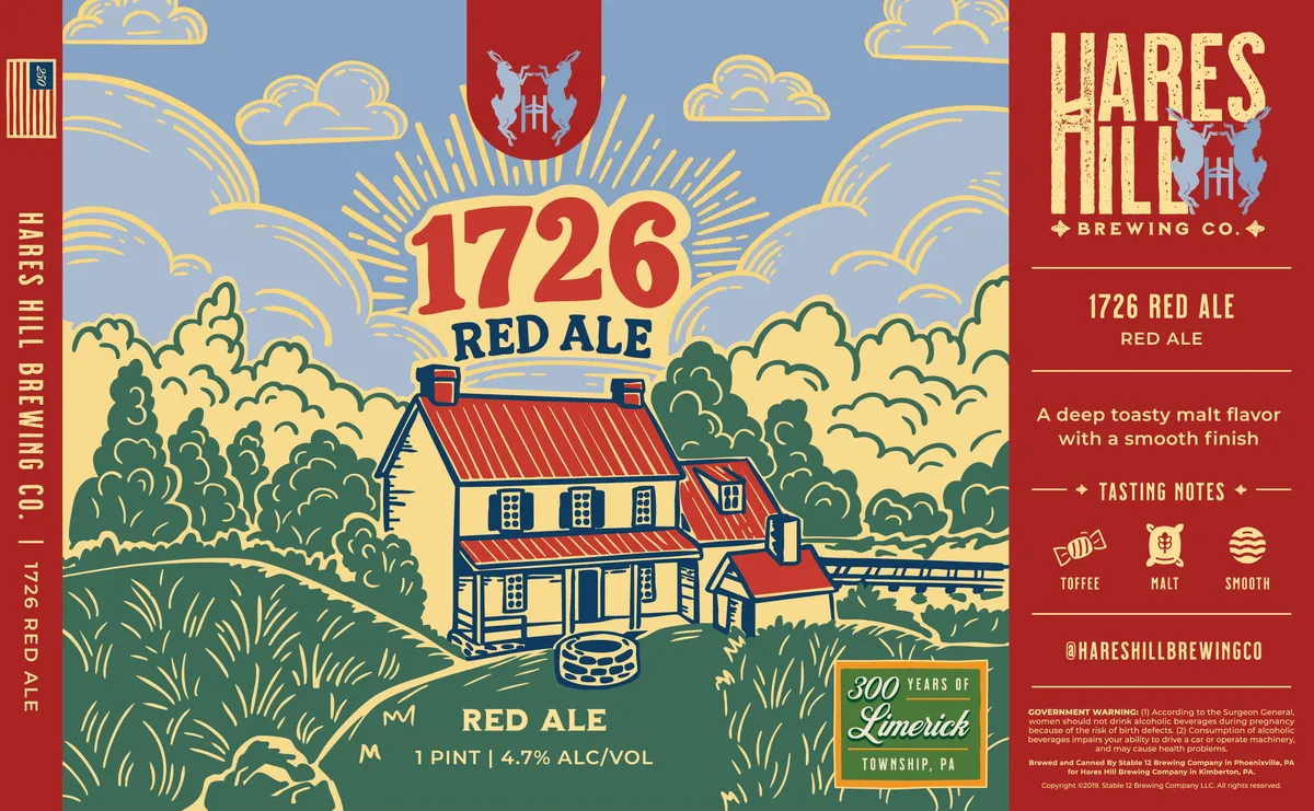 1726 Red AleHARES HILL BREWING CO.A colonial-era farmhouse with red roof and cream walls stands centered in a rolling pastoral landscape, surrounded by stylized dark green trees and golden clouds against a periwinkle sky. The house is rendered in a bold, linear woodcut style with heavy outlines; a large sunburst frames the beer name "1726" above the structure in gold and red lettering. The composition is divided between the illustrated scene occupying the left two-thirds and a solid red panel on the right containing the brewery name, style designation, tasting notes, and regulatory information.periwinkle · gold · red · cream
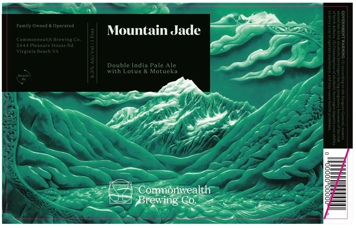 Mountain JadeCOMMONWEALTH BREWING COA full-bleed alpine landscape rendered in deep jade and cream shows snow-capped peaks and forested valleys in layered relief, evoking traditional East Asian woodblock prints. The composition fills the entire front label with mountains receding in depth, their slopes defined by parallel curves and textured vegetation. The beer name appears in large serif capitals across the upper-centre portion, with a black band containing brewery information and style description. An ornamental vine-scroll border frames the left edge in matching jade, and the Commonwealth Brewing Co. logo sits centred at the base in a geometric linework style.jade · cream · black
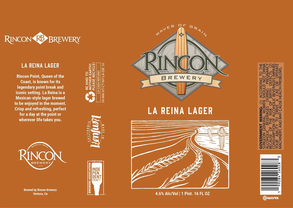 La Reina LagerA woodcut-style landscape dominates the lower half: a perspective field of grain stalks receding toward a distant horizon, with a saguaro cactus visible on the right skyline, rendered in white line-work against the orange field. Above it, a diamond-shaped emblem centers the label with a wooden surfboard motif topped by "Waves of Grain" text in an arc, the brewery name in serif capitals on a cream banner beneath. The entire composition sits on a solid burnt-orange ground with white and cream typography distributed across the upper left and lower portions.burnt-orange · cream · white
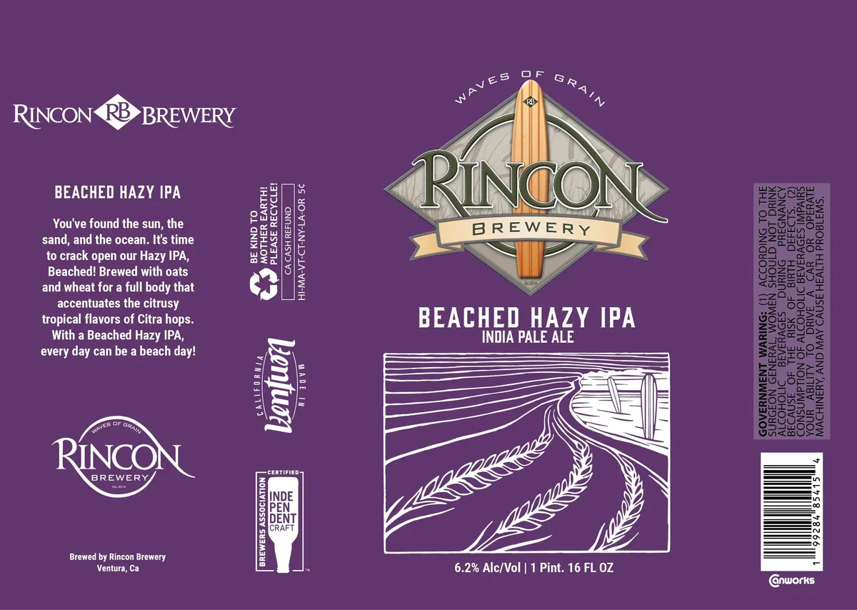 Beached Hazy IPAA woodcut-style illustration dominates the center of the label, showing a wooden surfboard planted upright in a field of grain stalks rendered in parallel linear perspective lines, all in white line-work against the purple ground. Above sits the Rincon Brewery diamond-shaped emblem with a surfboard finial and cream banner, flanked by "WAVES OF GRAIN" in outlined capitals. The composition is anchored by the beer name in white serif caps and a bordered rectangular vignette containing the surfboard-in-wheat scene, with the style category and ABV listed beneath.purple · white · cream · gold
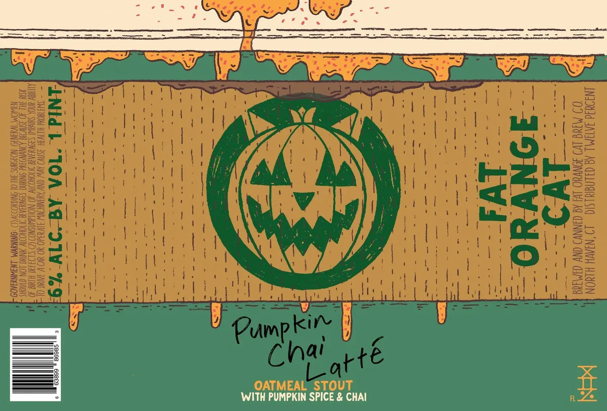 Pumpkin Chai LattéFAT ORANGE CATA jack-o'-lantern with a carved grimacing face sits centered within a circular green border, rendered in green woodcut against a tan wood-grain textured background. The pumpkin illustration occupies the upper two-thirds of the label, with melting orange cheese or dripping caramel illustrated across the very top edge, and the beer name hand-lettered in script across the lower green band. The composition uses a horizontal banding structure with a wood-veneer pattern filling the central field.green · tan · orange · cream
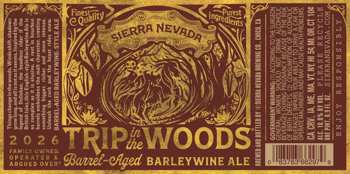 Trip in the Woods Barrel-Aged BarleywineSIERRA NEVADAA dense, ornamental woodcut-style illustration of a gnarled tree dominates the center of the label, its twisted trunk and branches rendered in dark brown against a gold background, framed by art-nouveau scrollwork and corner flourishes. The composition is symmetrical and heavily decorated, with leaf motifs and curved borders filling the upper and lower edges. The beer name is split across the image in a large serif typeface, with 'SIERRA NEVADA' arching above and 'Barrel-Aged BARLEYWINE ALE' positioned below the central motif. Regulatory text and descriptors run vertically along both sides on the gold field.gold · oxblood · cream
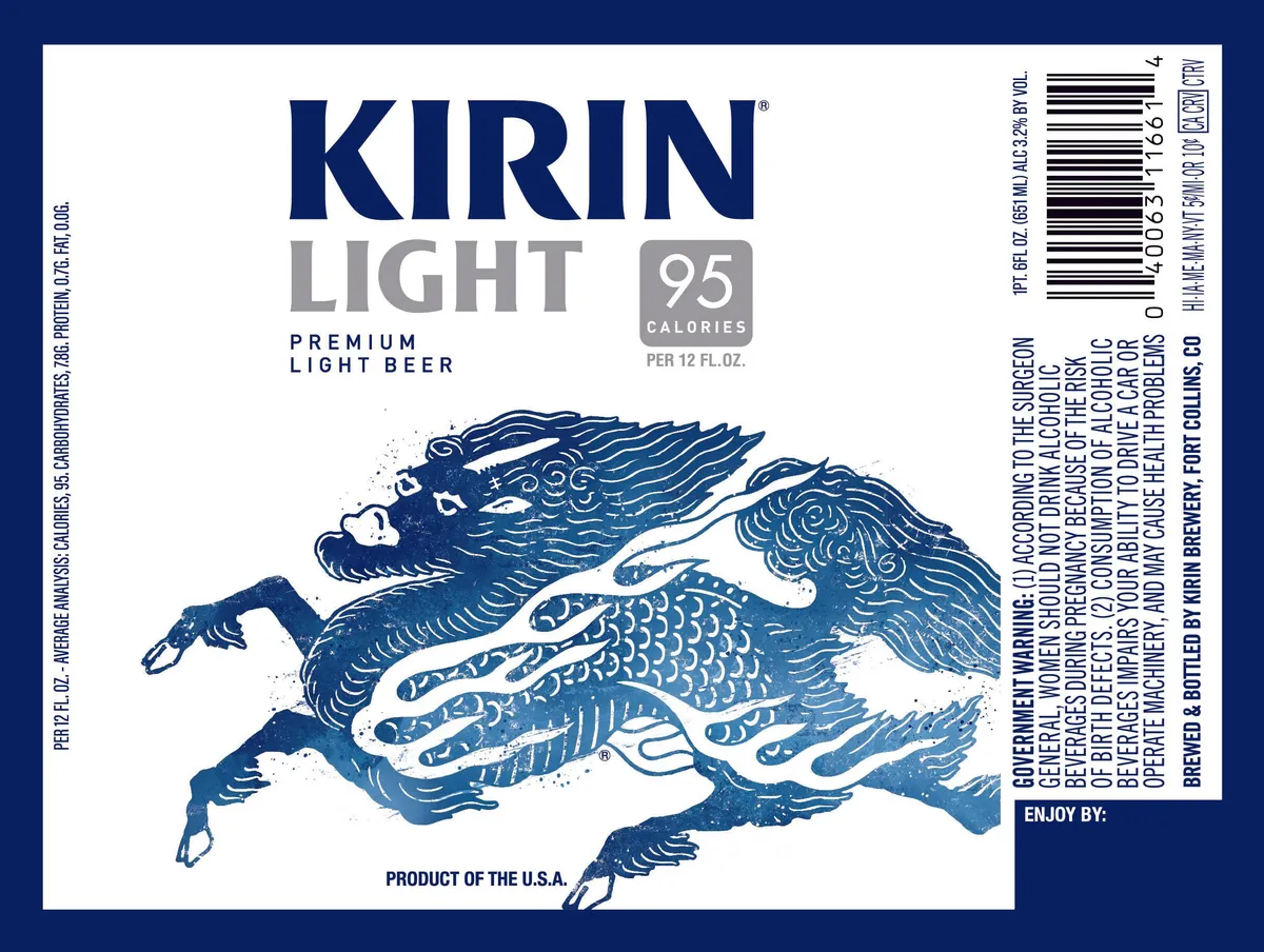 Kirin LightKIRINA stylized dragon rendered in woodcut technique dominates the center of the label, depicted in navy blue with intricate linear patterning across its scaled body and flowing mane. The creature is shown in profile, leaping or flying across a white field, with detailed linework defining feathers, scales, and fur. The KIRIN wordmark appears in heavy sans-serif caps above the dragon, with LIGHT and product details set in smaller sans and slab-serif type below. The composition is balanced and symmetrical, anchoring the dragon as the central emblem against an otherwise type-driven layout.navy · cream · white
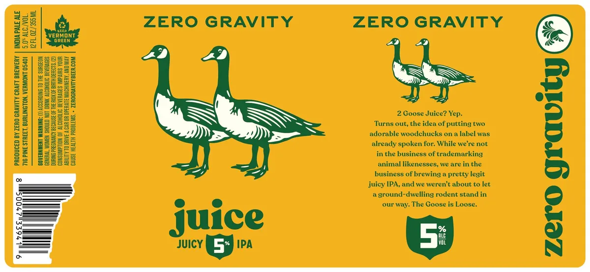 Juice Juicy IPAZERO GRAVITY CRAFT BREWERYTwo geese rendered in a woodcut style — white bodies with dark green heads, wings, and legs — dominate the left-centre of the label against a bright yellow ground. The composition is split between the prominent pair on the lower left and a smaller pair at upper right, with the beer name "juice" in large lowercase letters below the main geese, and "ZERO GRAVITY" repeated at top and right edge. The label employs a two-colour palette of forest green and cream against the saturated yellow background, with a small circular Vermont Brewery Association logo at top right and a beer-specific shield badge indicating 5% ABV in green near the lower centre.gold · forest-green · cream · white
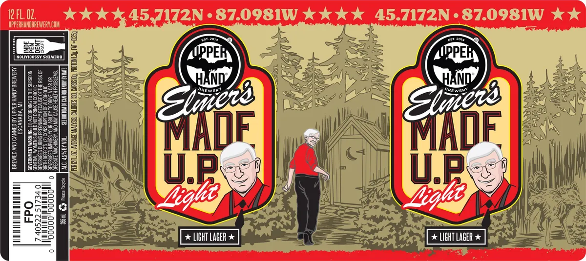 Elmer's Made U.P. LightUPPER HANDTwo identical panels show a bespectacled man in a red jacket and black trousers standing in a forested landscape with coniferous trees rendered in muted tan and olive tones. The figure appears in a woodcut or engraving style, positioned before a cabin in the background; the scene fills a red-bordered shield-shaped badge that dominates each panel. The badge contains a black circular brewery emblem at the top with "UPPER HAND" and "EST. 2014", beneath which the beer name appears in script and bold caps in oxblood and cream. A red banner across the top edge displays gold stars and GPS coordinates; the bottom edge is solid red with a "LIGHT LAGER" label.red · cream · olive · tan
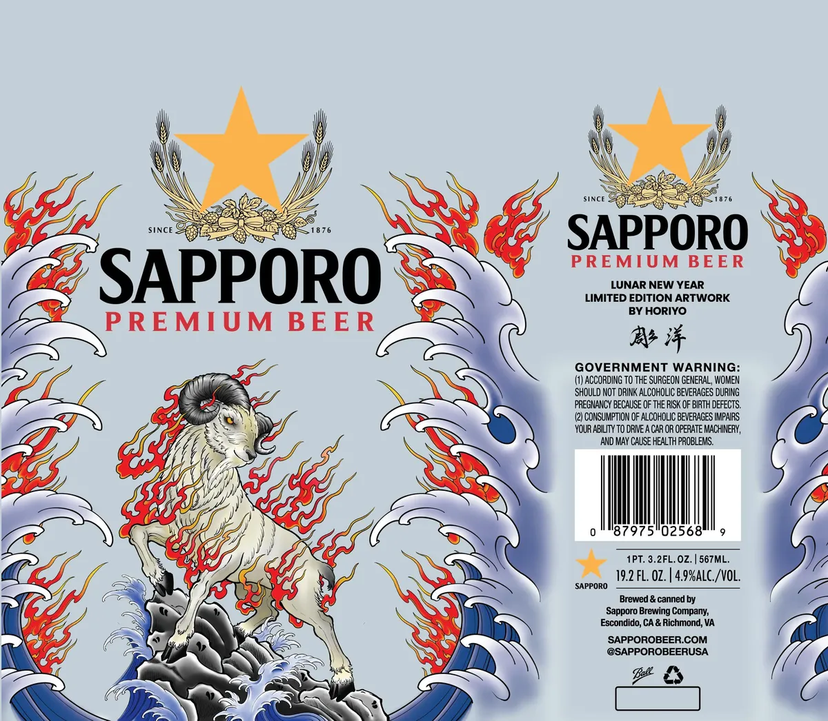 Sapporo Premium BeerSAPPORO PREMIUMA white goat stands amid red flames and stylized blue waves in a Japanese ukiyo-e style composition, centred on the front label against a pale blue ground. Above the animal sits a large golden star flanked by hop bundles and a banner reading "SINCE 1876". The palette combines cream, red, blue, and gold in a full-bleed illustration with fine linework throughout. The label declares this a "Lunar New Year Limited Edition Artwork by Horiyo" in the upper right.pale blue · cream · red · blue
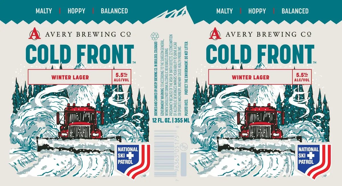 Cold FrontAVERY BREWING CO.A woodcut-style winter landscape dominates the label, depicting a red snowcat or snow vehicle nestled among snow-laden evergreen trees beneath a mountain peak, rendered in teal, cream, and black with cross-hatching throughout. The composition extends across the full front, with snow drifts flowing across the foreground and dense forest rising behind the central cabin-like structure. The beer name appears in bold teal caps across the upper portion, while "Winter Lager" sits in a red-outlined banner below, with the ABV and National Ski Patrol badge anchoring the lower corners.teal · cream · red · black
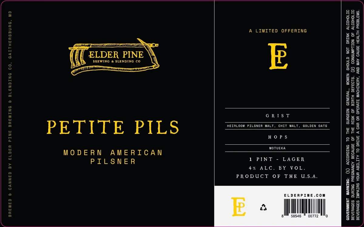 Petite PilsELDER PINE BREWING & BLENDING COThe front label is dominated by a gold-inked woodcut-style illustration of a wooden barrel lying horizontally, rendered with bold cross-hatching and linear detail across a black ground. Below the barrel emblem, the beer name 'PETITE PILS' is set in tall, widely spaced capitals in gold, with 'MODERN AMERICAN PILSNER' beneath in the same typeface. The back panel continues the black ground with recipe details and brewery information in gold and white type, aligned in discrete blocks separated by thin horizontal rules. The palette throughout is restricted to black, deep gold, and white.gold · black · white
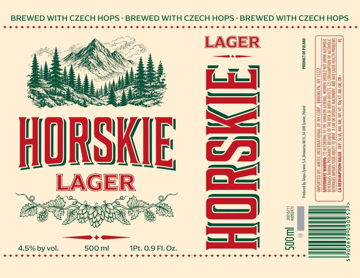 Horskie LagerHORSKIEA woodcut-style alpine landscape dominates the upper left: a snow-capped peak rises above a dense coniferous forest rendered in green and cream, with rocky outcrops in the foreground. Below it, the beer name "HORSKIE" appears in bold condensed slab caps with red fill and dark green outlines, flanked by a band of hop and foliage line art in green. The right side displays the word "LAGER" vertically in the same slab caps, creating a split-field composition with the main brand name on the left and supplementary branding on the right. The palette is cream, oxblood red, and forest green throughout, with decorative diamond ornaments and hop-vine borders framing the design.cream · oxblood · forest green
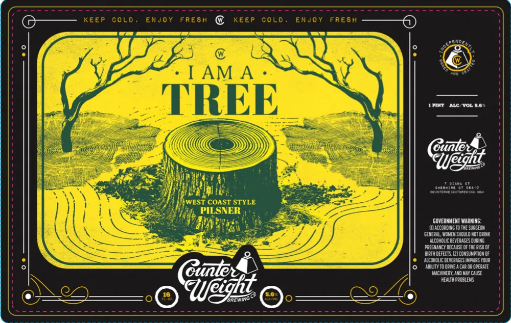 I Am a TreeA felled tree stump dominates the center of a yellow field, its growth rings rendered in concentric lines, flanked by two bare trees with gnarled branches. The landscape extends to the horizon with contour lines suggesting rolling terrain. The composition is framed by a rounded-corner rectangle with decorative corner elements, and the beer name is set in large serif caps across the upper half. The palette is primarily yellow and deep teal-green throughout the illustration, printed on a black background with gold-foil accents on the border and brewery mark.yellow · teal · black · gold
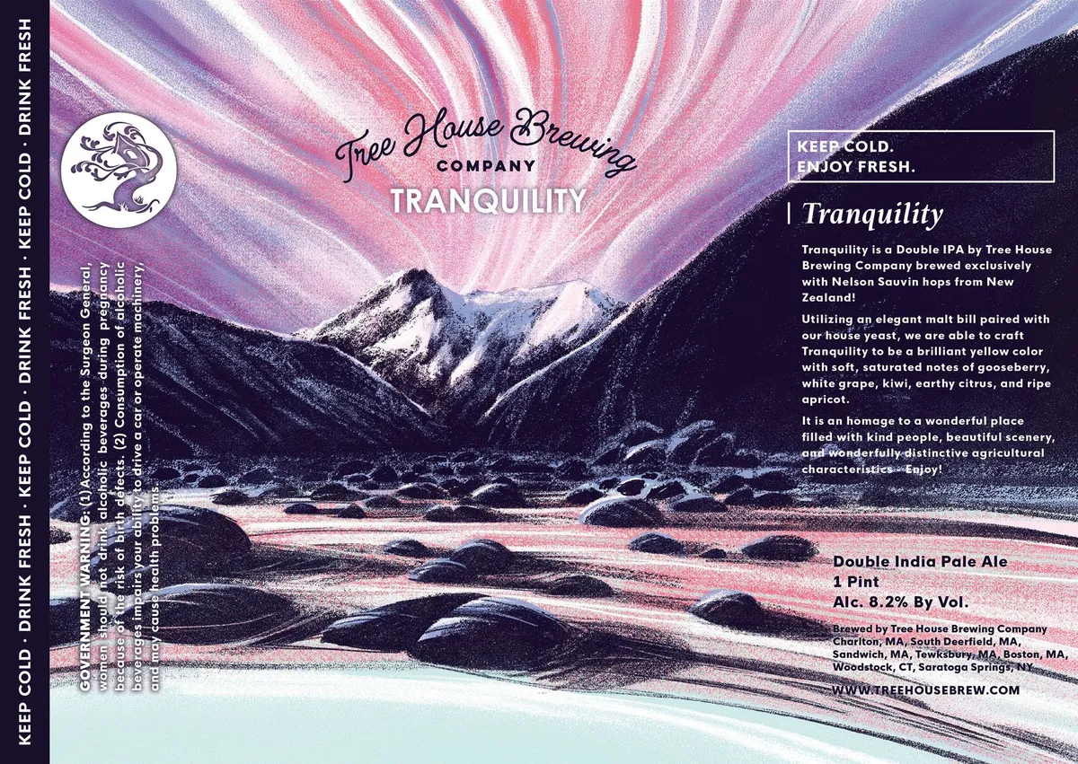 TranquilityA landscape scene dominates the front, showing snow-capped mountains reflected in a still river with dark rocky banks, rendered in a style suggesting wood engraving or linocut. The sky above radiates outward in bands of pink, purple, and white, creating a sunrise or sunset effect. The brewery name and beer name are set in script and sans-serif type across the upper portion, with regulatory text and product information anchoring the right side and left margin against a dark ground.purple · pink · cream · navy
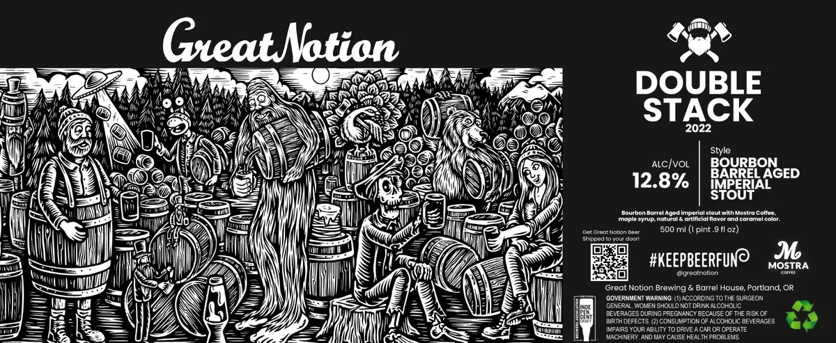 Double Stack 2022GREAT NOTIONA densely detailed woodcut fills the upper two-thirds of the label, depicting a raucous tavern scene with numerous figures—bearded loggers, musicians, and revellers—crowded around barrels and tables beneath a rising sun and coniferous forest. The composition is rendered entirely in bold black line work on a dark ground, with characters and objects layered and overlapping across the full width. The right side features clean, modern sans-serif typography for the beer name, style designation, and alcohol content, creating a stark contrast with the ornate illustration. The label is matte black with no visible special finish.black · white
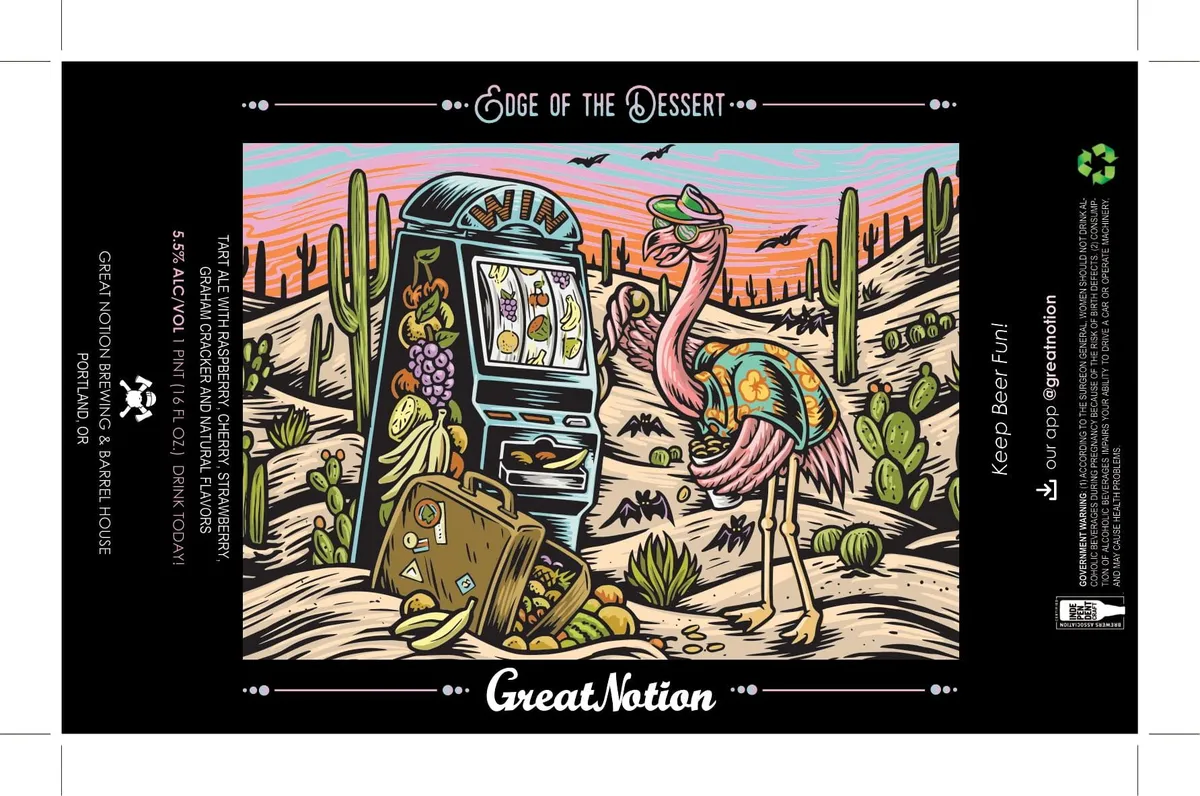 Edge of the DessertGREAT NOTION BREWINGA full-bleed desert scene rendered in woodcut style depicts an anthropomorphic pink ostrich operating a slot machine amid saguaro cacti, tumbleweeds, and scattered desert flora under a streaked sunset sky with bats in flight. A weathered wooden crate and various desert plants surround the central figures. The illustration employs bold black outlines with multicolour fills—cream, tan, green, pink, orange, and purple—against a deep black border frame containing the beer name and brewery mark in script and sans-serif lettering.cream · tan · green · pink