A cut through the label corpus
Type only beer labels
93 labels in the register read as type only. Every one was described by us from the filed artwork — the TTB records what a label says, never what it looks like.
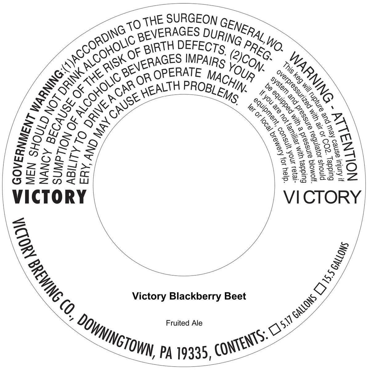 Victory Blackberry BeetVICTORYThe label is a circular black-and-white type composition with the beer name black · white
 VI IILOLEV BEERA minimalist label dominated by a bright sky-blue ground. The beer name 'Lolev Beer' appears in large sans-serif capitals across the upper centre, with a small white hop wreath emblem positioned below at the label's midpoint. 'Vi II / Ultra Hopped Ale' is set in lighter type in the lower third. Hop variety and ingredient information occupy the left edge in small caps, while regulatory text runs vertically along the right margin. A QR code sits in the lower left corner.sky blue · white · cream
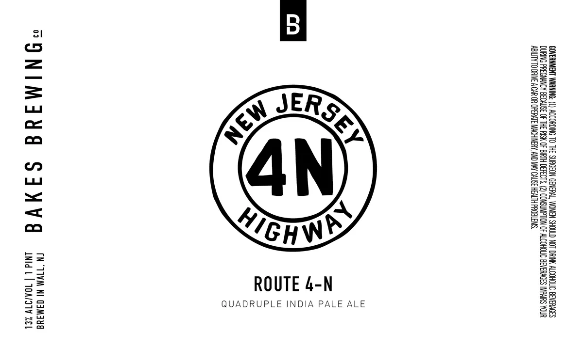 Route 4-NA circular emblem centred on the label bears the text "NEW JERSEY" at the top, "4N" in bold sans-serif at the centre, and "HIGHWAY" at the bottom, all rendered in black linework. Below the emblem sit the beer name "ROUTE 4-N" and style descriptor "QUADRUPLE INDIA PALE ALE" in clean sans-serif type. The design uses black ink on a white ground with no visible illustration or photographic elements beyond the geometric circle and typography.white · black
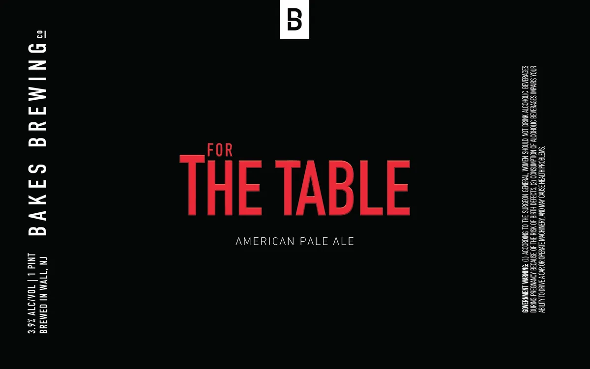 For the TableA stark typographic label dominated by the beer name in large red sans-serif capitals centred against a black background, with the style designation "AMERICAN PALE ALE" set in smaller capitals below. The brewery name runs vertically in white sans-serif along the left edge, and a white square containing the letter "B" sits at the upper centre. No illustration or decorative element appears; the composition relies entirely on geometric type arrangement and high contrast.black · red · white
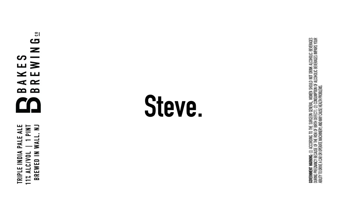 Steve.The label is type-only, dominated by the beer name "Steve." in large sans-serif capitals centered on a cream ground. The brewery name "BAKES BREWING" appears vertically along the left edge in the same typeface, with beer style and ABV details set in smaller type below. Regulatory and ingredients text runs vertically on the right side.cream · black
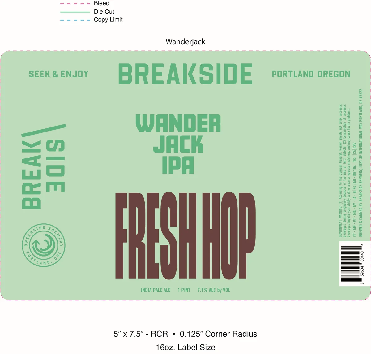 Fresh Hop WanderjackBREAKSIDE BREWERYA single-colour label on soft sage-green background, with the brewery name and beer variety distributed across the field in stacked sans-serif capitals. The word "FRESH HOP" dominates the lower two-thirds in large maroon block letters with a compressed, geometric weight; above it sit "WANDER JACK IPA" in smaller green caps, with "SEEK & ENJOY" and location text flanking the top margin. A circular badge incorporating a swirl motif appears lower left in green outline; regulatory and batch information runs vertically along the right edge in small green type.sage · maroon · cream
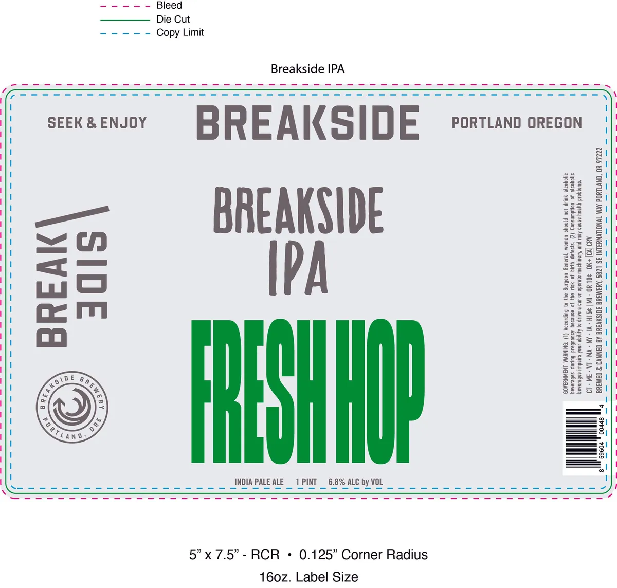 Fresh Hop Breakside IPABREAKSIDE BREWERYA type-only label dominated by the word "FRESH HOP" in large kelly green capitals occupying the lower half of the field. Above it, "BREAKSIDE IPA" and brewery identifying text are set in charcoal sans-serif; "BREAKSIDE SIDE" appears vertically on the left margin in the same weight. A small circular brewery seal with concentric rings sits in the lower left corner. The background is a light grey-lavender, with the brewery name and location (Portland Oregon) anchoring the top.lavender · charcoal · kelly green
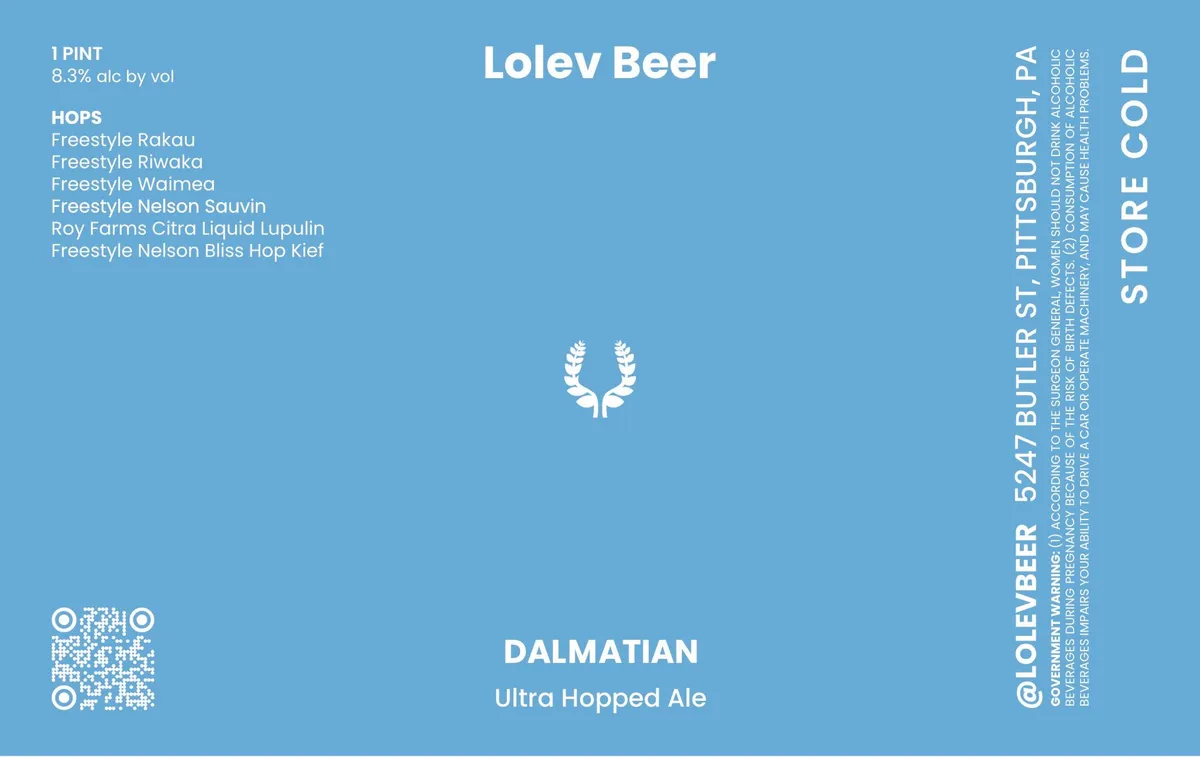 DalmationLOLEV BEERA symmetrical hop-bine wreath in white occupies the centre of a solid sky-blue field, with the brewery name "Lolev Beer" in large sans-serif capitals across the top and the beer style "Dalmation Ultra Hopped Ale" centred below in smaller type. The label is type-dominant, with regulatory and ingredient text running down the right edge and a QR code positioned in the lower left corner.sky-blue · white
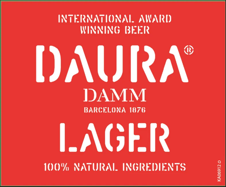 DauraThe front label is dominated by the brand name red · white
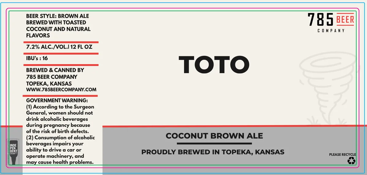 Toto785 BEER COMPANYThe front of the label is dominated by the beer name TOTO in large, bold black sans-serif capitals, positioned centre-right. A faint line-drawn tornado or swirling funnel shape appears in light grey to the right of the text. The composition is split horizontally: regulatory and brewery information occupies the left and upper portions in black and red sans-serif type on cream, while a grey band across the lower half carries the beer style and origin statement in black capitals. The palette is cream, black, red, and grey with a turquoise border frame.cream · black · red · grey
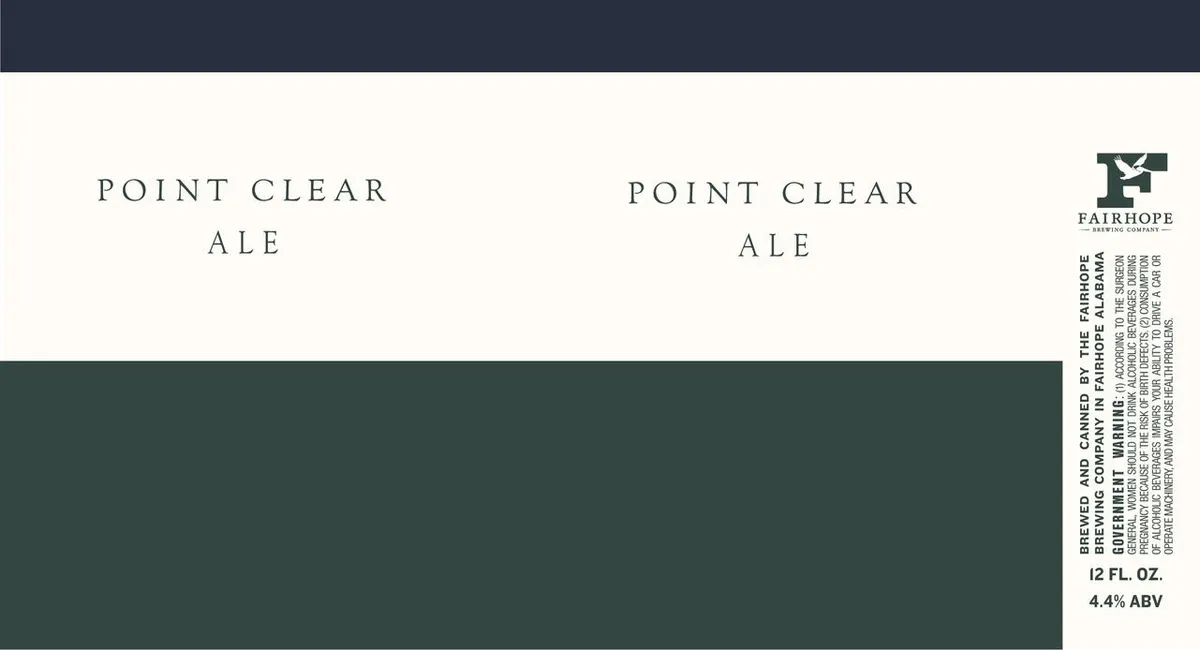 Point Clear AleThe label is divided into two fields by a dark teal horizontal band that bisects the composition. Above, cream-coloured stock bears the beer name "POINT CLEAR ALE" in spaced serif capitals, repeated twice across the width. Below, the teal field occupies roughly half the label with no pictorial element. The Fairhope Brewing Company logo—a stylised pelican in white—appears in the upper right corner, with vertical regulatory and brewery information set in small caps along the right edge.cream · teal · white
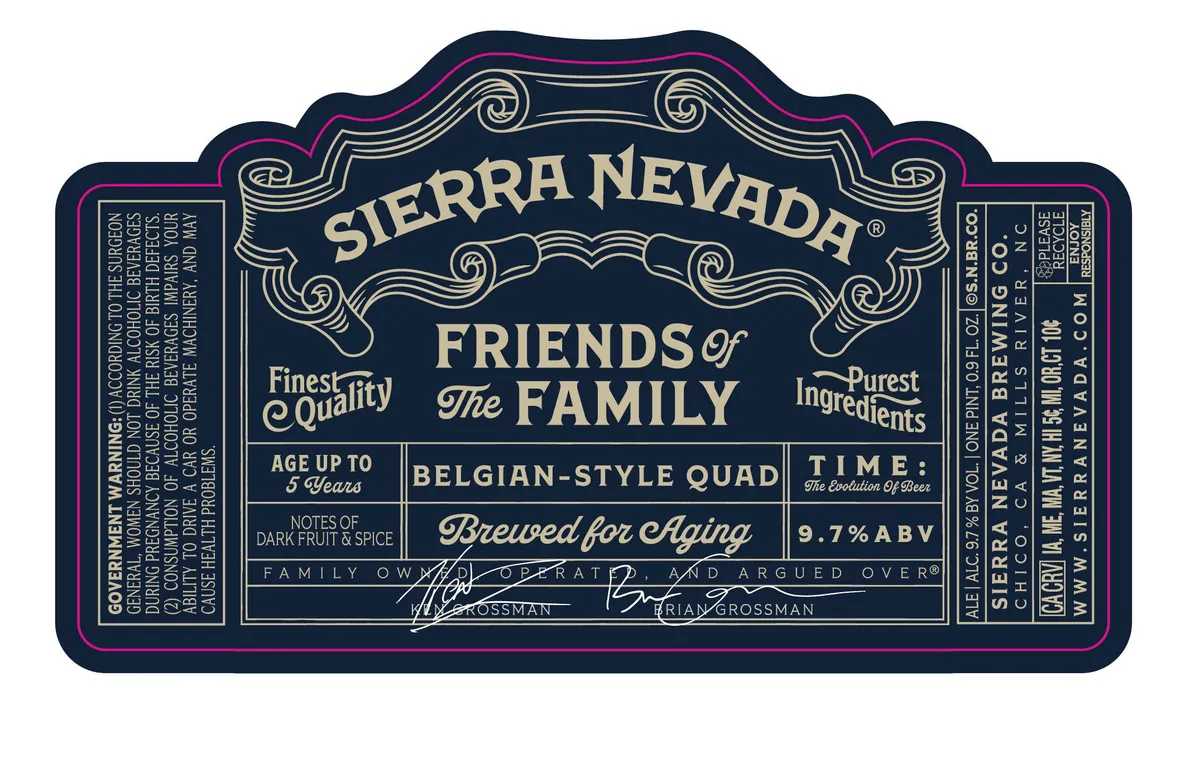 Friends of the FamilySIERRA NEVADAAn ornamental cartouche with Art Nouveau scrollwork occupies the upper half of the label, framing the brewery name in spaced serif capitals. Below, nested rectangular borders contain the beer name in script, style designation, and aging statement, with the entire composition rendered in cream type on a dark navy field. The label employs a symmetrical, heraldic arrangement with no pictorial imagery; decorative spiral volutes and curved flourishes provide visual structure across a type-forward design.navy · cream · magenta
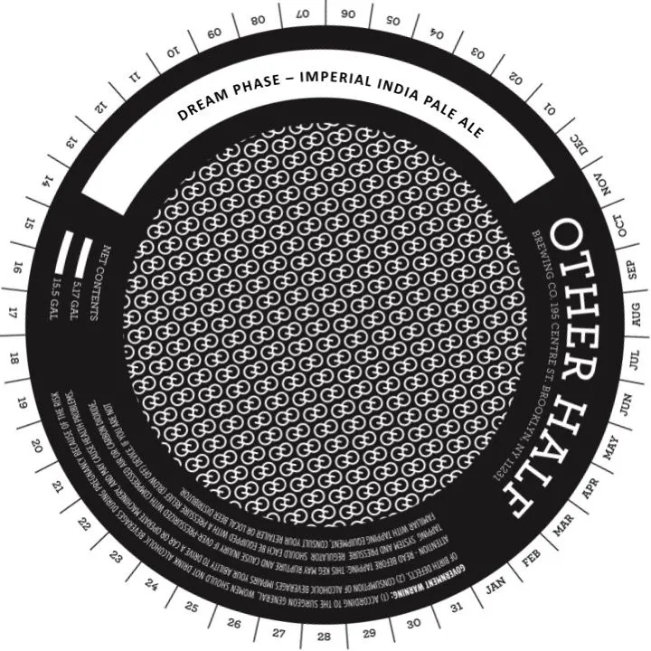 Dream PhaseOTHER HALF BREWING CO.A round keg collar with black ground and white type. The centre field holds a dense repeating pattern of interlocked circular geometric motifs in white on black. The beer name and style arc across the top in sans-serif capitals; the brewery name runs vertically down the right edge. A date wheel with numerical increments occupies the outer perimeter, with regulatory text and production information stacked in the lower black band.black · white
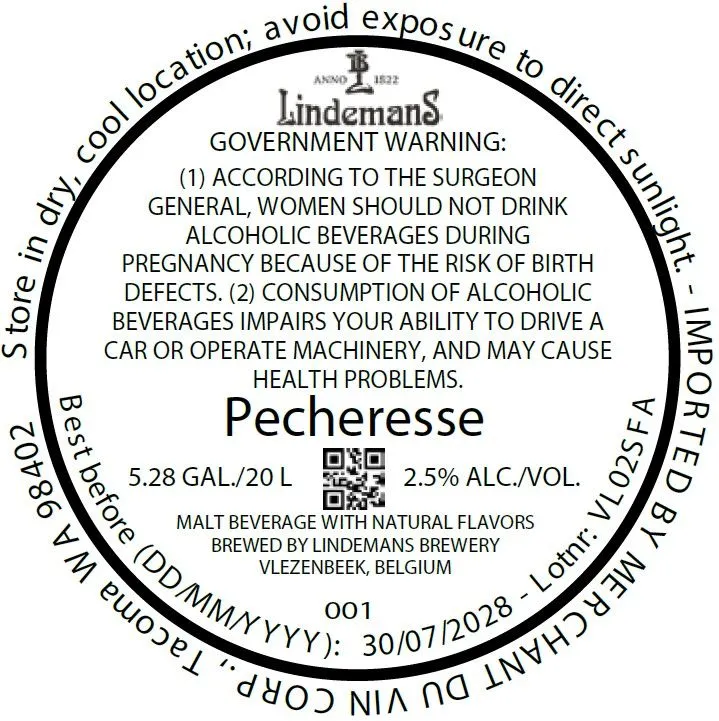 PecheresseLINDEMANSA cream-coloured circular label dominated by the Lindemans heraldic emblem at the top, with the beer name cream · black
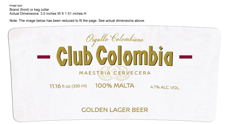 Club Colombia DoradaA minimalist label dominated by the brand name cream · gold · maroon
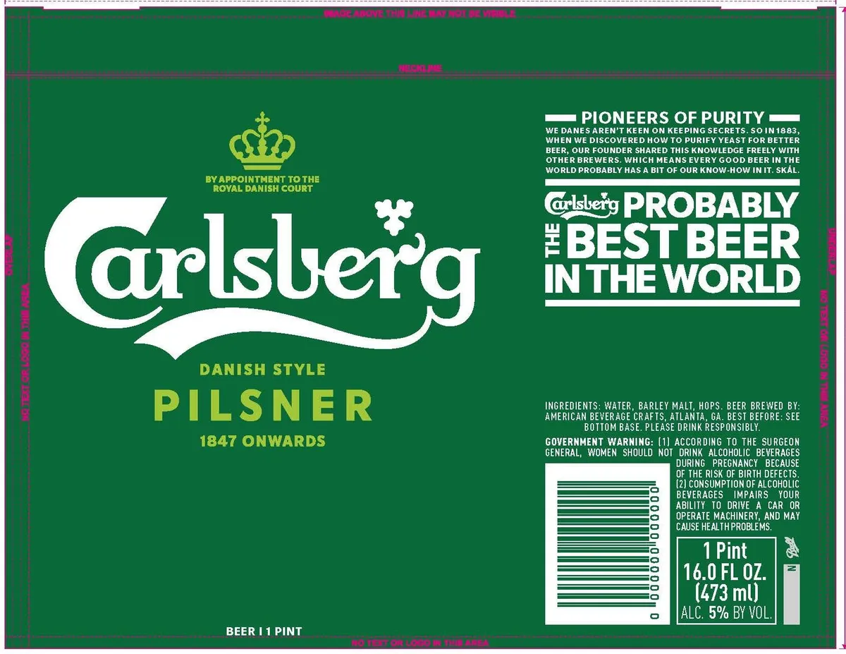 Carlsberg Danish Style PilsnerCARLSBERGThe Carlsberg script logo dominates the centre-left in large white serif lettering with an integral decorative swash, anchored above by a gold crown and the phrase "By Appointment to the Royal Danish Court". The background is a solid forest green field. To the right, white sans-serif block capitals announce "Probably the Best Beer in the World" over a narrative paragraph in smaller type about yeast purification and the founder's legacy. Below the logo, "Danish Style Pilsner" and "1847 Onwards" appear in gold capitals. The lower right corner contains ingredients, government warnings, and size information in white and green type on white rectangular panels.forest green · white · gold
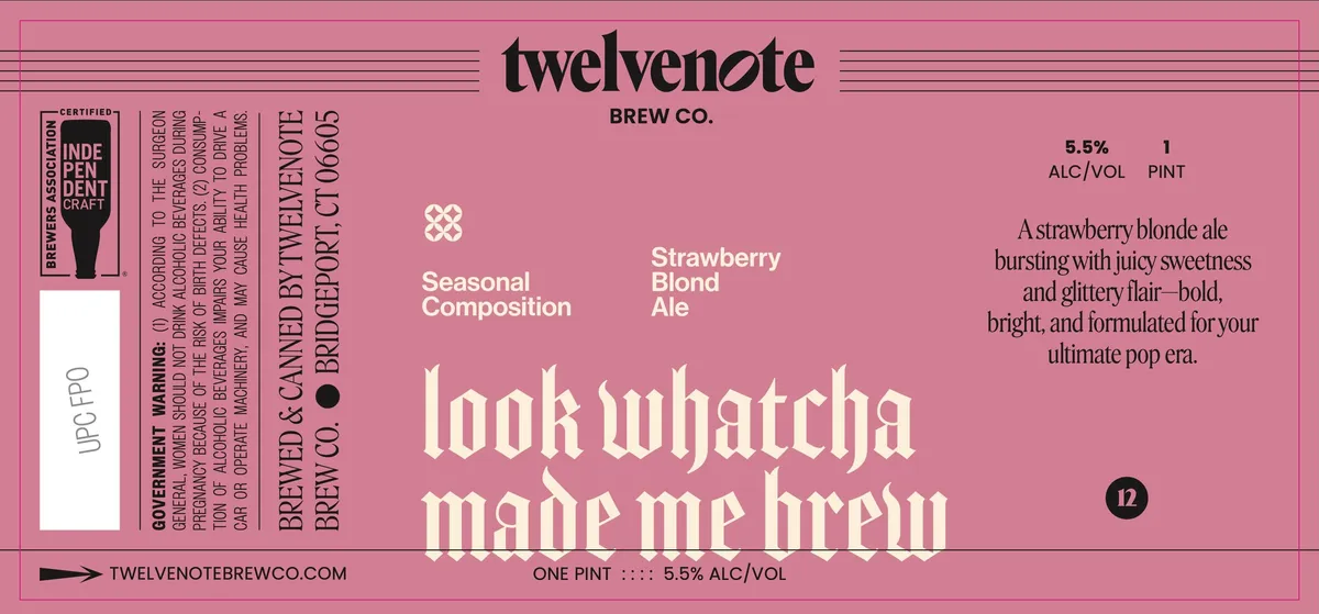 Look Whatcha Made Me BrewA strawberry-blonde ale label on a solid mauve ground features a small white geometric cross motif centered near the top, above the beer name "Strawberry Blond Ale" set in white sans-serif capitals. The dominant element is large cream-coloured Old English lettering reading "look whatcha made me brew" occupying the lower half of the label. Regulatory and brewery information run vertically along the left edge and horizontally across top and bottom in black type on the pink ground; the right side carries marketing copy in black serif type. The label is entirely typographic with no illustration, rendered in a flat two-colour scheme.mauve · cream · black
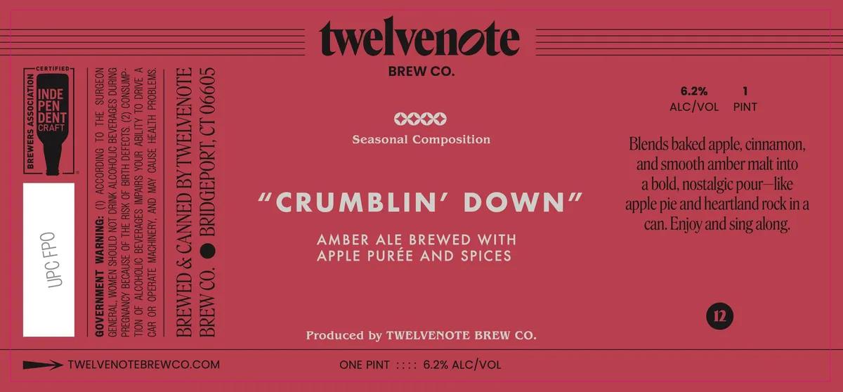 Crumblin' DownA type-led label on a deep rose-red field with the beer name "CRUMBLIN' DOWN" set in large sans-serif caps across the center, flanked by descriptive text in smaller serif type. A four-diamond motif in cream sits above the name. The left edge features a cream-coloured vertical panel with a Brewers Association Independent Craft logo and an UPCFO code block. The right side carries tasting notes and ABV in black serif type. The entire composition is framed by thin horizontal lines at top and bottom, and the left margin bears vertical text listing brewery information.rose-red · cream · black
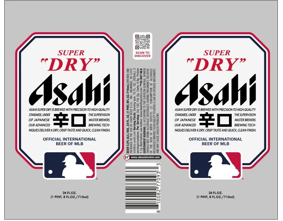 Asahi Super DryThe front and back panels feature an octagonal frame with rounded corners, bordered in magenta and black, enclosing a white field. The Asahi brand name dominates in large black italics below red "SUPER" and quotation marks, with two Japanese characters (幸口) set directly beneath. Regulatory and marketing text fills the lower half in black sans-serif type. A small MLB (Major League Baseball) logo in navy and magenta sits at the bottom center of each panel.white · magenta · black · navy
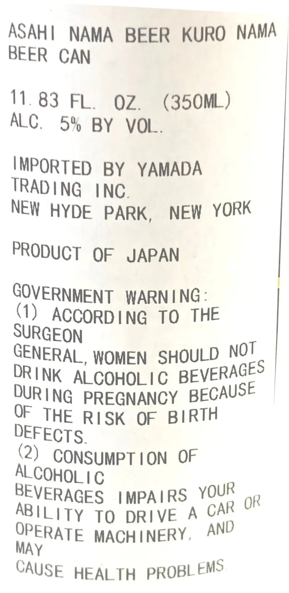 Asahi Nama Beer Kuro NamaA type-only label for an imported Japanese beer can, with product name, volume, alcohol content, importer information, origin statement, and government warnings set in a uniform sans-serif typeface on a cream ground.cream · grey
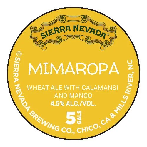 MimaropaSIERRA NEVADAA circular label rendered primarily in a solid golden-yellow field. The top features a decorative cartouche in darker gold with scrollwork borders, containing the brewery name in serif capitals. Below sits the beer name "MIMAROPA" in large sans-serif capitals, followed by style and ingredient information in white sans-serif type. The brewery location and 5 Lizards logo appear at the bottom. A dark circular border frames the entire composition. The second image shows a white circular keg collar with red and black regulatory text and no illustration.gold · white · black
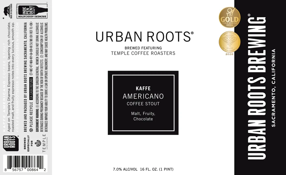 Kaffe AmericanoURBAN ROOTS BREWINGA split-field label dominated by a black vertical panel on the right bearing the brewery name in tall, sans-serif capitals. The left side is cream-coloured, centring a black-framed rectangular box with white sans-serif type announcing the beer name, style, and flavour profile. Two gold medals appear in the upper right corner. The composition relies on stark typographic contrast — clean sans-serif throughout — with minimal illustration.cream · black · white · gold
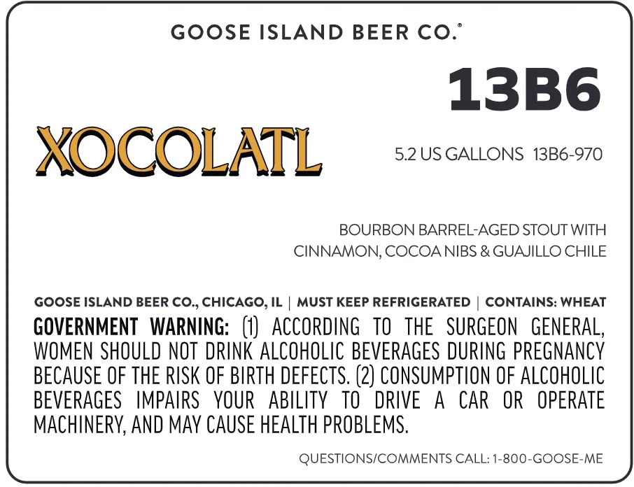 XocolatlGOOSE ISLAND BEER CO.The word cream · black · gold
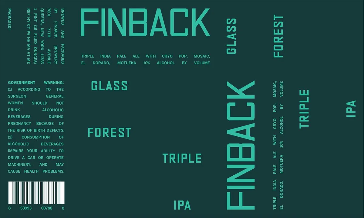 Glass ForestFINBACKA type-only label in turquoise and dark teal, with the brewery name 'FINBACK' dominating the right half in tall sans-serif capitals, and the beer name 'GLASS FOREST' and style designation 'TRIPLE IPA' set in the same typeface across the center and lower portion. The left third contains regulatory text and a barcode. No illustration is present; the design relies entirely on typography and a two-colour field.teal · dark teal
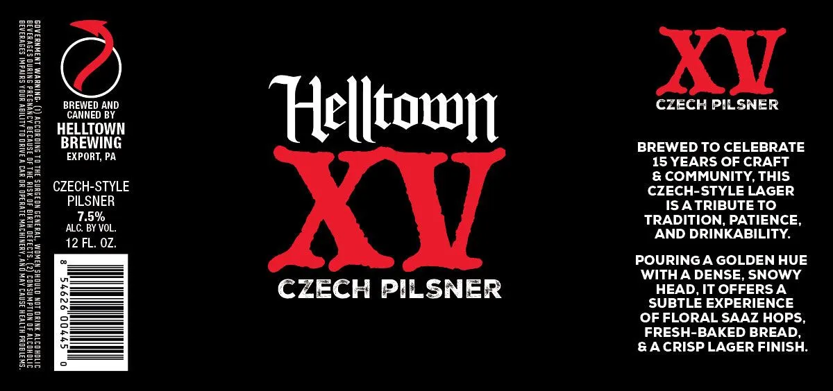 Helltown XVHELLTOWN BREWINGThe front carries the beer name set in large distressed gothic capitals—'Helltown XV'—in red against a solid black ground, with 'CZECH PILSNER' in white sans-serif below. The Helltown Brewing logo, a stylised red ribbon or flag wrapping a circle with white outline, appears in the upper left. A second identical logo in red sits in the upper right, paired with the text 'XV CZECH PILSNER'. The right panel repeats the XV mark and contains marketing copy in white sans-serif type. The label is fundamentally typographic, relying on scale contrast and colour inversion—red and white type on black—rather than representational imagery.black · red · white
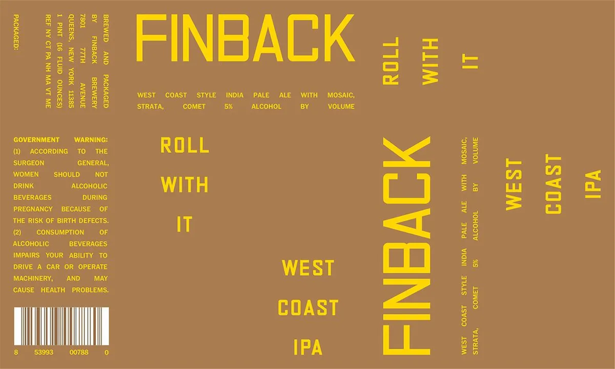 Roll With ItFINBACKThe label is entirely typographic, dominated by large blocky sans-serif capitals spelling "FINBACK" vertically down the right side in yellow, with "ROLL WITH IT" and "WEST COAST IPA" arranged in a staggered, angular composition across the centre and lower portion. A tan-brown ground carries all text in yellow and olive tones, with regulatory information and brewing details set in smaller capitals around the edges and left margin. No illustration; the design is built entirely from letterform placement and scale variation.tan · yellow · olive
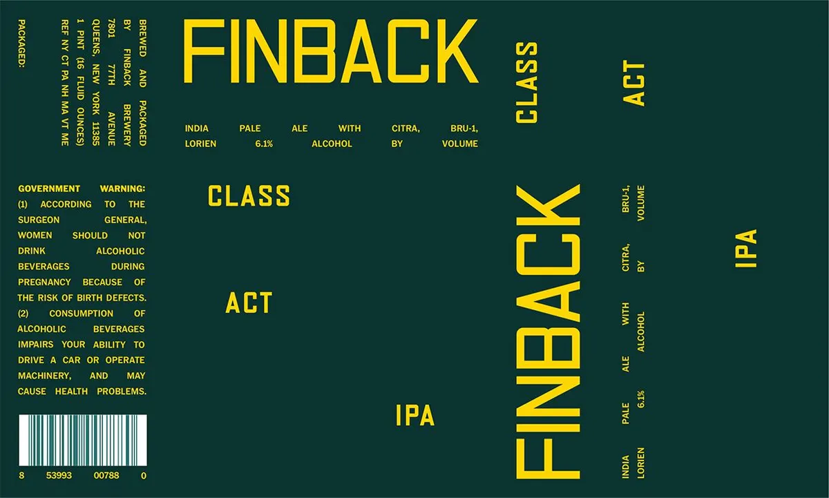 Class ActFINBACKThe label is dominated by the beer name teal · yellow
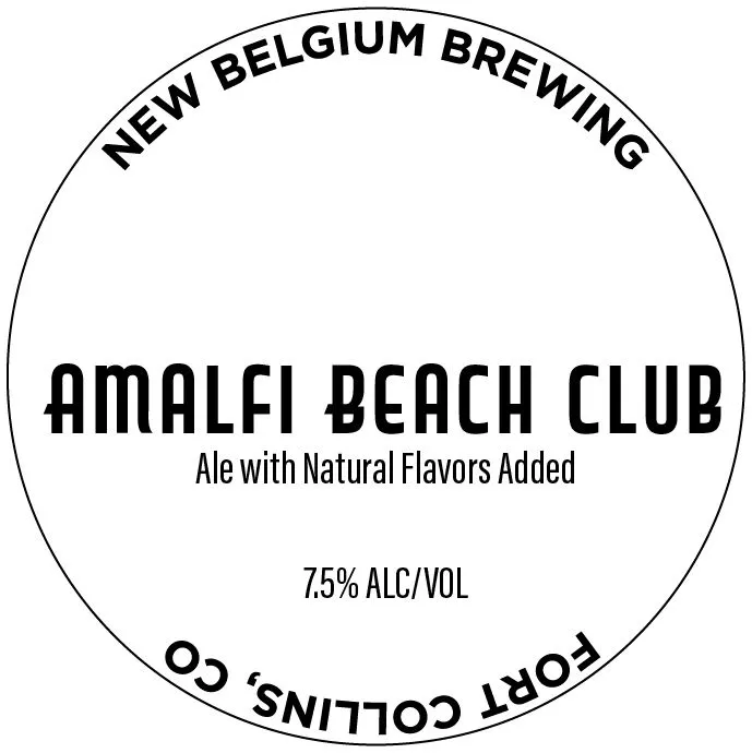 Amalfi Beach ClubNEW BELGIUMA type-only label set within a circular frame. The beer name appears in a bold, geometric sans-serif typeface across the upper half, with the brewery name curved along the top edge and descriptive text and ABV information arranged below in a smaller sans-serif. The entire design is rendered in black type on a white ground, with text also running upside-down along the lower curve of the circle.white · black
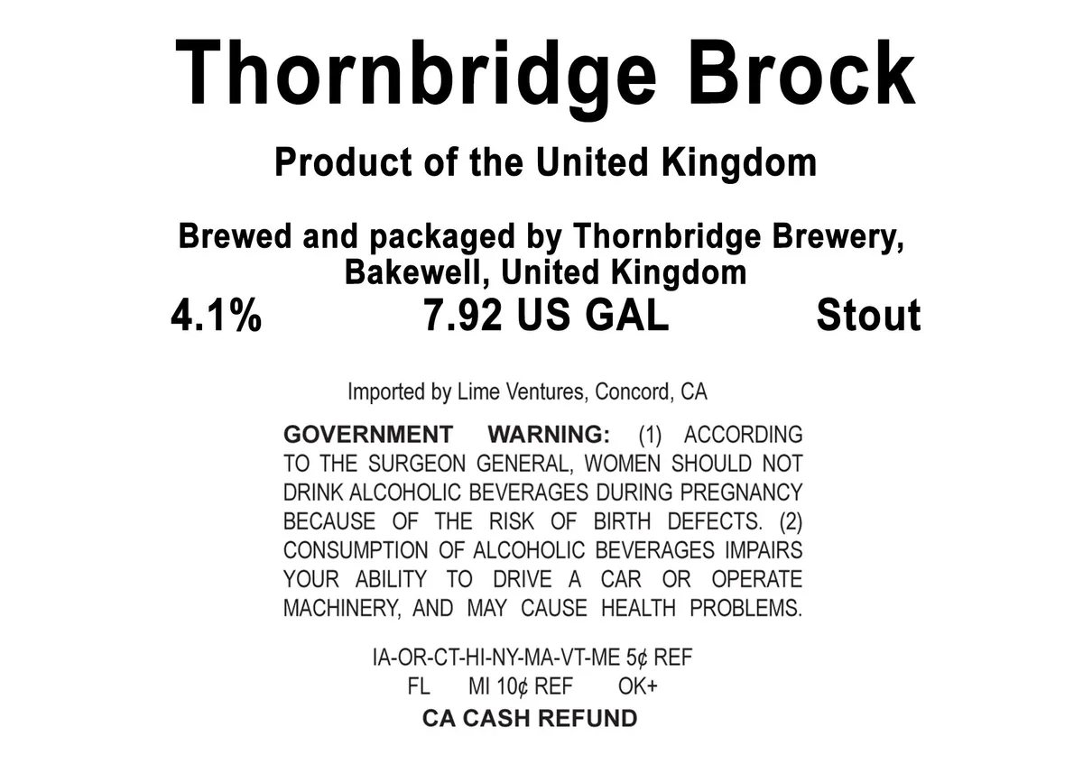 Thornbridge BrockTHORNBRIDGEThe label is entirely typographic, presenting information in bold sans-serif type centered on a plain white ground. The beer name anchors the top in large capitals, followed by origin, brewer details, ABV, volume, and style in progressively smaller sizes. Regulatory text and government warning occupy the lower half in standard body type.white · black
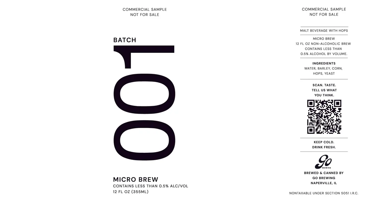 Batch 001GO BREWINGThe label presents the word black · white
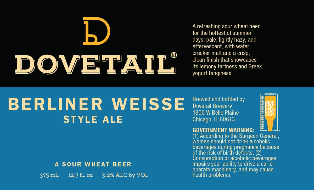 Berliner WeisseDOVETAIL BREWERYThe label is dominated by the Dovetail nameplate—a large serif 'D' monogram and the word 'DOVETAIL' in outlined serif caps—set against a black upper panel, with cream and gold lettering. Below, a teal horizontal band carries the beer style 'BERLINER WEISSE / STYLE ALE' and volume information in cream capitals, while the right side holds brewery address and regulatory text. The composition divides cleanly into a typographic emblem above and an informational band below, with no figurative illustration.black · teal · cream · gold
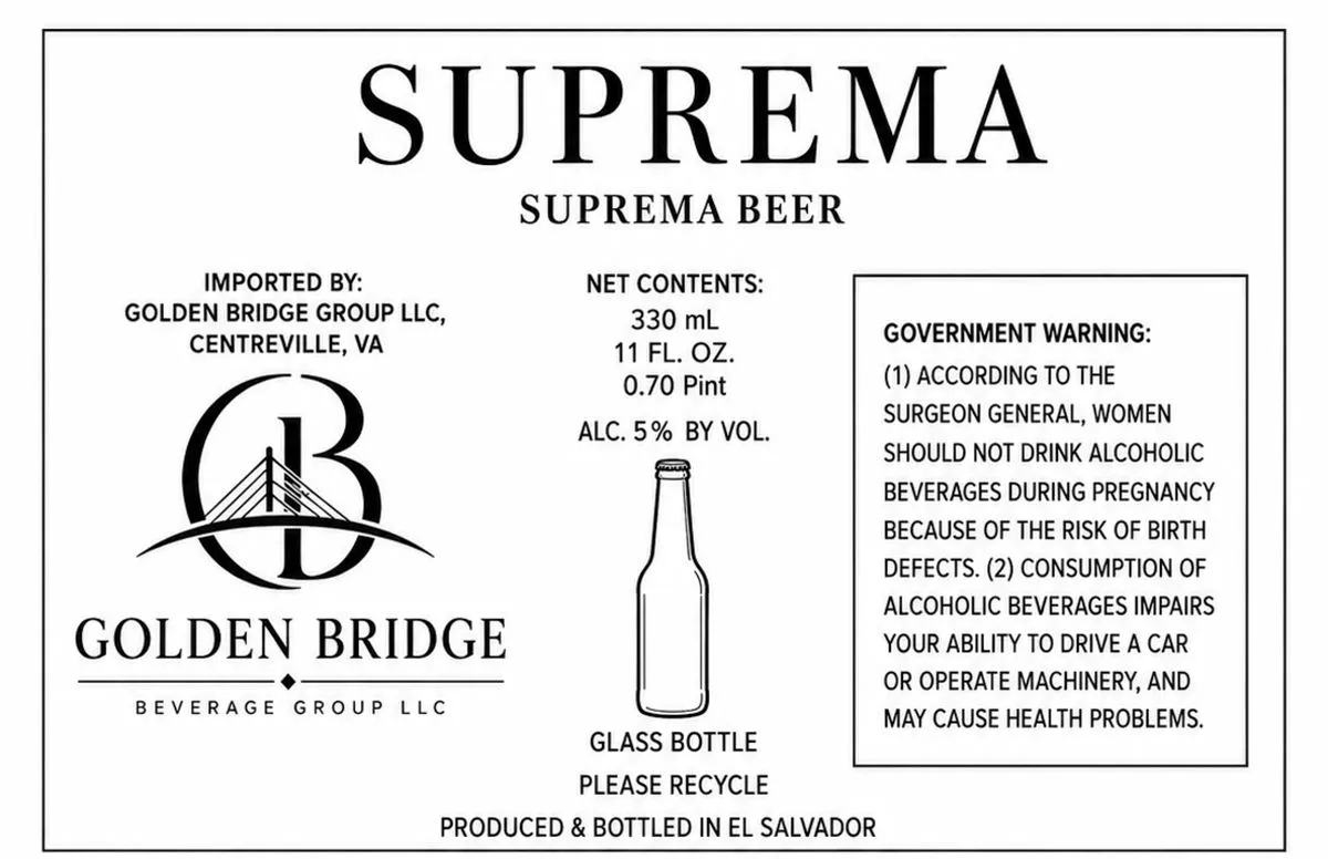 Suprema BeerGOLDEN BRIDGEA type-only label in black on cream field, dominated by the brand name SUPREMA in large serif capitals across the top, with a secondary line reading SUPREMA BEER below. The Golden Bridge Beverage Group logo—a stylised capital B with a suspension bridge integrated into its form—appears in the left third. The remaining space is devoted to regulatory information: net contents, alcohol by volume, importer details, government warning, and production notes, set in various serif and sans-serif typefaces. A single line-drawn bottle illustration sits centre-right above recycling instructions.cream · black
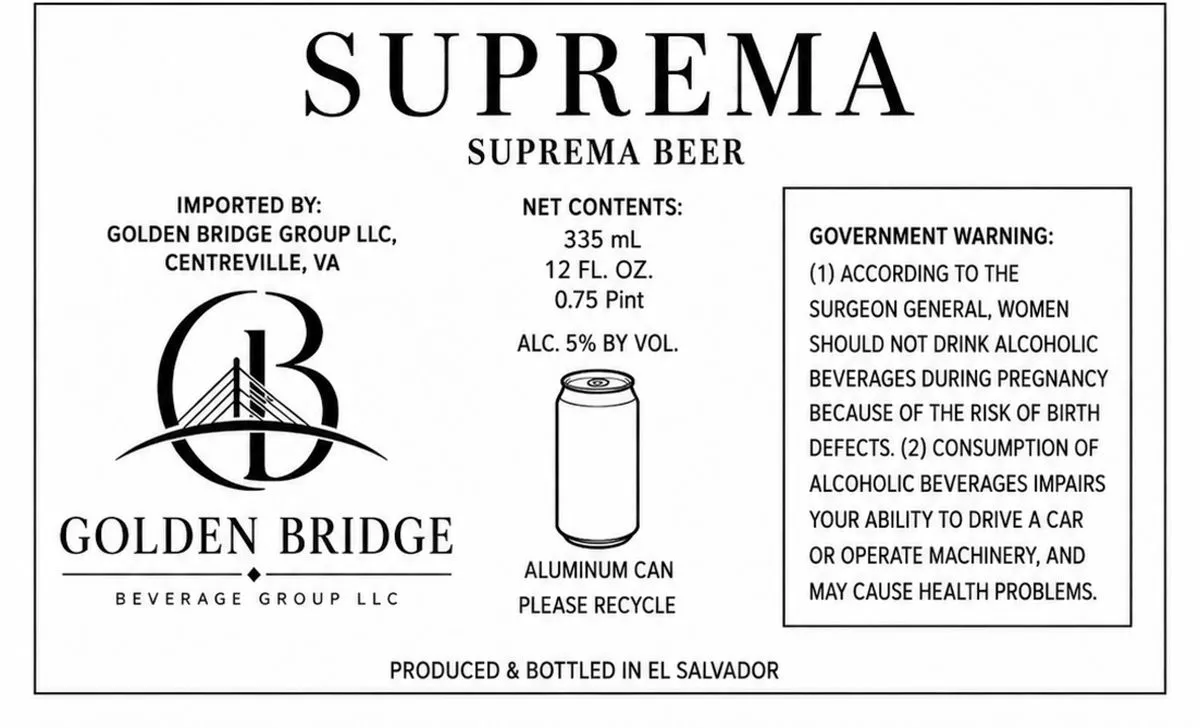 Suprema BeerGOLDEN BRIDGEA type-only label in black on cream featuring the brand name and importer details in serif capitals, with a stylized monogram of interlocking letters B and G topped by a suspension bridge motif at centre-left. The composition is divided into functional zones: brewery name and logo occupy the left third, product specifications the centre, and regulatory warning the right. No illustration or ornamental art beyond the geometric bridge emblem.cream · black
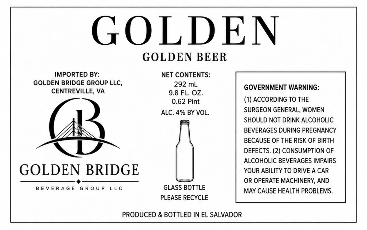 Golden BeerGOLDEN BRIDGEThe label is predominantly type on a cream field, with a stylised bridge monogram—a capital B enclosing a suspension bridge rendered in fine line—positioned left of centre. The word GOLDEN appears in large serif capitals across the top, followed by GOLDEN BEER in smaller caps, and GOLDEN BRIDGE in serif type below the monogram. A horizontal line with a small diamond accent sits beneath the brewery name. Regulatory and product information occupy the remaining space in sans-serif type, with a line-drawn bottle illustration and government warning panel on the right.cream · black
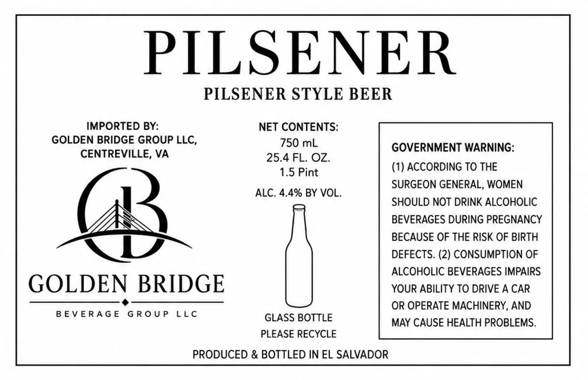 PilsenerGOLDEN BRIDGEA type-only label with the beer name in large serif capitals across the top, followed by the style designation and importer information. The Golden Bridge Beverage Group logo—a stylized suspension bridge within a circular monogram—occupies the left side in black line work. The centre and right side contain regulatory text, net contents, an outlined bottle illustration, and the mandatory government warning in a bordered box. The entire design is set on a cream ground with black type and line art.cream · black
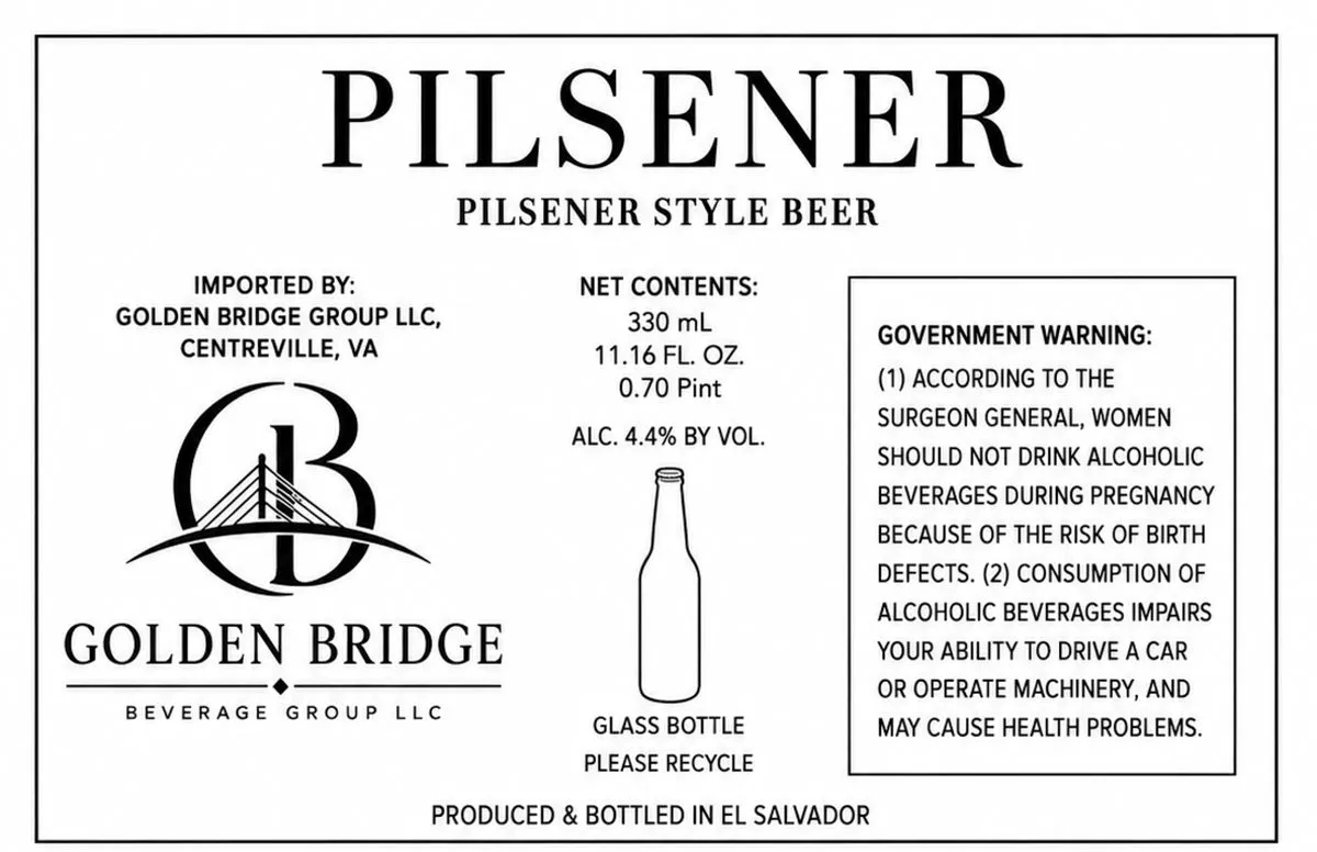 PilsenerGOLDEN BRIDGEThe label is primarily typographic, dominated by the word "PILSENER" in large serif capitals across the upper portion. Below it sits the Golden Bridge logo—a stylized suspension bridge rendered in black line work, integrated into a circular emblem with the letter "B". The composition is split into three columns of information: the brewery details and logo on the left, net contents and a line-drawn beer bottle in the centre, and the government warning panel on the right. All type is black on a white field.white · black
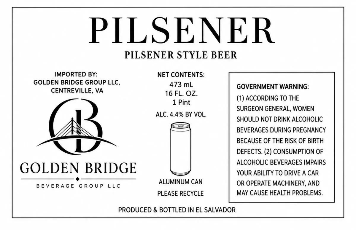 PilsenerGOLDEN BRIDGEThe label is type-only, with the beer name "PILSENER" in large serif caps at the top, followed by the style descriptor in smaller caps. The Golden Bridge Beverage Group logo—a stylized monogram combining "G" and "B" with a suspension bridge motif rendered in line art—sits left of center. Regulatory and product information fills the remaining space in sans-serif type on a cream ground with black ink throughout.cream · black
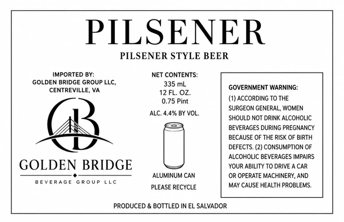 Golden Bridge PilsenerGOLDEN BRIDGEThe label is a type-only design on white, featuring the beer name in large serif capitals at the top, with a stylized bridge emblem — a suspension bridge rendered in black line art within a circular frame — positioned left of centre below the heading. The Golden Bridge Beverage Group company mark and importer information occupy the left third, while product specifications, a technical can diagram, and the government warning panel fill the remaining space in a functional layout.black · white
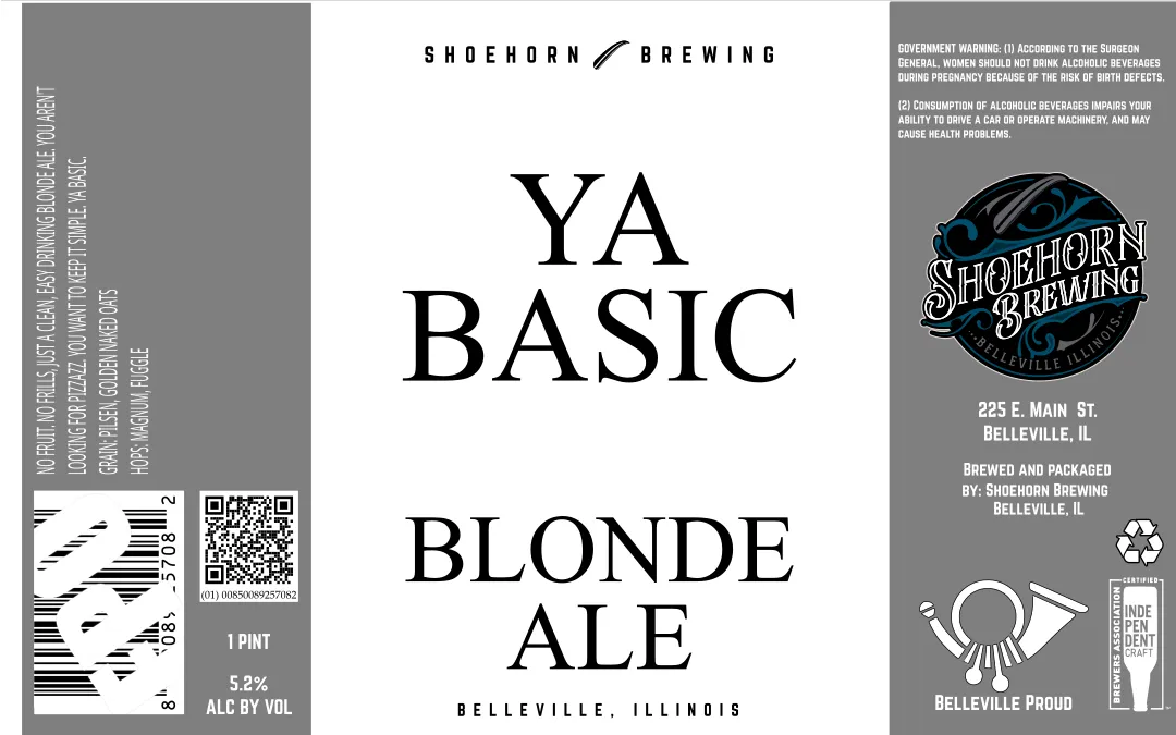 Ya Basic Blonde AleSHOEHORN BREWINGThe label is dominated by large, centered serif typography spelling "YA BASIC" and "BLONDE ALE" in black on a cream ground, with "BELLEVILLE, ILLINOIS" set below in smaller caps. The Shoehorn Brewing circular emblem—featuring a stylized shoehorn in blue and black with ornamental lettering—occupies the upper right, paired with the brewery address and "Belleville Proud" icon below. The left third contains a gray panel with white sans-serif regulatory and company information, barcode, and batch coding.cream · black · gray · blue
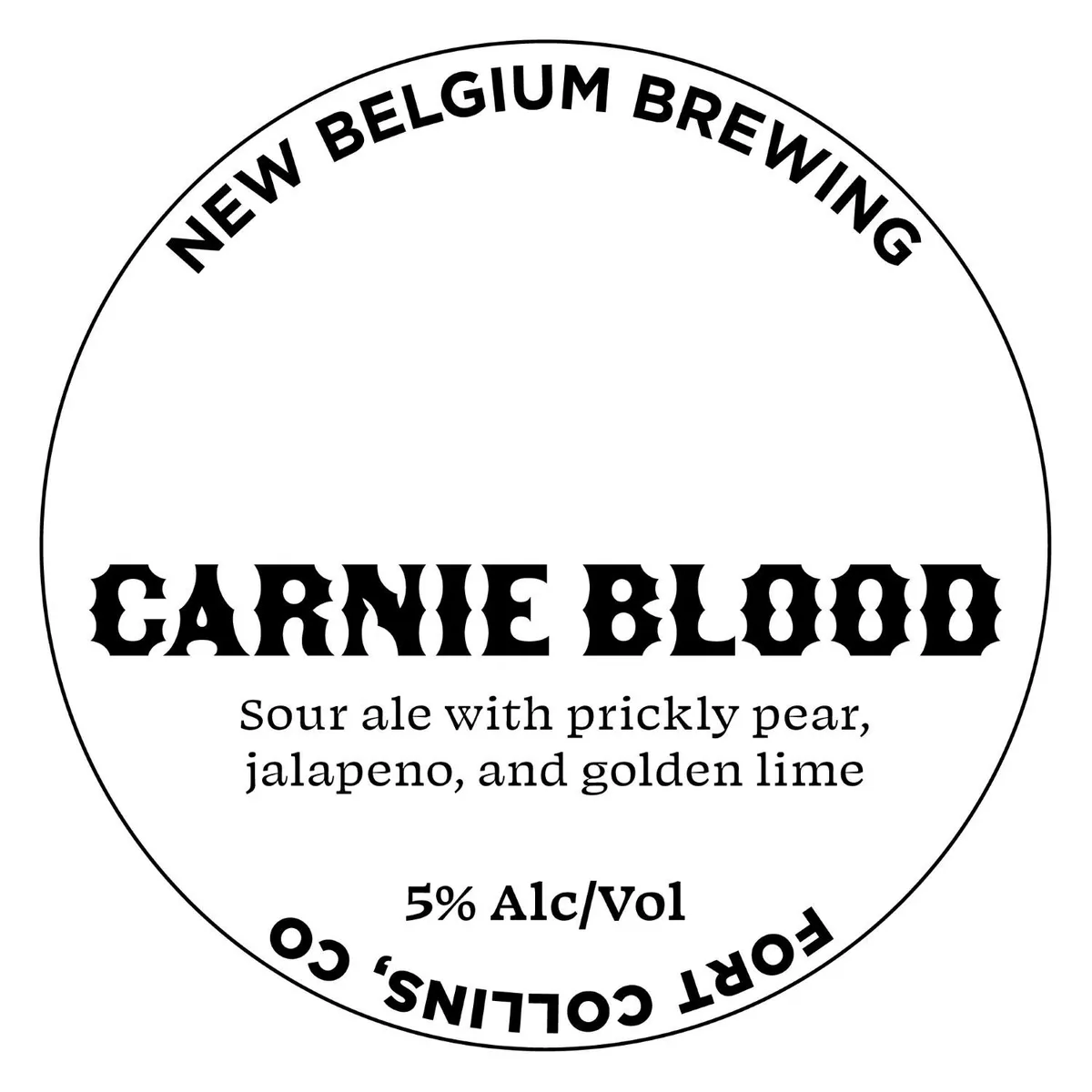 Carnie BloodNEW BELGIUMA circular label with cream background and black printing. The brewery name arcs along the top in sans-serif caps, while the beer name "CARNIE BLOOD" dominates the centre in a heavy, distressed typeface with notched serifs. Below sits a single line of small serif type describing the beer's composition, with the ABV and country of origin arcing along the bottom edge. The entire design is contained within a simple circular rule.cream · black
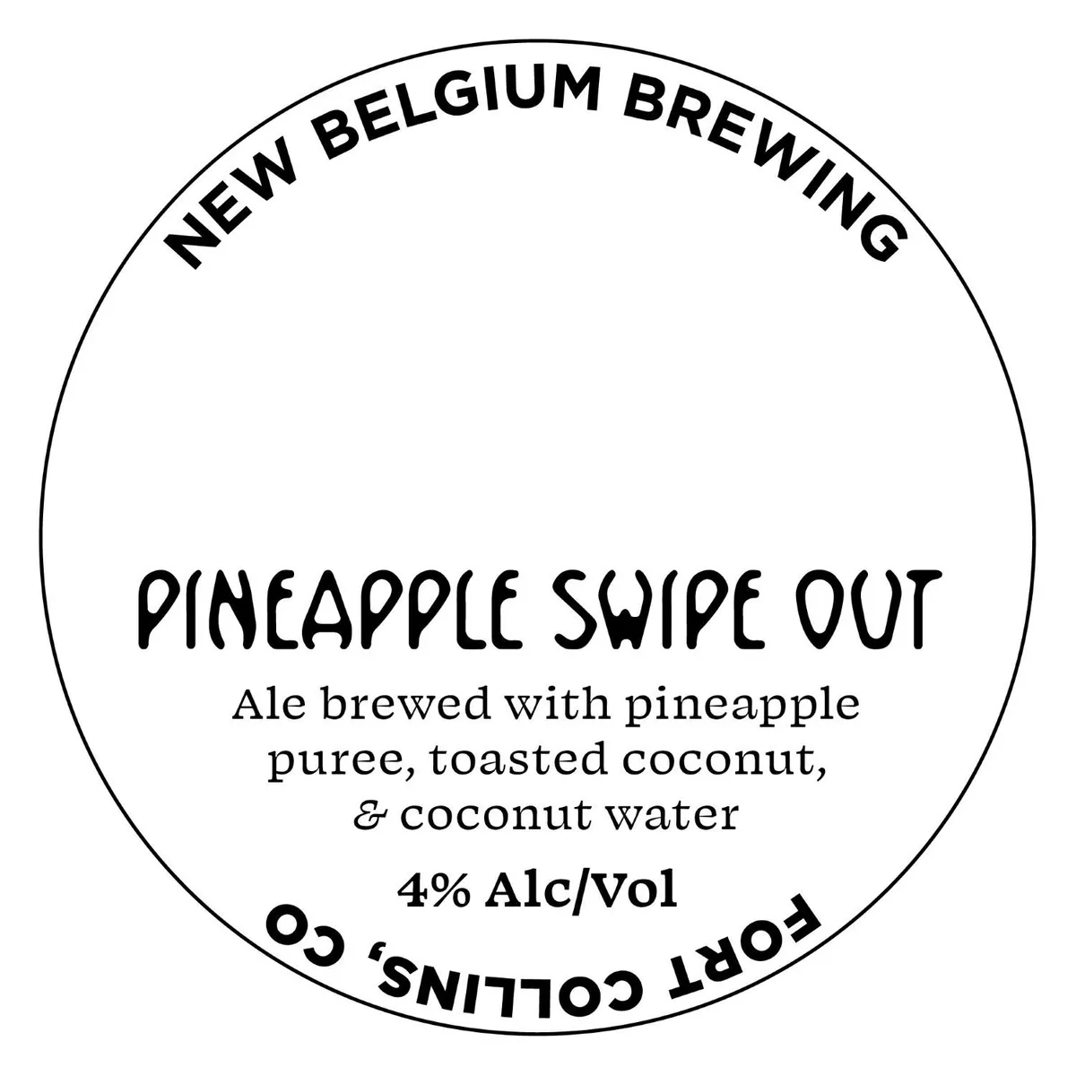 Pineapple Swipe OutNEW BELGIUMA circular label with a minimalist design; the beer name "PINEAPPLE SWIPE OUT" is hand-lettered in a casual, slightly irregular script across the center, with a subtitle in serif type below describing the ale's ingredients. The brewery name curves along the top in sans-serif capitals, and "FORT COLLINS CO" curves along the bottom. The entire composition is centered within a thin black circular border on a white ground.white · black
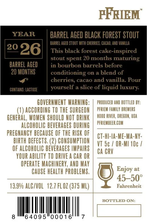 Barrel Aged Black Forest StoutPFRIEM FAMILY BREWERSThe front label is divided into two fields on a black ground: a narrow left column holds the year '2026' and 'BARREL AGED 20 MONTHS' with a small winged emblem, while the right column features the beer name and description in tan serif type. The back label is a red band printed with the beer name repeated three times in tan caps, separated by vertical rules, serving as a wraparound band or collar element. All typography is in a classical serif face.black · tan · red
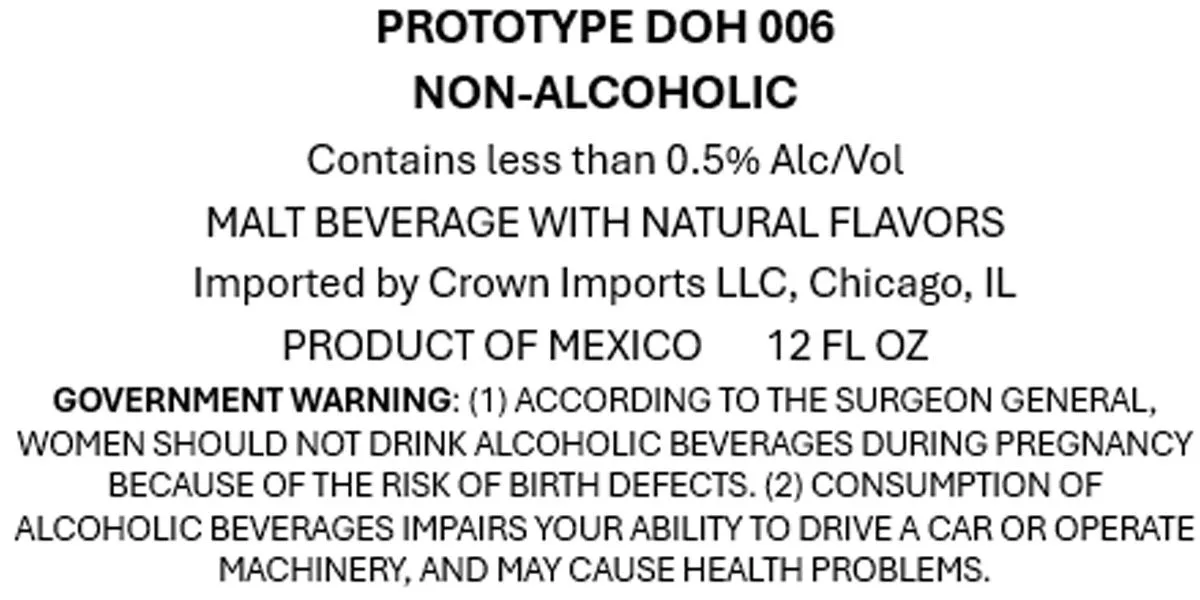 Prototype Doh 006CROWN IMPORTS LLCType-only label with black sans-serif text on white background. The label presents product information and regulatory language in a uniform typographic hierarchy, with no illustration or decorative elements.white · black
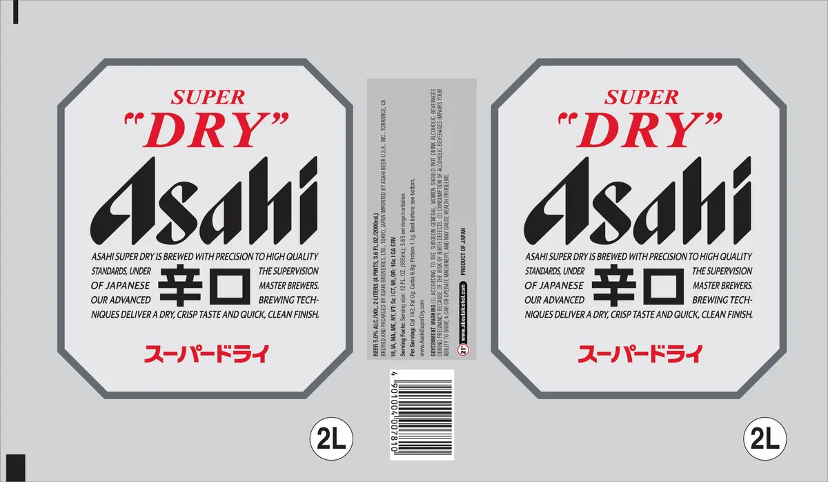 Asahi Super DryA symmetrical label with a pale grey ground features the brand name "Asahi" in large black italic lettering, flanked by "SUPER" in red italic caps above and Japanese characters in red below. A black square and rectangular emblem sits at the centre of the composition, surrounded by small-type promotional text in black. The label is framed by a dark grey octagonal border.grey · black · red · white
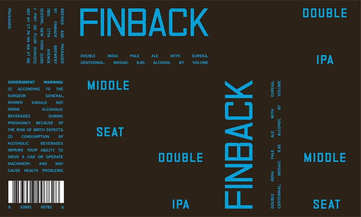 Middle SeatFINBACKThe label is dominated by the large word "FINBACK" in bright cyan sans-serif capitals across the top, with "MIDDLE SEAT" rendered vertically in the same typeface down the center. The design employs a minimal geometric composition with stacked text elements scattered across a dark brown background: "DOUBLE," "IPA," and product details in cyan capitals arranged across the field, creating a rhythmic typographic pattern. The colour palette is restricted to bright cyan type and descriptive text against the dark brown ground, with no illustration present.dark brown · cyan
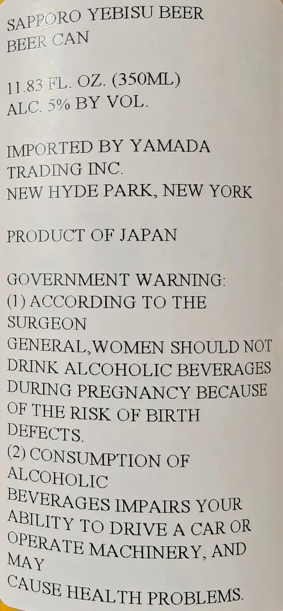 Sapporo Yebisu BeerA type-only label with the beer name and regulatory information set in a sans-serif typeface on a cream ground with a gold foil border stripe along the top edge.cream · gold · black
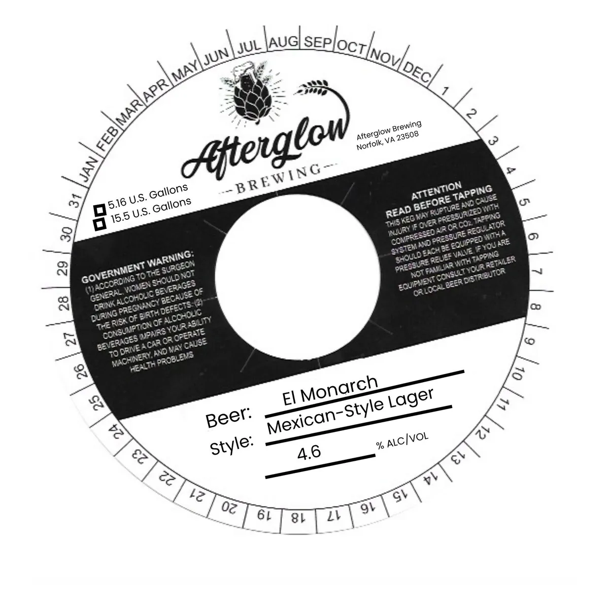 El MonarchAFTERGLOW BREWINGA circular keg collar with a date wheel around the perimeter and a large white center circle. A hop cone with radiating lines and a curved hop leaf illustration appear above the Afterglow Brewing logo and brewery address in the upper portion. A black diagonal band crosses the middle, containing government warning and tapping instruction text. Below the band, the beer name "El Monarch", style "Mexican-Style Lager", and ABV "4.6% ALC/VOL" are set in simple sans-serif type with horizontal rules above and below.white · black
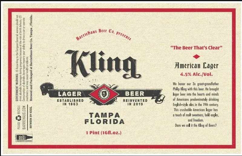 Kling Lager BeerA cream label with a bold red border frames the design. The beer name "Kling" appears in large blackletter type at center, with a decorative banner below reading "Lager Beer" flanking a red diamond emblem containing a shield and wreath. Smaller text identifies the brewery, location (Tampa, Florida), and establishes the beer's heritage from 1863, with a reinstatement date of 2019. The right side carries marketing copy in serif type against the cream ground. The composition is symmetrical and historically informed, rendered in black, red, and cream throughout.cream · red · black