A cut through the label corpus
Type only beer labels
93 labels in the register read as type only. Every one was described by us from the filed artwork — the TTB records what a label says, never what it looks like.
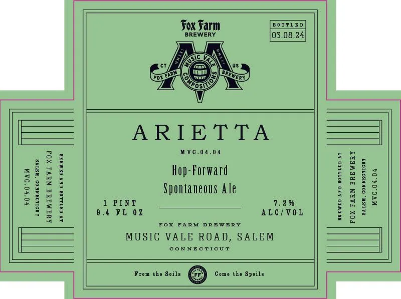 AriettaARIETTA HOP-FOWARD SPONTANEOUS ALEA symmetrical emblem centred at the top features a shield-like form in black with the letters 'M' and 'A' flanking a circular seal bearing a barrel motif and radiating banner ribbons. The label is entirely type and emblem on a pale green ground, with the beer name in spaced caps across the middle, surrounded by product details, brewery information, and a footer tagline beneath a small circular seal. All typography is in black, ranging from display faces for the beer name to smaller caps and serif text for the composition notes and address.pale green · black
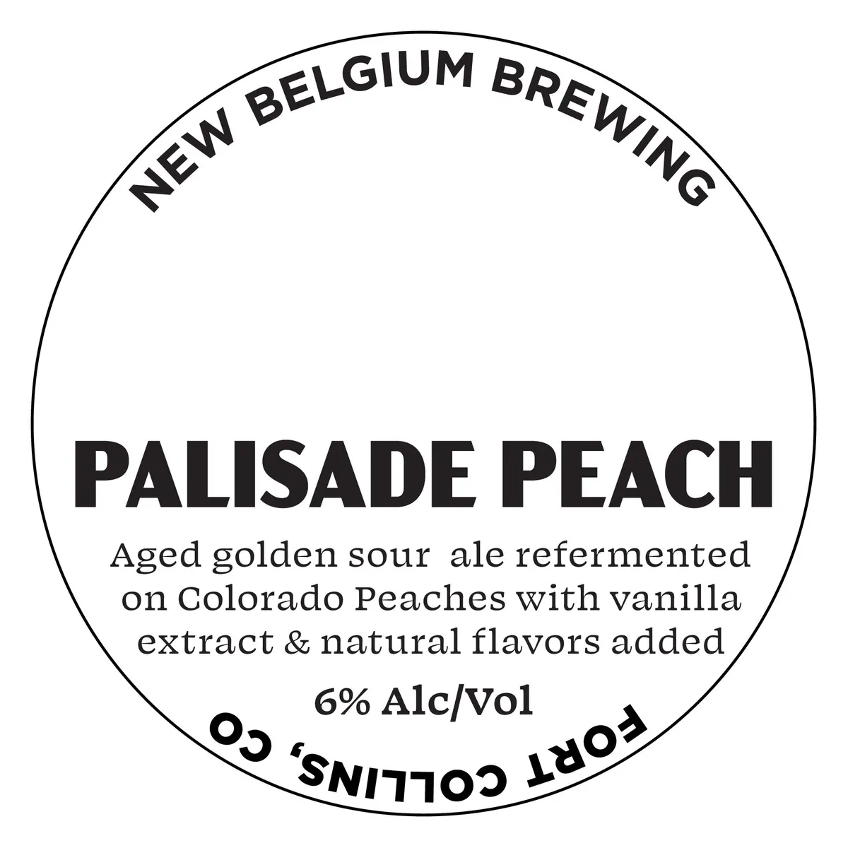 Palisade PeachNEW BELGIUMA circular label with a black-outlined border contains the beer name "PALISADE PEACH" in large, bold sans-serif capitals at the centre, with "NEW BELGIUM BREWING" set in a similar typeface along the top arc and product composition text in a serif face below the name. The background is plain white with no illustration or decorative artwork. The only text-based compositional elements are the brewery name at top, the beer name dominating the centre, and descriptive copy in the middle describing the beer's ingredients and composition.white · black
 Sapporo Draft Beer Black LabelA type-only label with the beer name and product information set in a serif typeface across a cream field. The label lists the volume, alcohol content, importer details, country of origin, and government warnings in uniform typographic treatment with no illustration or decorative elements.cream · black
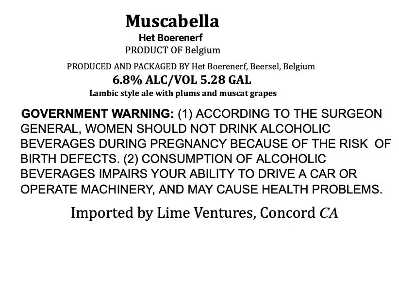 MuscabellaHET BOERENERFType-only label with the beer name "Muscabella" set in a sans-serif display face at the top, followed by brewery name, origin statement, alcohol content, and style descriptor in mixed caps and lowercase. The entire front is composed of black typography on a white or cream ground with no illustration or decorative elements beyond the text hierarchy itself.cream · black
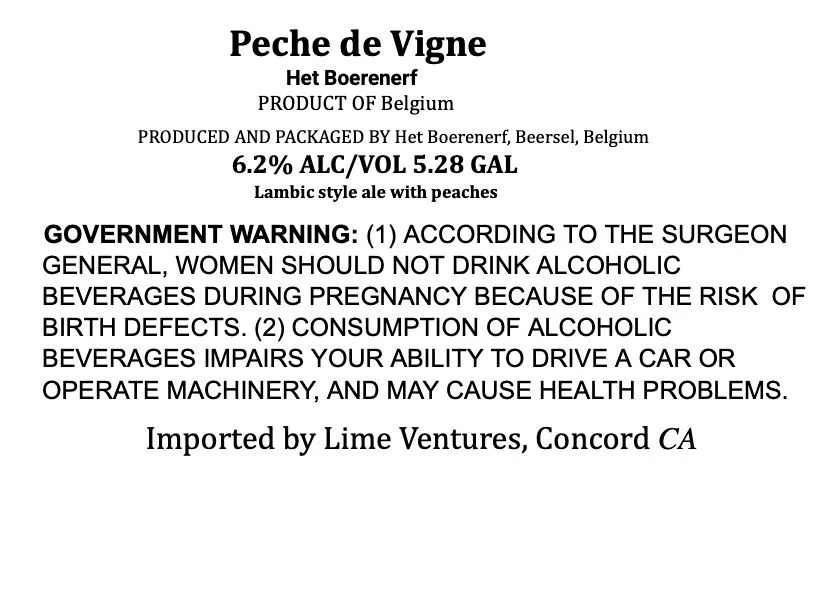 Peche de VigneHET BOERENERFA type-only label with the beer name 'Peche de Vigne' in bold serif capitals at the top, followed by the brewery name, product origin, alcohol content, and style descriptor in black text on a white ground. The regulatory warning and importer information occupy the lower portion in smaller type. No illustration or decorative element is present.white · black
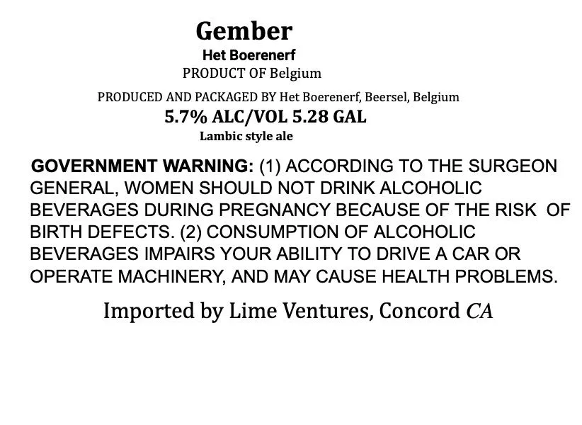 GemberHET BOERENERFType-only label with the beer name 'Gember' in large black serif capitals centered near the top, followed by brewery name, origin statement, ABV, and style designation in smaller serif type. All text is black on a white or cream ground with no illustration or decorative element beyond the typographic hierarchy.cream · black
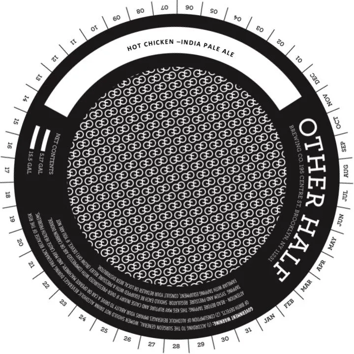 Hot ChickenOTHER HALF BREWING CO.A keg collar with a concentric circular layout: the beer name and style — 'Hot Chicken—India Pale Ale' — set in a white band across the top, while the brewery name 'OTHER HALF' runs vertically down the right side in white sans-serif capitals. The central field is filled with a repeating geometric pattern of interlocking circles in white on black. A date wheel with numbered segments occupies the outer edge, with regulatory text and brewery details set in small type around the inner black band.black · white
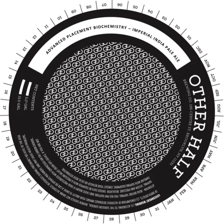 Advanced Placement BiochemistryOTHER HALF BREWING CO.A circular keg collar with black · white
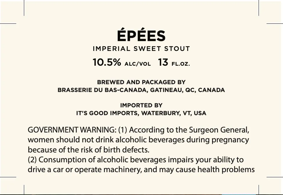 ÉpéesBRASSERIE DU BAS-CANADAA type-only label dominated by the beer name 'ÉPÉES' in large sans-serif capitals centred near the top, with secondary type below identifying the style as Imperial Sweet Stout and listing ABV and volume. The label is cream-coloured with black letterpress type arranged in a clean hierarchical structure, accompanied by mandatory brewery information and government warning.cream · black
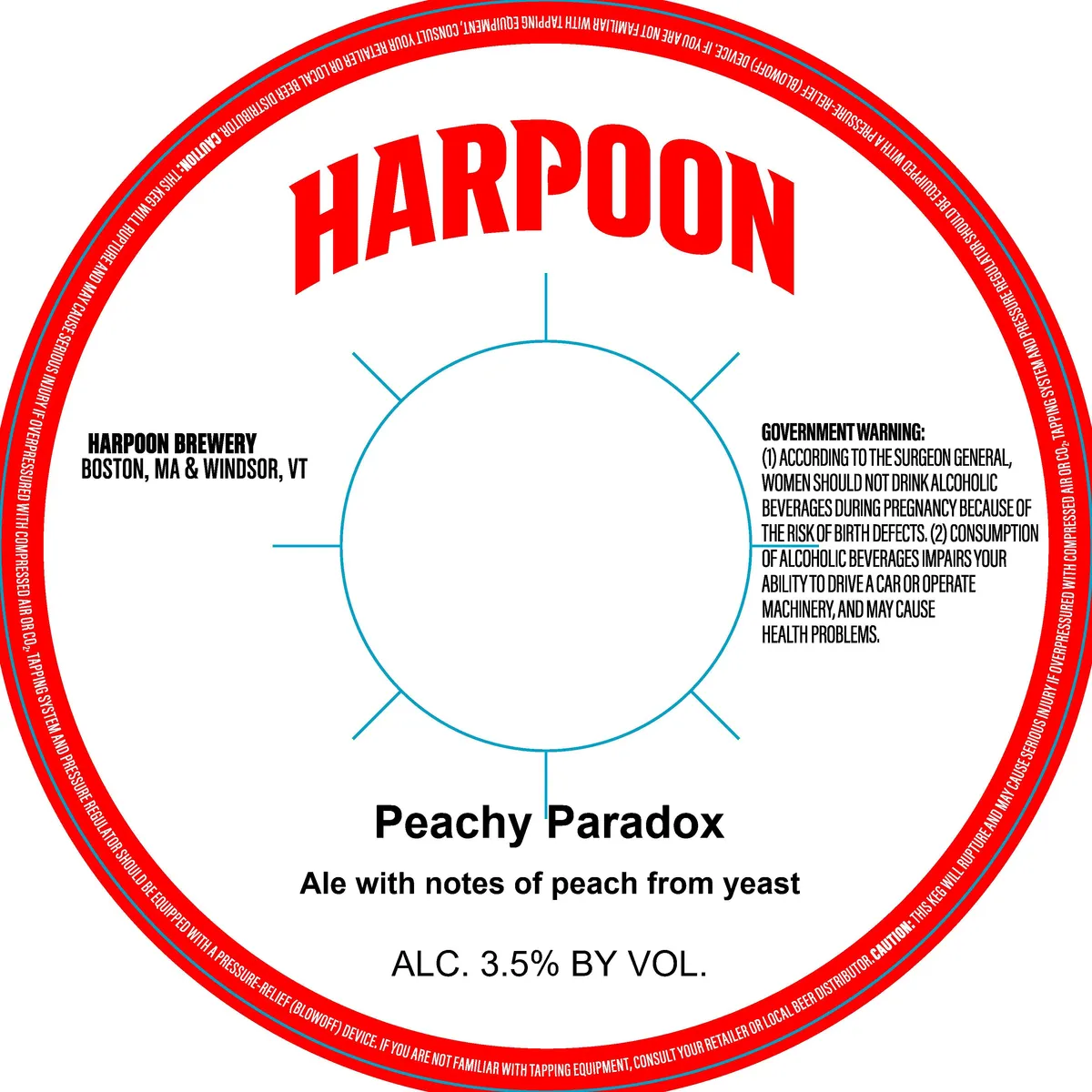 Peachy ParadoxHARPOONA bright red circular border frames a cream-coloured centre dominated by the brewery name red · cream · blue · black
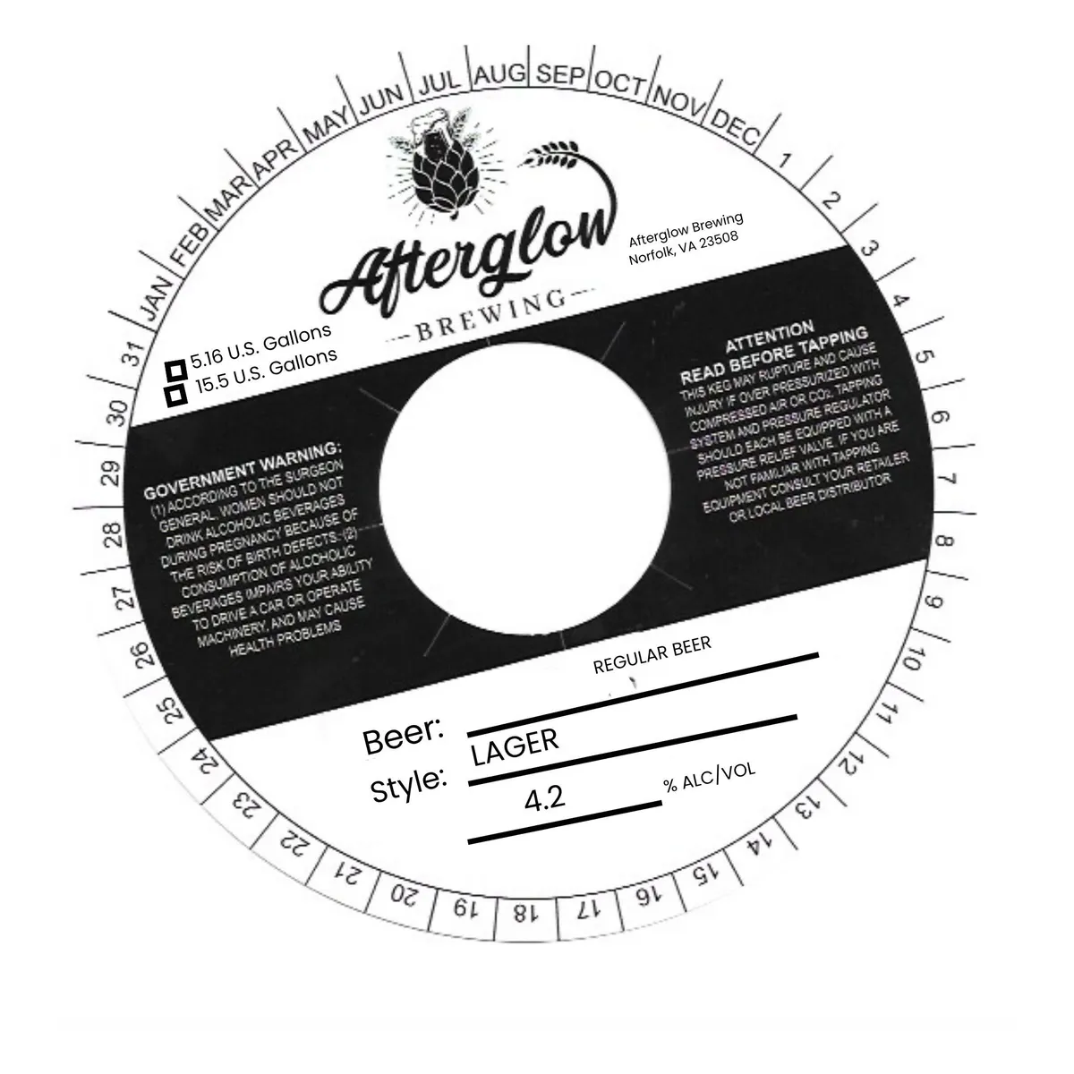 Regular BeerAFTERGLOW BREWINGA round keg collar with a circular date wheel at the perimeter showing months and numbered days. The Afterglow Brewing name and logo—featuring a hop cone with radiating lines and a curved hop leaf—occupy the upper centre in script lettering. A large black diagonal band crosses the lower half, containing regulatory text on the left and right, with a blank white circle at the centre. Below the band, beer style ('LAGER'), type ('REGULAR BEER'), and ABV ('4.2%') are printed in simple sans-serif type with underscores for fill-in lines. The palette is black, cream, and white throughout.black · cream · white
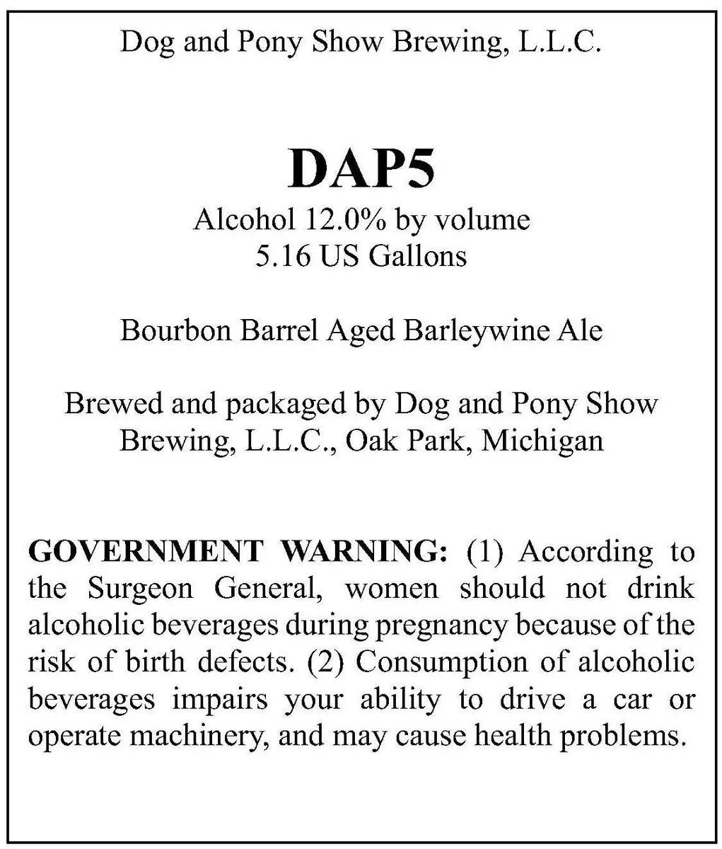 DAP5DOG AND PONY SHOW BREWING, L.L.C.A type-only label with black serif type on cream ground. The brewery name appears at top, followed by the beer name 'DAP5' in large bold caps, with alcohol content and volume below. The style designation 'Bourbon Barrel Aged Barleywine Ale' sits in the centre, with brewing and location information and the government warning filling the lower half. No illustration or decorative element is present.cream · black
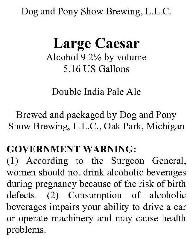 Large CaesarDOG AND PONY SHOW BREWING, L.L.C.A type-only label in serif typeface displaying the beer name black · white
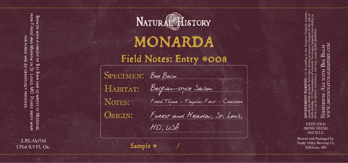 MonardaNATURAL HISTORYA burgundy label with a centred emblem reading "Natural History" at the top, featuring a circular seal with a bee illustration. Below in large gold capitals sits the beer name "Monarda" followed by "Field Notes: Entry #008" in smaller type. A framed box in the centre contains four handwritten-style entries labelled Specimen, Habitat, Notes, and Origin, rendered in an italic script hand. The entire composition mimics a naturalist's field journal entry, with decorative borders and regulatory text in smaller type flanking the sides.burgundy · gold · cream
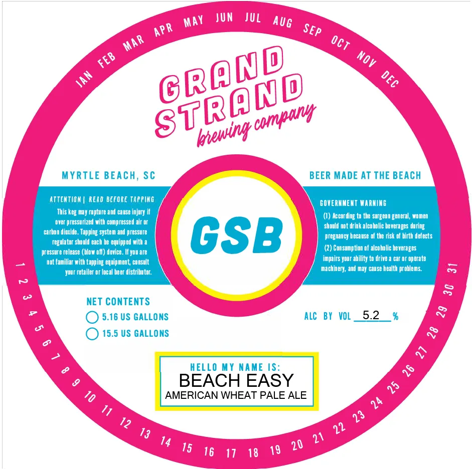 Beach EasyGRAND STRAND BREWINGA keg collar with concentric circular bands in magenta, cyan, and yellow. The dominant magenta outer ring carries a month-date wheel around its perimeter; the middle band holds the brewery name and location in outline lettering at top, regulatory panels in cyan on left and right, and net contents and ABV information in cyan below. A large central circle frames the beer's acronym "GSB" in cyan, with the beer name "Beach Easy" and style identification in a yellow-bordered box at the bottom.magenta · cyan · yellow · white
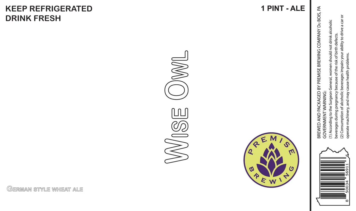 Wise OwlPREMISE BREWING COMPANYThe label features the beer name "WISE OWL" rendered in a tall, outlined sans-serif typeface running vertically down the centre of a cream field. A circular brewery emblem appears in the lower right, yellow with a purple stylized hop cone and the text "PREMISE BREWING" around its circumference. The lower left corner carries the substyle line "GERMAN STYLE WHEAT ALE" in a condensed sans-serif. The design is minimal and type-driven across the full front label.cream · purple · yellow
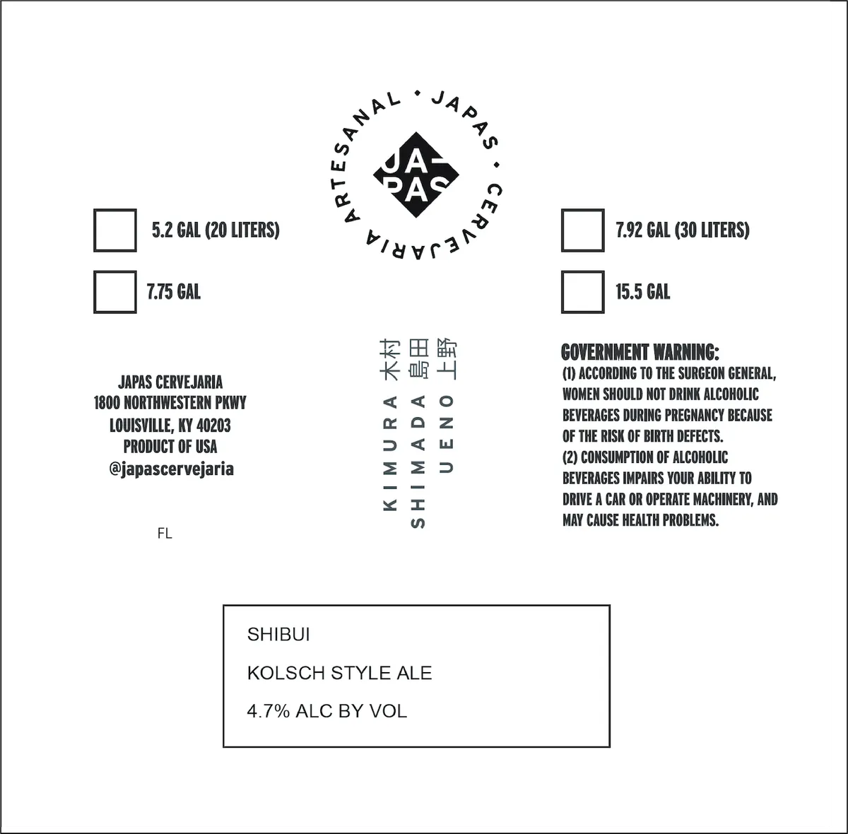 ShibuiJAPASA diamond-shaped emblem centred near the top holds the letters 'JA' and 'RAS' in bold sans-serif capitals, surrounded by a circular band of text reading 'ARTESANAL · JARAS · CERVECERÍA'. Japanese characters appear vertically below the emblem. The label is entirely type-based, rendered in black on white, with keg-size checkboxes, brewery address, government warning, and product specifications arranged in a clean, minimal layout across the field.white · black
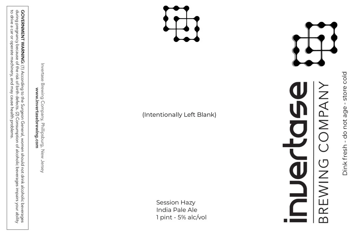 (Intentionally Left Blank)The label is primarily type-based, with the brewery name and beer style set in a heavy sans-serif typeface running vertically down the right side, accompanied by two small geometric motifs composed of connected dots and lines positioned near the top. The centre of the label features minimal text — the beer name, style, and ABV — set flush left in a smaller sans-serif weight. A government warning and brewery information occupy the left edge in small type. The overall field is white with black type and graphics.white · black
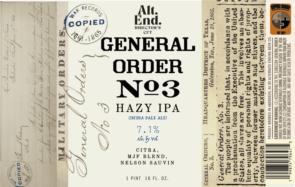 General Order No. 3The front label is dominated by the beer name set in large black slab-serif capitals across the centre, with 'Alt. End.' and 'Director's' in smaller type above and 'Hazy IPA' below. A circular 'War Records Copied' stamp in dark blue occupies the upper left. The background is cream with faint handwritten script and two small circular stamps, evoking the look of a historical document or ledger page. The typography, colour palette, and archival aesthetic suggest a deliberate reference to early 20th-century official paperwork or military orders.cream · black · dark blue
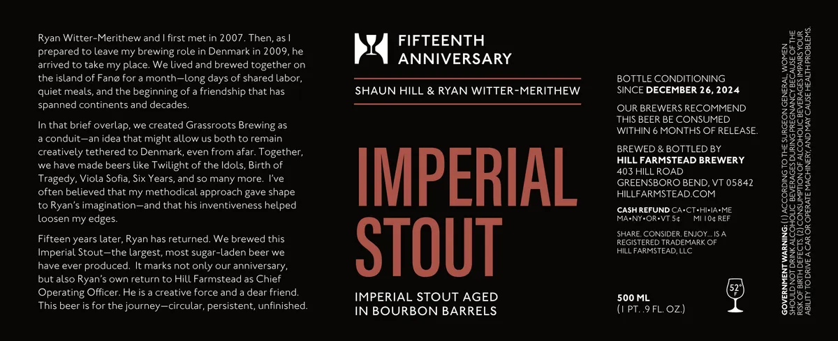 Fifteenth Anniversary Imperial StoutSHAUN HILL & RYAN WITTER-MERITHEW IMPERIAL STOUTThe label is dominated by the words "IMPERIAL STOUT" set in large, condensed sans-serif capitals in a warm terracotta-red against a black ground. Above them sits a small geometric emblem in white—two overlapping shapes suggesting a stylised anchor or compass point. The composition is spare and centred, with regulatory text and a narrative paragraph occupying the left and right margins in white type. The overall effect is austere and architectural rather than illustrative.black · terracotta · white
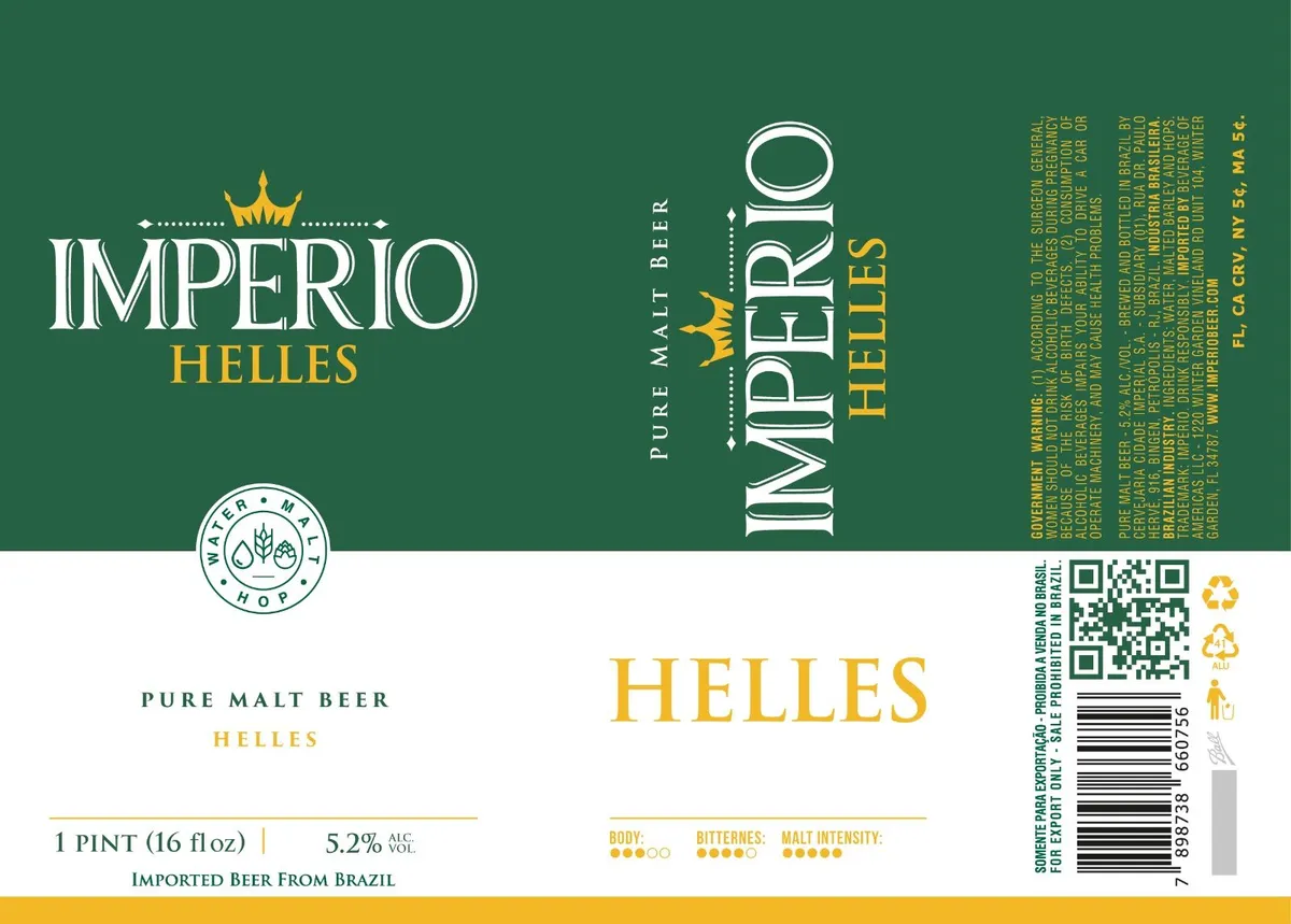 Imperio HellesIMPERIOA gold crown with dotted lines flanks the word "IMPERIO" in tall serif capitals across the upper left, with "HELLES" in smaller gold type below. The label is split horizontally: the upper half shows the front design on deep forest green, while the lower half is off-white and contains regulatory text, a small circular seal with a hop leaf and wheat emblem, and a gold horizontal stripe at the bottom. A vertical panel on the right edge displays "IMPERIO" and "HELLES" in white serif type with a gold crown icon, accompanied by small-type informational text. The palette is restrained—deep green, cream, white, and gold—with no illustration beyond the decorative crown and heraldic seal.forest-green · cream · gold · white
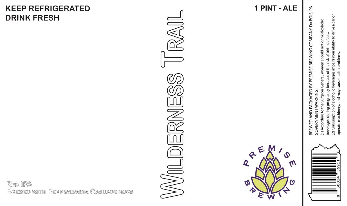 Wilderness TrailPREMISE BREWING COMPANYThe label is predominantly type-on-white, with the beer name "Wilderness Trail" set in tall, outlined block capitals running vertically up the center of the label. Below, a stylized hop flower in yellow and purple sits within a circular text ring reading "Premise Brewing" in purple serif capitals. Regulatory and product information occupy the upper left and right margins in black sans-serif type.white · black · purple · yellow
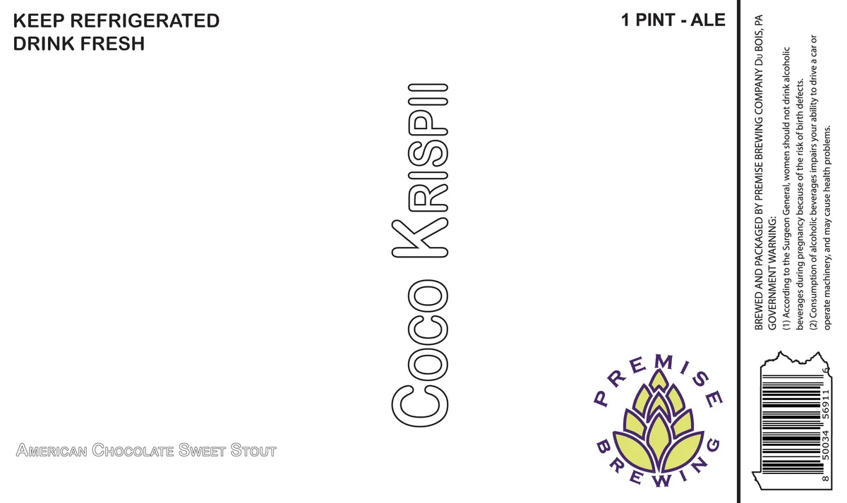 Coco KrispiiPREMISE BREWING COMPANYThe label is a type-only design with the beer name 'COCO KRISPII' set vertically in outlined sans-serif capitals at the centre of a cream field. The brewery's logo—a stylized hop cone in yellow with purple outline, enclosed in a circular wordmark reading 'PREMISE BREWING'—sits in the lower right. The style description 'AMERICAN CHOCOLATE SWEET STOUT' appears in small outlined caps at the lower left, with regulatory and storage information occupying the header and right margin.cream · purple · yellow
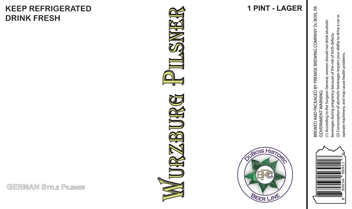 Wurzburg PilsnerPREMISE BREWING COMPANYThe label is a cream-coloured field with minimal artwork. The beer name appears in tall, outlined serif capitals running vertically down the centre. A circular emblem in the lower right contains a hop plant in green set within a ring inscribed cream · black · green
 Sundae SourPREMISE BREWING COMPANYThe label is predominantly type-on-white, with the beer name "SUNDAE SOUR" rendered in tall, outlined sans-serif capitals running vertically down the center of the front. A circular brewery emblem appears in the lower right: a hop cone in purple and yellow within a purple ring bearing the brewery name. Supplementary text—"AMERICAN SOUR ALE", "1 PINT - ALE", and storage instructions—is set in outline and solid sans-serif type at various scales across the field.white · purple · yellow
 Premise DubbelPREMISE BREWING COMPANYThe label is predominantly type-only, with the beer name "PREMISE DUBBEL" set in tall, outlined sans-serif capitals running vertically down the centre of a white field. A circular emblem in the lower right features a stylized hop flower rendered in yellow-gold against a purple ground, with "PREMISE BREWING" arcing around the circle's perimeter. The words "BELGIAN STYLE DUBBEL ALE" appear in small outlined capitals at the lower left. Regulatory text and a barcode occupy the right edge.white · purple · yellow-gold · black
 Orange Blossom WheatPREMISE BREWING COMPANYThe label is predominantly type-only, with the beer name "ORANGE BLOSSOM" set in a tall, outlined sans-serif running vertically down the centre of a white ground. Below, in smaller outlined capitals, sits "AMERICAN WHEAT ALE / BREWED WITH ORANGES AND HONEY". A circular emblem in the lower right contains a stylized hop cone in purple against a yellow-green field, with "PREMISE" and "BREWING" lettered around the circumference. Storage and serving instructions appear in the upper left; regulatory text and a barcode occupy the right edge.white · purple · yellow-green · black
 Kelly's BrownPREMISE BREWING COMPANYThe label is predominantly typographic, with the beer name "KELLY'S BROWW" set in outline capitals running vertically down the centre in a tall, narrow sans-serif. At the lower right sits a circular emblem featuring a stylized hop cone in gold set against a purple ground, with "PREMISE" and "BREWING" arced along the top and bottom edges. The remainder of the label carries regulatory text and storage instructions in small sans-serif type against a white field.white · purple · gold · black
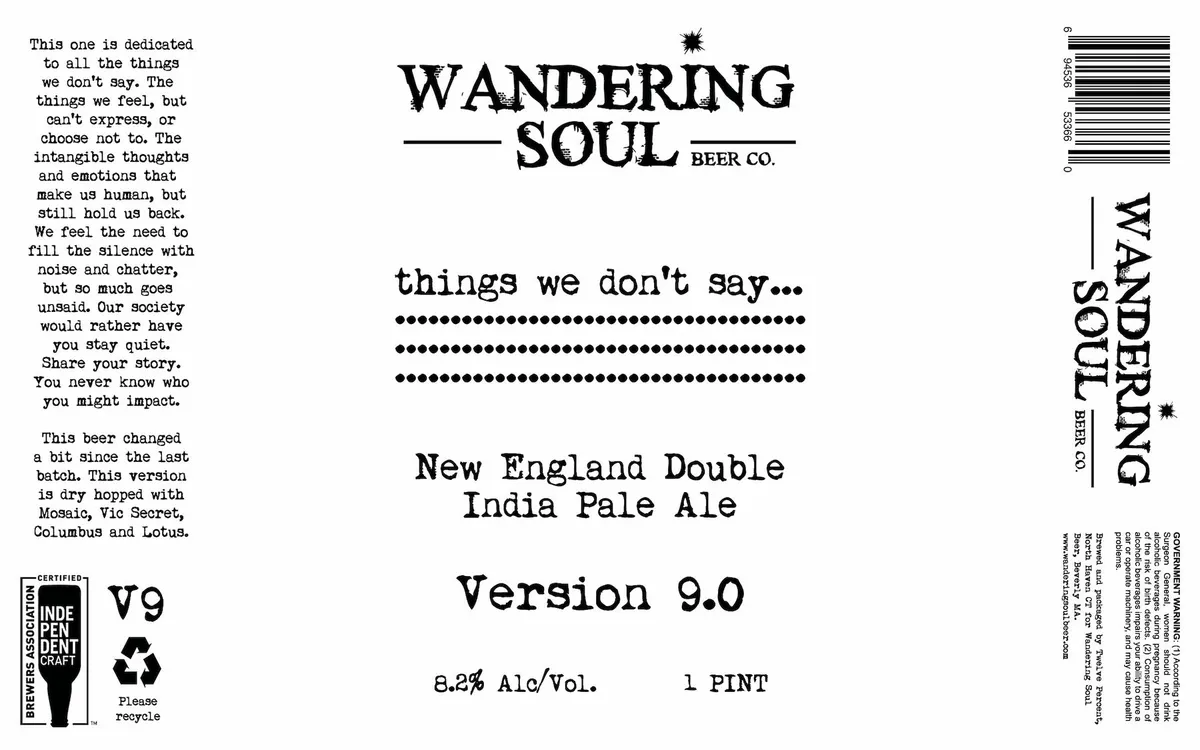 Things We Don't Say... Version 9.0WANDERING SOUL BEER CO.The label is predominantly type-based, with the brewery name and beer style centered at the top in a serif typewriter font, flanked by small star ornaments. Below, a series of three solid horizontal dot rows serve as a visual divider under the phrase "things we don't say..." The remaining space features the beer name, version number, and ABV statement in the same serif typewriter face, with a substantial block of justified prose text on the left side and regulatory information on the right and bottom edges. The design employs a stark, utilitarian aesthetic with no illustration.black · cream
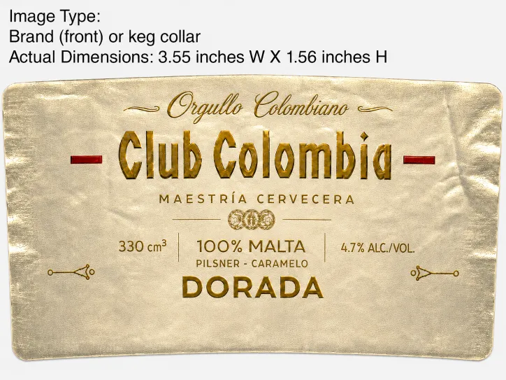 Club Colombia DoradaThe front label features a cream-coloured ground with ornamental golden type and decorative flourishes arranged symmetrically. The beer name "Club Colombia" appears in a large serif condensed display face in oxblood and gold, flanked by horizontal burgundy rules. Above sits the text "Orgullo Colombiano" in a flowing script, and below are the words "Maestría Cervecera", a small shield emblem, "100% Malta / Pilsner - Caramelo", and "Dorada", all set in golden type. Small ornamental line ornaments frame the composition vertically.cream · gold · oxblood
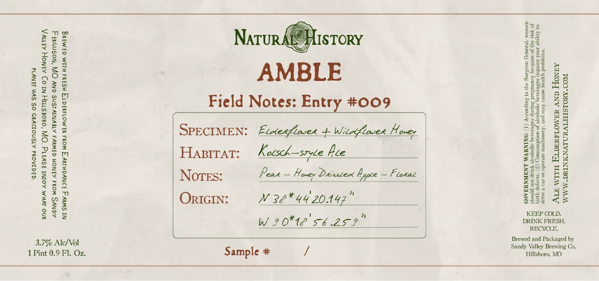 AmbleNATURAL HISTORYA label designed as a naturalist's field journal entry, with a central framed specimen card in pale cream containing handwritten-style notes on elderflower and wildflower honey, habitat, tasting notes, and geographic coordinates. The composition is symmetrical and austere, set against a muted off-white ground with the beer name "AMBLE" in russet capitals below the Natural History logotype, and regulatory text ranged left and right in small serif type. The palette is restricted to cream, sage green in the logo, and russet-brown type. The overall treatment evokes a 19th-century naturalist's documentation system.cream · russet · sage
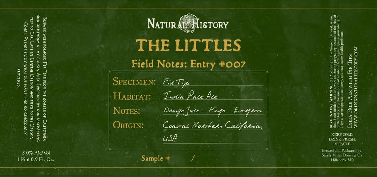 The LittlesNATURAL HISTORYA field-notes design on a deep green background presents a naturalist's specimen card for an India Pale Ale. The label mimics a journal entry with a central framed box containing handwritten-style italic script recording specimen details, habitat, tasting notes, and origin. The header features serif capitals and a small circular emblem, all rendered in cream and gold metallic ink against the matte ground.dark green · cream · gold
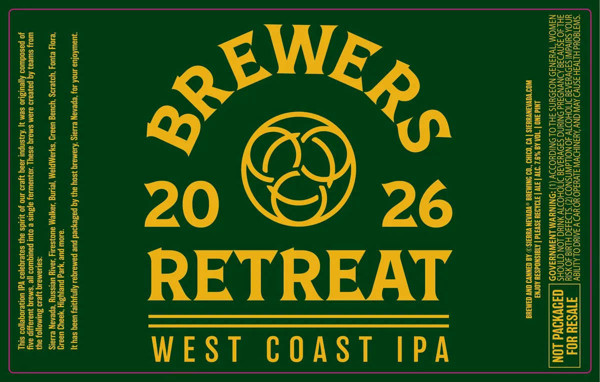 Brewers Retreat West Coast IPASIERRA NEVADAThe label is dominated by the beer name set in large, bold gold sans-serif caps arranged in an arc across the upper half, with a stylised three-lobed emblem centred below it flanked by the year numbers 20 and 26. The word RETREAT appears in matching gold caps on the second line, with WEST COAST IPA in smaller letters below a pair of horizontal rules. The entire composition is centred on a deep forest green field with regulatory text in smaller gold type running vertically down both edges.forest green · gold
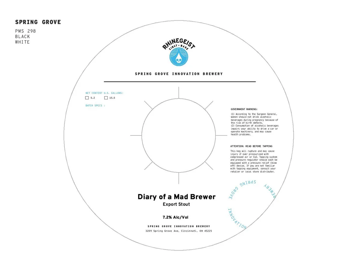 Diary of a Mad BrewerRHINEGEISTA keg collar, primarily typographic and regulatory, featuring the Rhinegeist logo—a blue water droplet with white geometric detail—centered near the top above "Spring Grove Innovation Brewery" in small caps. The composition is radial around a blank central circle with four cross-marks; regulatory text occupies the right side, batch specs and net-content fields the upper left, and the beer name "Diary of a Mad Brewer" and ABV appear in the lower half in sans-serif type. The entire design is printed in black and white on a circular field.white · black · blue
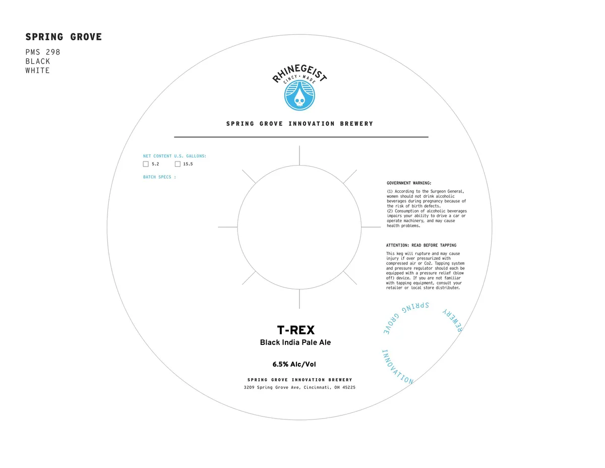 T-REXRHINEGEISTA keg collar with a circular layout anchored by the Rhinegeist logo—a blue water droplet in a circle—at the top center. The design is predominantly typographic, with the brewery name in small caps across the upper third, the beer name white · black · cyan
 Stoner's IPAType-only label with the beer name, style, and alcohol content set in sans-serif caps across the upper portion, and the brewery name and location in matching type at the lower edge, all on a white background. No illustration or decorative element is present.white · black
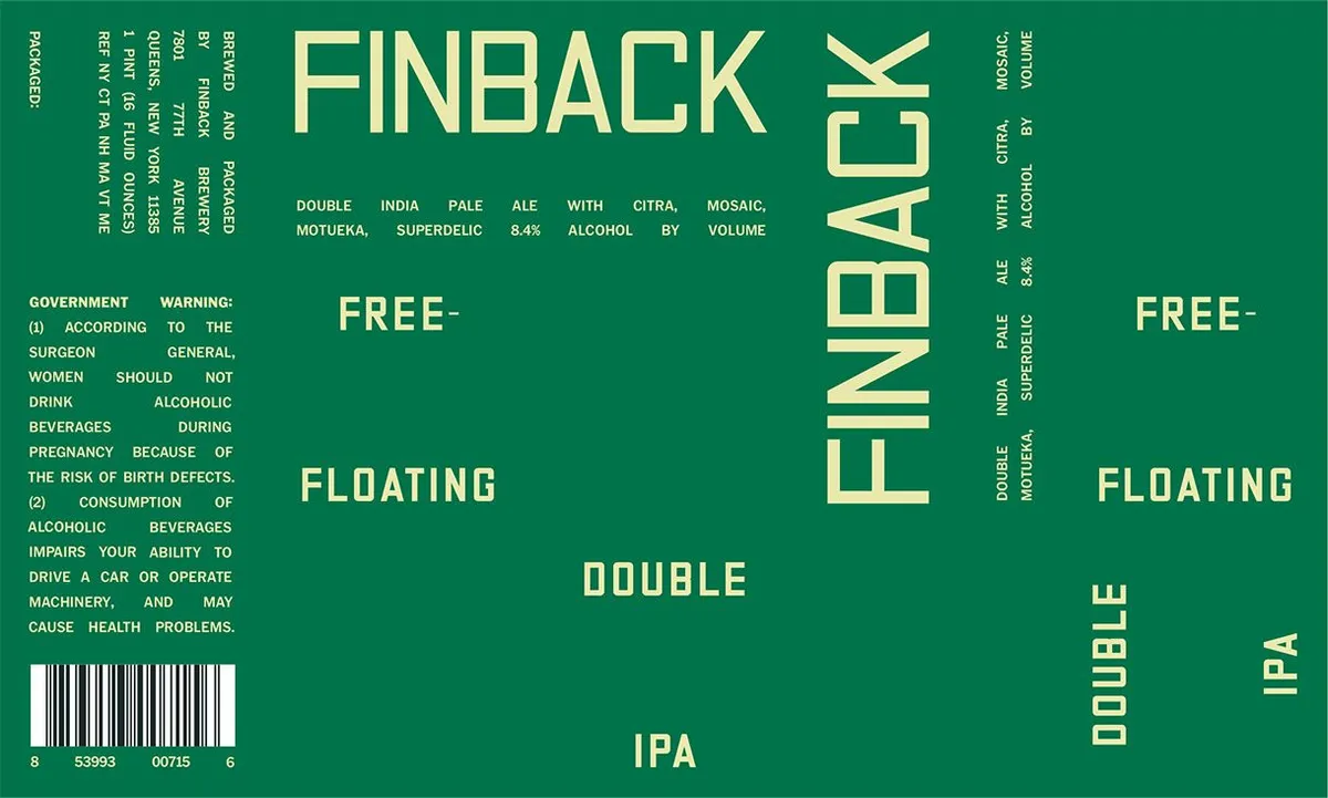 Free-FloatingFINBACKThe label is entirely typographic, composed in a geometric sans-serif font across a solid forest-green field. "FINBACK" appears vertically along the right edge in tall, condensed capitals, while "FREE-FLOATING DOUBLE IPA" is distributed horizontally and vertically across the center and lower portions in pale yellow-cream lettering. Style descriptors and ABV information are set in smaller type along the top and right margins.forest-green · cream
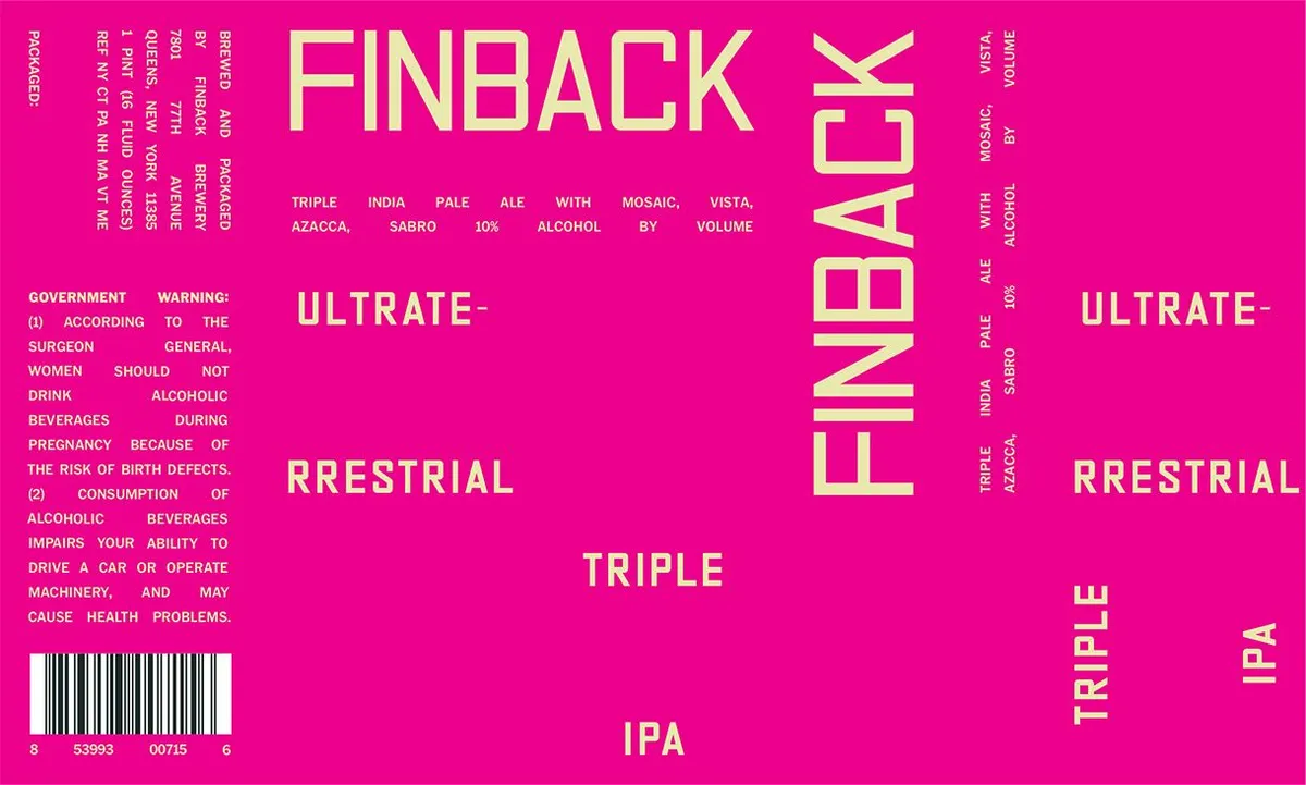 UltraterrestrialFINBACKThe label is dominated by hot magenta ground with text arranged in bold, irregular angles across the surface. "FINBACK" runs vertically in large cream caps down the right side, while "ULTRATERRESTRIAL" is split and rotated across the centre and lower portion in the same typeface. Beer style descriptors—"TRIPLE INDIA PALE ALE WITH MOSAIC, VISTA, SABRO"—and regulatory text occupy the remaining space in smaller cream type, creating a densely typographic composition with no figurative element.magenta · cream · black
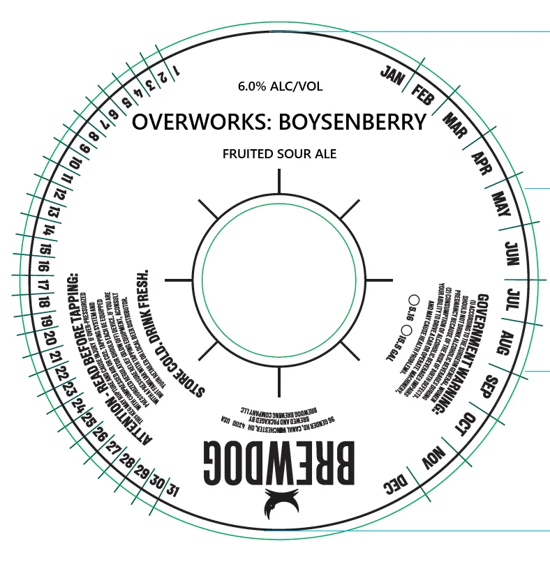 Overworks: BoysenberryOVERWORKSA keg collar with a circular date wheel and temperature ring. The design is minimal and functional: a centred empty circle marked with cardinal crosshairs, surrounded by concentric rings for month rotation and temperature reference. The brewery name appears inverted at the bottom, with the beer style and ABV stated at top center. All typography is sans-serif in black and teal on a white ground.white · black · teal
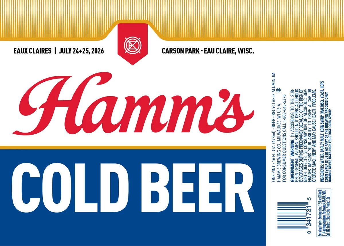 Hamm's Cold BeerHAMM'SThe label features a horizontal tripartite composition with a cream field at top, a gold-striped band running across, and a navy blue band at the bottom. The dominant visual is the word "Hamm's" rendered in large red script lettering across the centre, with "COLD BEER" in white sans-serif capitals on the navy ground below. A small red shield emblem containing a white wagon-wheel motif anchors the upper centre, flanked by event details in black type.red · cream · navy · gold
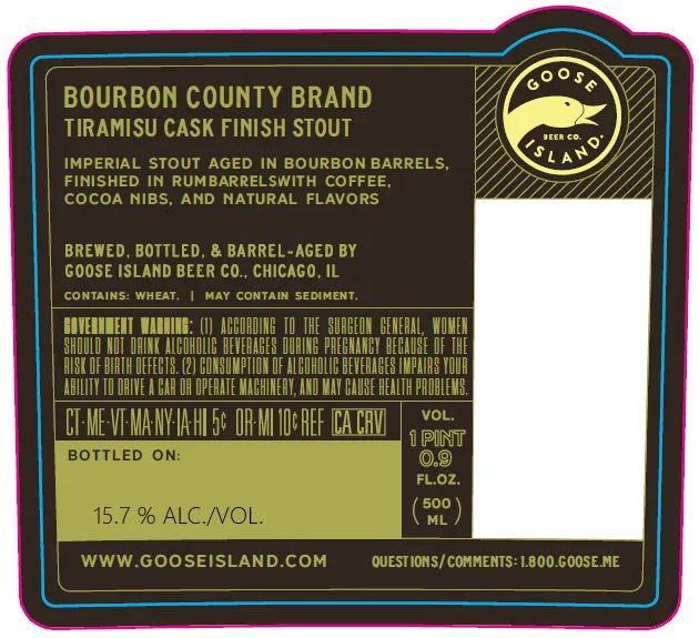 Bourbon County Brand Tiramisu Cask Finish StoutGOOSE ISLAND BEER CO.The front label features a dark brown field with a circular emblem in the upper right: a goose in profile within a gold circle printed against diagonal hatching, set within a round banner reading "GOOSE ISLAND". The composition is dominated by regulatory and descriptive text in gold and cream, arranged in horizontal bands; a paler yellow-green panel at the bottom contains the bottled-on date, ABV statement, and volume. The label is bordered by a thick magenta frame with a teal inner stripe.brown · gold · magenta · teal
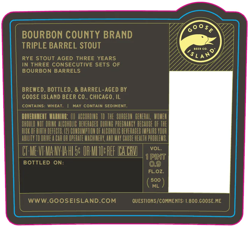 Bourbon County Brand Triple Barrel StoutGOOSE ISLAND BEER CO.The front label features the Goose Island brewery emblem—a flying goose in a circular frame with diagonal hatching—positioned in the upper right against a charcoal ground. The composition is divided left and right by a vertical gold rule, with product name and description in gold condensed sans-serif capitals on the left side and a large white blank panel on the right. A thick magenta border frames the entire label with cyan and gold accent lines, while the back label repeats the brewery name and product details in the same typographic system with four gold stars as a secondary mark.charcoal · gold · magenta · cyan
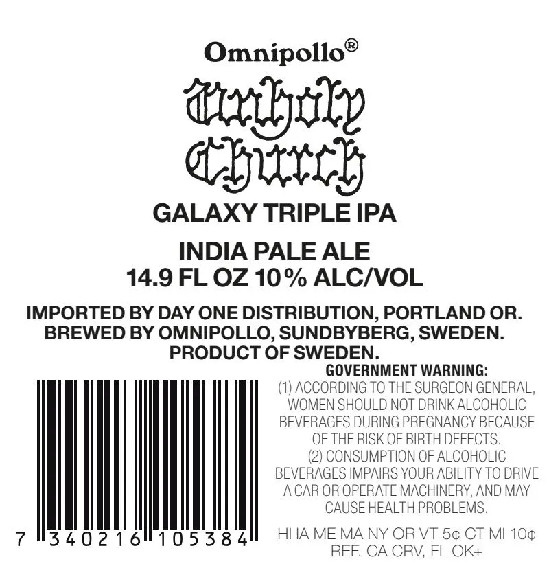 Unholy Church Galaxy Triple IPAUNHOLY CHURCHThe label is type-only, dominated by the brewery name 'Omnipollo' in bold sans-serif at the top, followed by 'Unholy Church' rendered in a stylized, interlocking gothic or blackletter-influenced hand-lettered script. Below sit the beer style descriptor 'Galaxy Triple IPA' in clean sans-serif, with regulatory and production information in smaller type. The entire composition sits on a white ground with black text and a barcode near the bottom left.white · black
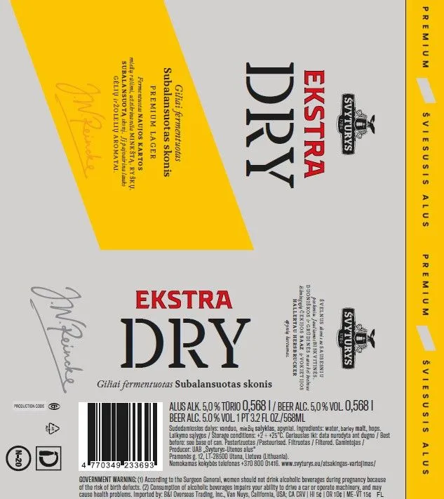 Ekstra DrySVYTURYSThe front label features the brand name 'EKSTRA DRY' in large, heavy serif capitals running vertically down the centre in black, with a red 'EKSTRA' block positioned above. A stylised signature in script appears in the lower left in grey. The label is divided between a white field on the right and a pale grey field on the left, with regulatory and descriptive text arranged in columns. A yellow diagonal panel spans the upper left, containing yellow-on-yellow ingredients and brewing notes. The right edge carries a tall yellow vertical band with regulatory text running along its spine.white · yellow · black · red
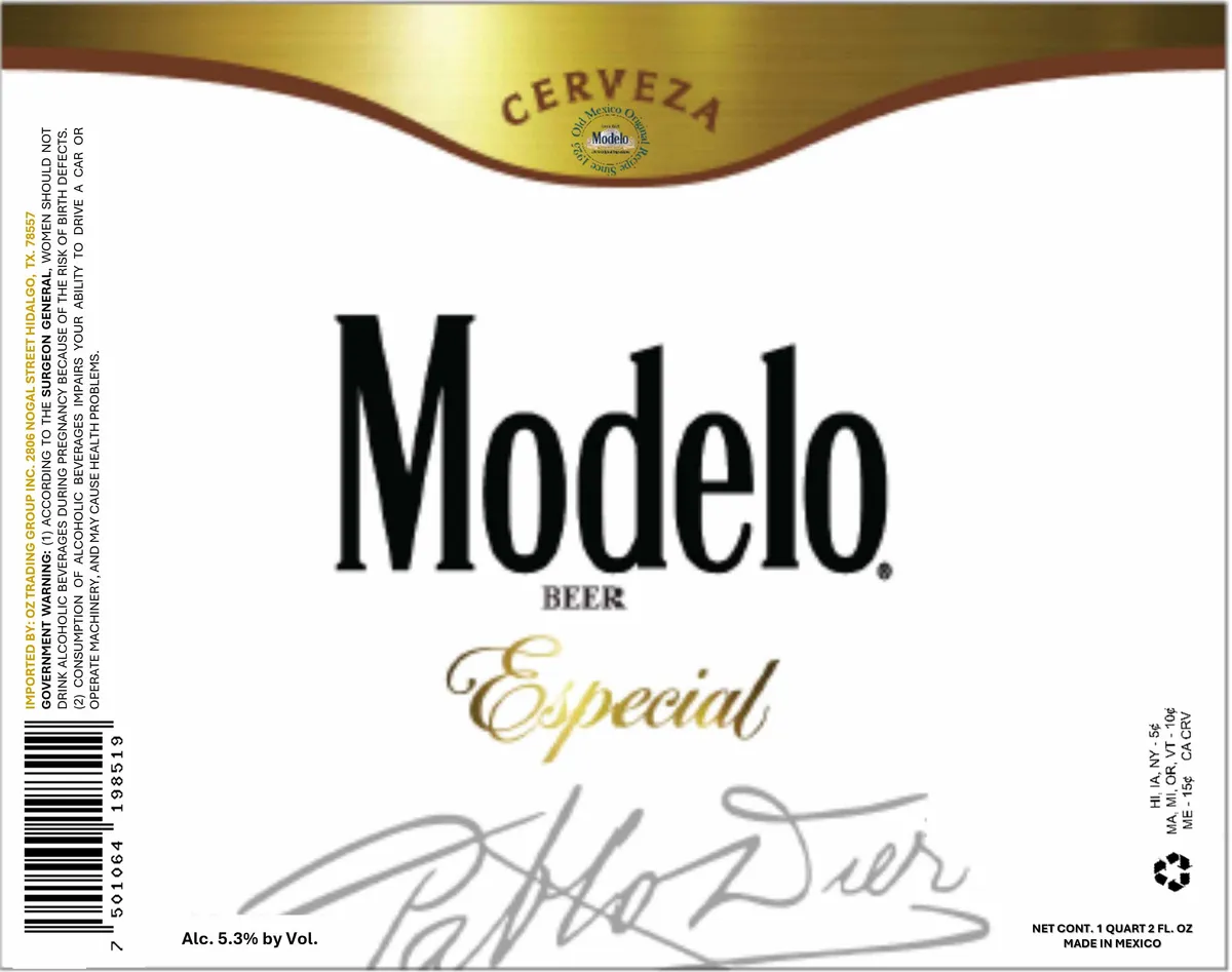 Modelo EspecialMODELO BEERThe front label presents the beer name gold · cream · black · brown