A cut through the label corpus
Pen and ink beer labels
370 labels in the register read as pen and ink. Every one was described by us from the filed artwork — the TTB records what a label says, never what it looks like.
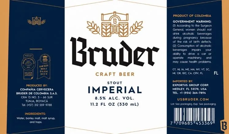 ImperialBRUDERThe front label features a golden line-drawn crest topped with laurel sprays, centered above the beer name rendered in bold blackletter capitals. The composition is vertically symmetrical, with a cream central panel flanked by navy-blue side sections that carry regulatory text and brewery information. The palette is dominated by navy, cream, and gold, with black type for the primary branding. The finish appears to be matte with no visible special treatment.navy · cream · gold · black
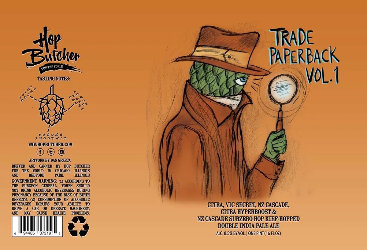 Trade Paperback Vol. 1HOP BUTCHER FOR THE WORLDA cartoon detective figure in a brown overcoat and fedora hat dominates the right side of the label, holding a magnifying glass and displaying a comical expression with a green hop-cone head. The character is rendered in pen-and-ink with crosshatching and loose linework against a solid orange field. A stylized hop illustration with tasting-note callouts appears on the lower left in simpler line work. The beer name "Trade Paperback Vol. 1" is hand-lettered in a casual brush script in the upper right, with regulatory text and brewery information completing the lower sections.orange · brown · green · cream
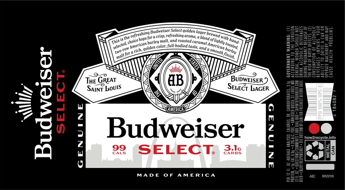 Budweiser SelectBUDWEISERA symmetrical heraldic emblem dominates the upper half, rendered in fine pen-and-ink line work with a central medallion bearing the AB monogram surrounded by geometric borders and radiating sun-burst ornament. Below sit two ribbon banners flanking the medallion — one reading 'The Great Saint Louis' and the other 'Budweiser Select Lager' — with descriptive text arched across the very top. The beer name 'Budweiser' appears in large serif capitals at centre, with 'SELECT' in red capitals below, flanked by calorie and carbohydrate declarations. A faded skyline silhouette sits beneath the main type. The entire composition sits on a black ground with white illustration and red accents.black · white · red · cream
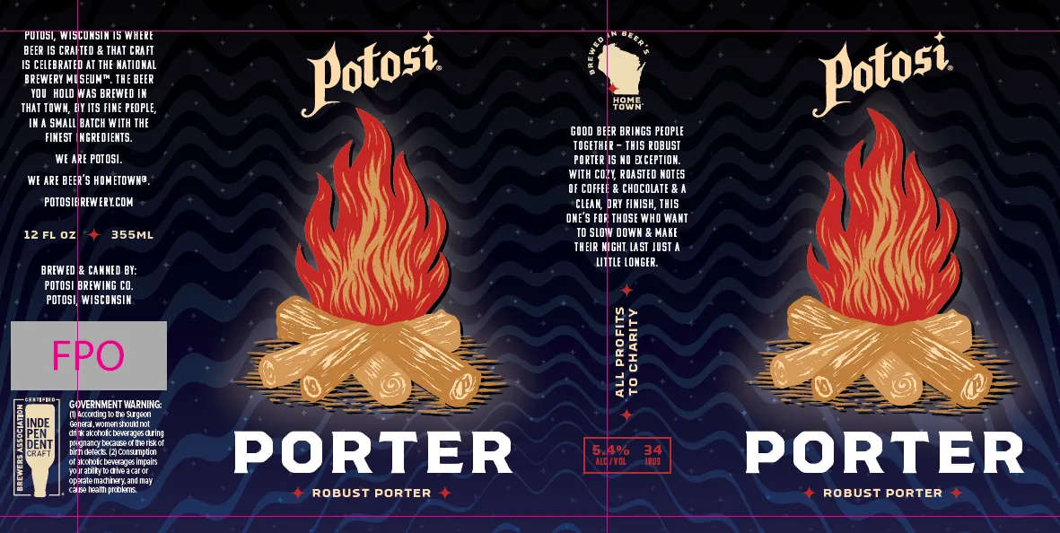 Potosi PorterPOTOSI BREWING COMPANYA stylized campfire dominates the centre of the label — bright red and orange flames rising from golden-tan logs rendered in a bold illustrative style — set against a dark navy background with subtle wavy horizontal striping and scattered small stars. The beer name "Potosi" appears in large serif capitals in cream at the top, with "Porter" and "Robust Porter" in sans-serif white below the flames. Cream and white type fills the left and right panels with brewery information and marketing copy. The "Potosi, Wisconsin" crest badge and "Brewed in Wisco" shield sit near the top centre.navy · cream · red · orange
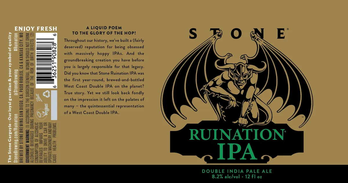 Ruination IPASTONE BREWINGA winged demon figure with prominent horns dominates the upper-right half of the label, rendered in black line-art against a tan field, with outstretched bat wings and a muscular, crouching posture. The creature sits above a black banner containing the beer name in bright green sans-serif capitals. The left side carries a narrow column of regulatory text and the brewery's origin story in justified body type, with a barcode and recycling symbol at the bottom of the spine. The composition balances the large illustrative emblem on the right with dense typography on the left, creating a split-field layout across a matte tan background.tan · black · green
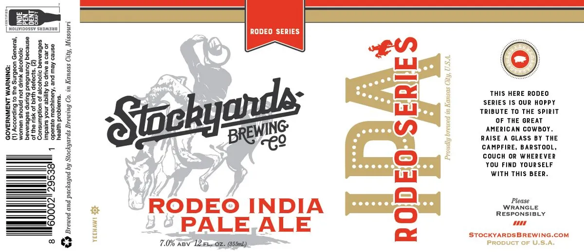 Rodeo India Pale AleA bucking horse and rider in mid-leap occupies the central left, rendered in grey line-art above the Stockyards Brewing Co. logotype in black script. The beer name 'Rodeo India Pale Ale' runs in red sans-serif capitals below the horse. A vertical banner reading 'Rodeo Series' in red and gold dominates the right side, with a second vertical 'Rodeo Bries' panel below in the same palette. The background is cream, with red and gold horizontal bands at top; a circular emblem appears upper right with marketing text set in black caps.cream · red · gold · black
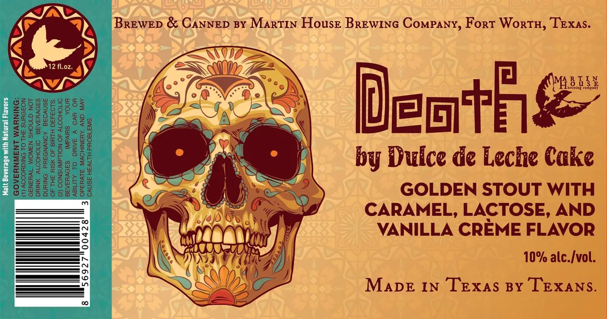 Death by Dulce de Leche CakeMARTIN HOUSE BREWING COMPANYA large skull rendered in the style of Mexican Day of the Dead art dominates the center-left of the label, painted in warm cream, gold, orange, and burgundy with ornamental floral and geometric details throughout. The background is a soft tan with repeating geometric tile patterns, while the beer name appears in bold burgundy serif lettering across the upper right, with smaller descriptive text below. A circular medallion in the upper left corner features a white dove on a burgundy ground with geometric framing. The overall composition balances the detailed skull illustration against a dense patterned field and right-aligned typography.cream · tan · burgundy · gold
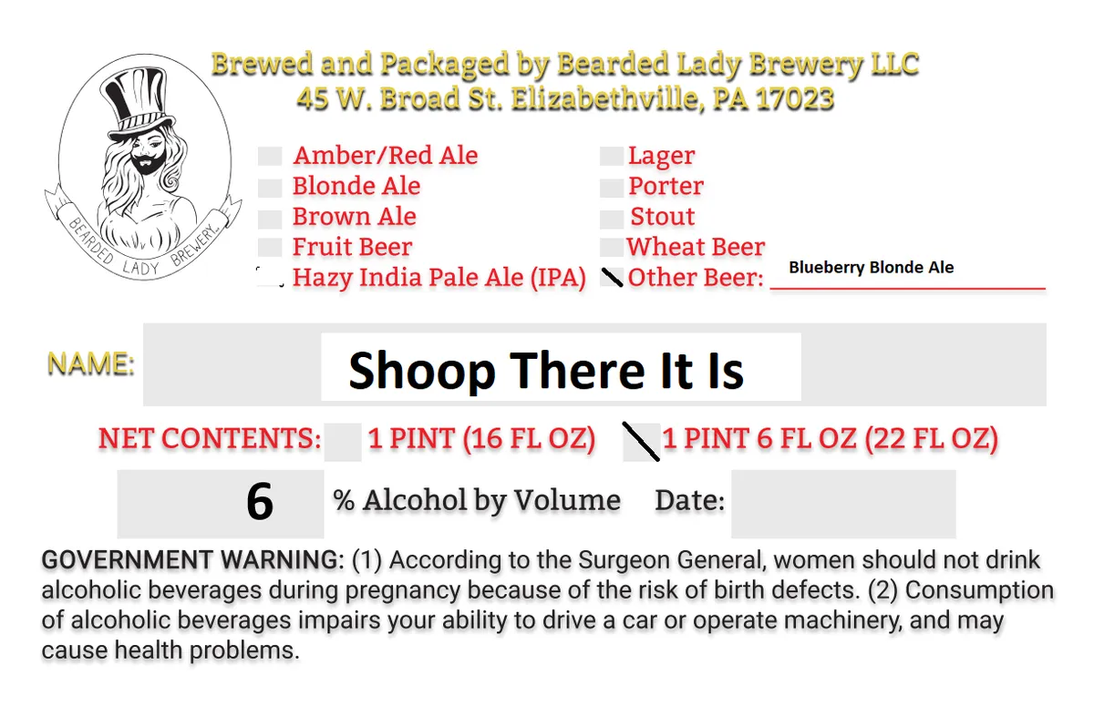 Shoop There It IsBEARDED LADY BREWERY LLCA pen-and-ink portrait of a bearded figure wearing a tall top hat occupies a circular emblem at the upper left, with the brewery name arched below in a banner. The label is primarily regulatory and typographic, with the beer name set in large black sans-serif capitals across the centre, flanked by style-selection checkboxes and brewery information in gold and red type. No illustration extends beyond the circular emblem.white · black · gold · red
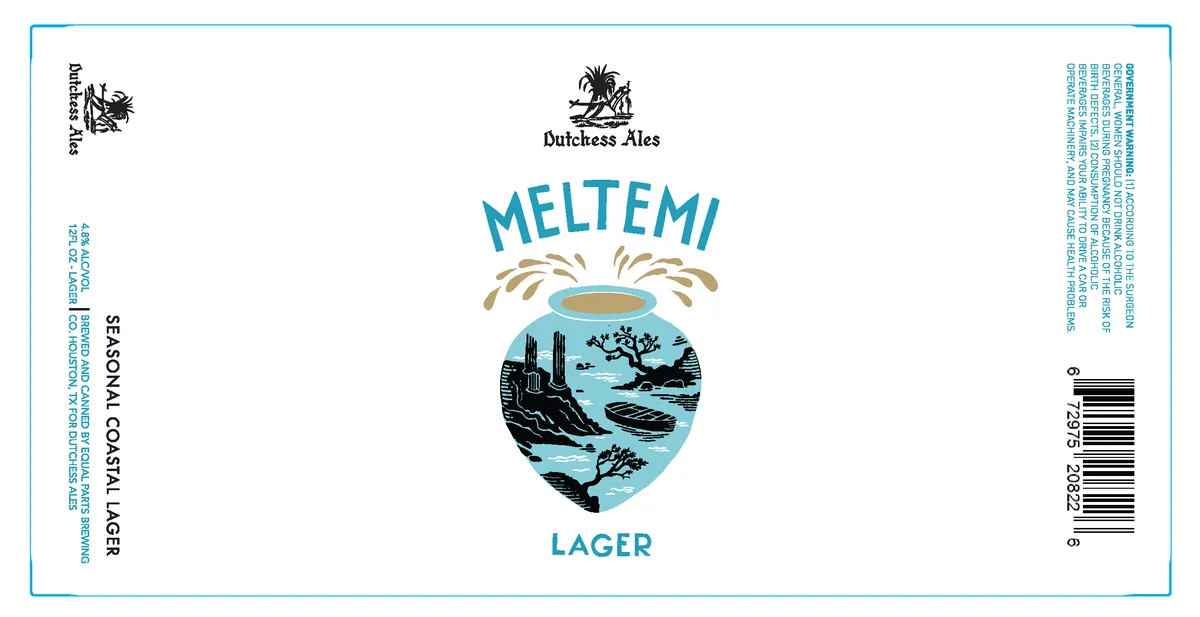 MeltemiDUTCHESS ALES MELTIMIA shield-shaped emblem dominates the centre, filled with a stylised Mediterranean landscape in black linework over a light blue field—rocky outcrops, cypress trees, a sailboat, and coastal terrain rendered in a pen-and-ink naturalistic style. Above the shield, the word "MELTEMI" appears in large turquoise sans-serif capitals, with wheat stalks or wind lines radiating outward. Below, "LAGER" sits in matching turquoise type. The Dutchess Ales logo and nameplate anchor the top. A thin turquoise border frames the entire label.cream · turquoise · black · tan
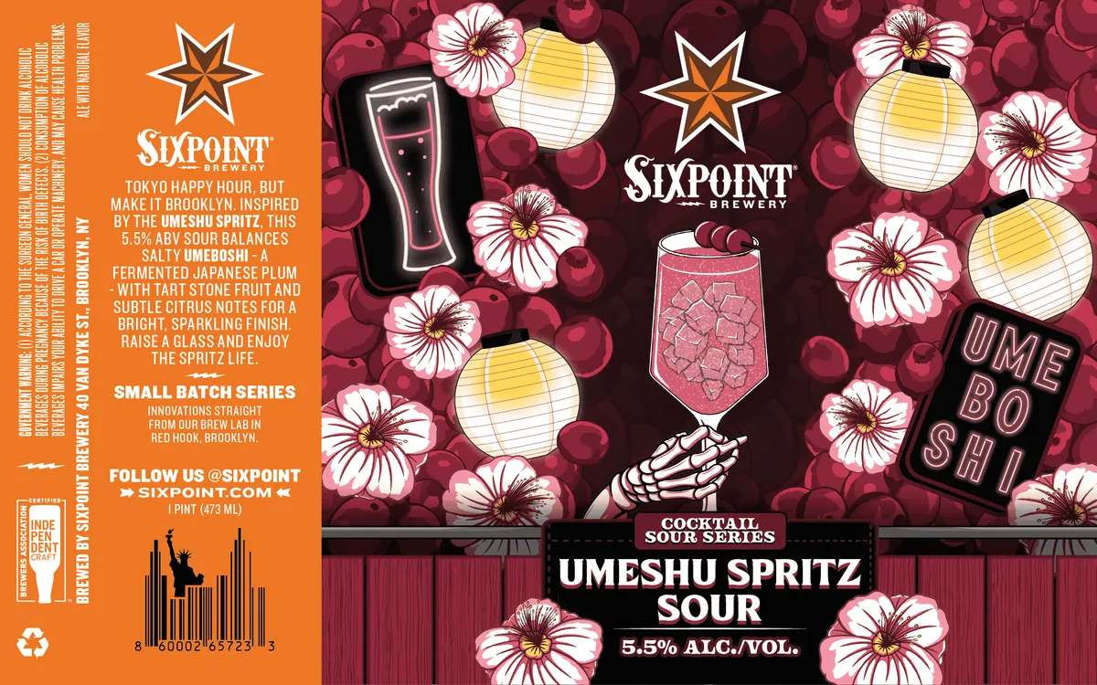 Umeshu Spritz SourSIXPOINTThe front label features a scattered pattern of pink cosmos flowers and dark burgundy plums across a deep maroon background, anchored by an illustrated cocktail glass with a quilted texture and a skeletal hand grasping the stem at center. Yellow paper lanterns drift among the florals, while neon-outlined text reading "UMEBOSHI" appears in the lower right. The composition splits between the full-bleed floral field above and a horizontal band at the bottom with the beer name in bold white sans-serif caps against black.maroon · pink · yellow · cream
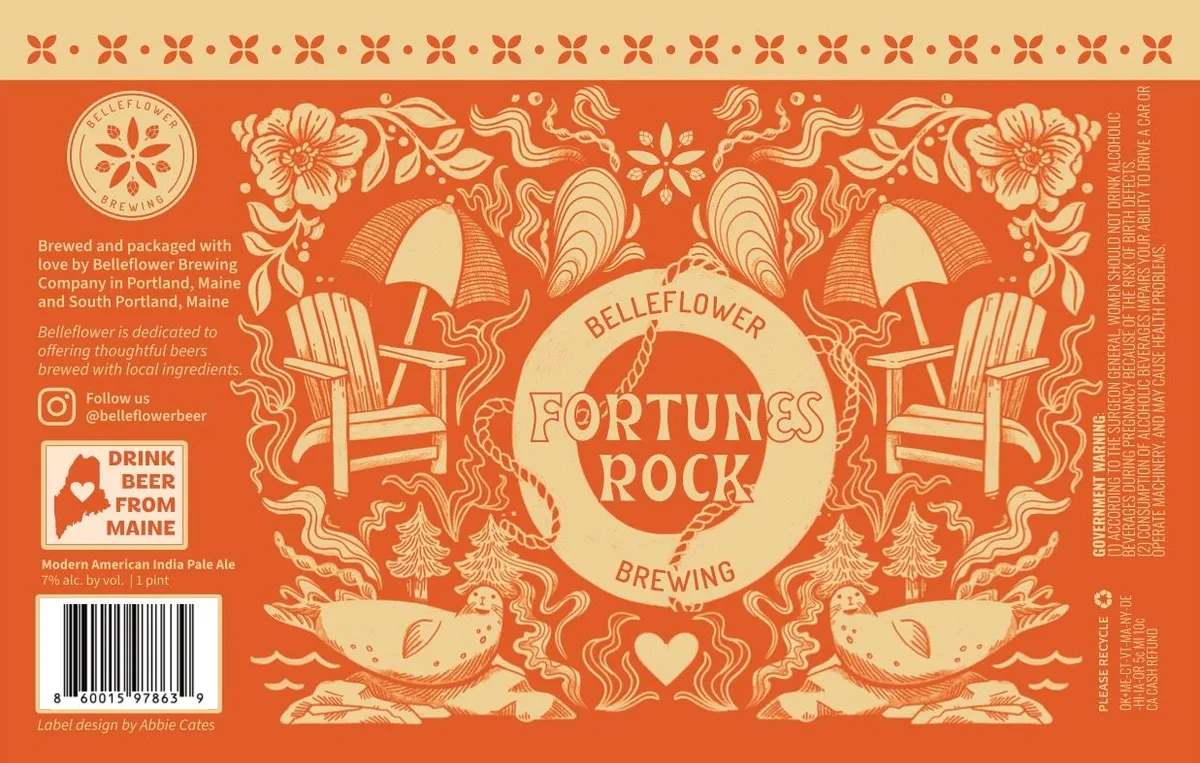 Fortunes RockBELLEFLOWER BREWING COMPANYA full-bleed illustration in cream and orange depicts a symmetrical composition anchored by two Adirondack chairs flanking a circular medallion at centre, with ornamental flourishes radiating outward—flowering vines, wavy ribbon motifs, stylised birds perched on rocks, and a rope border enclosing the brewery name. The entire field is filled with dense, interlocking botanical and decorative elements rendered in a consistent single-line or hatched style. At the top and bottom edges, repeated four-pointed floral stamps form a border frame.orange · cream
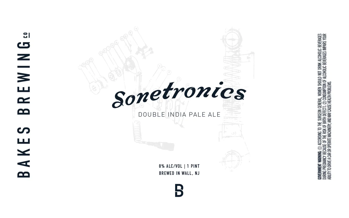 SonetronicsThe label features faded technical line-drawings of electronic components and machinery—circuit boards, tools, gauges, and mechanical parts—scattered across a cream field. The beer name appears in italic script at centre, with the style descriptor in sans-serif capitals below. The brewery name runs vertically in bold caps down the left edge, while regulatory text occupies the right margin. The overall composition is minimal and asymmetrical, with the technical imagery rendered so lightly it reads more as watermark than foreground element.cream · black · grey
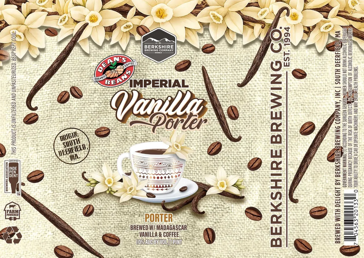 Imperial Vanilla PorterBERKSHIRE BREWING COMPANY, INC.Vanilla orchids and coffee beans scatter across a cream linen-textured ground, with dark vanilla pods curving through the composition. At the centre, a white coffee cup patterned with geometric line-work sits on a saucer, surrounded by coffee beans and flowers. The beer name appears in white script with shadow effect, flanked by the Dean's Beans logo above and style and origin information below.cream · brown · white · tan
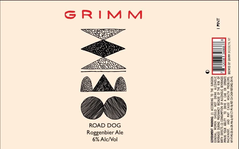 Road DogGRIMMA vertical stack of five geometric shapes in pen-and-ink rendering occupies the center: a cross-hatched triangle at top, a solid black diamond, a stippled triangle, a trio of textured domes, and two striped circles at bottom. The composition is symmetrical and abstract, with each shape rendered in a distinct linear or dotted pattern. The brewery name GRIMM appears in sans-serif caps at the top in red, while the beer name, style, and ABV are set in black type below the geometric stack. The label is cream-coloured throughout with black linework and red accent typography.cream · black · red
 Pasele JovenGRIMMA geometric stack of five hand-hatched shapes—a textured trapezoid, a diamond, a bumpy triangle, a three-domed arch, and two overlapping circles—occupies the centre of a cream label beneath the red GRIMM logo. Each form is rendered in black pen-and-ink with distinct linear patterns: scales, dashes, stippling, and cross-hatching. The beer name, style, and ABV are set in a simple sans-serif below the stack.cream · red · black
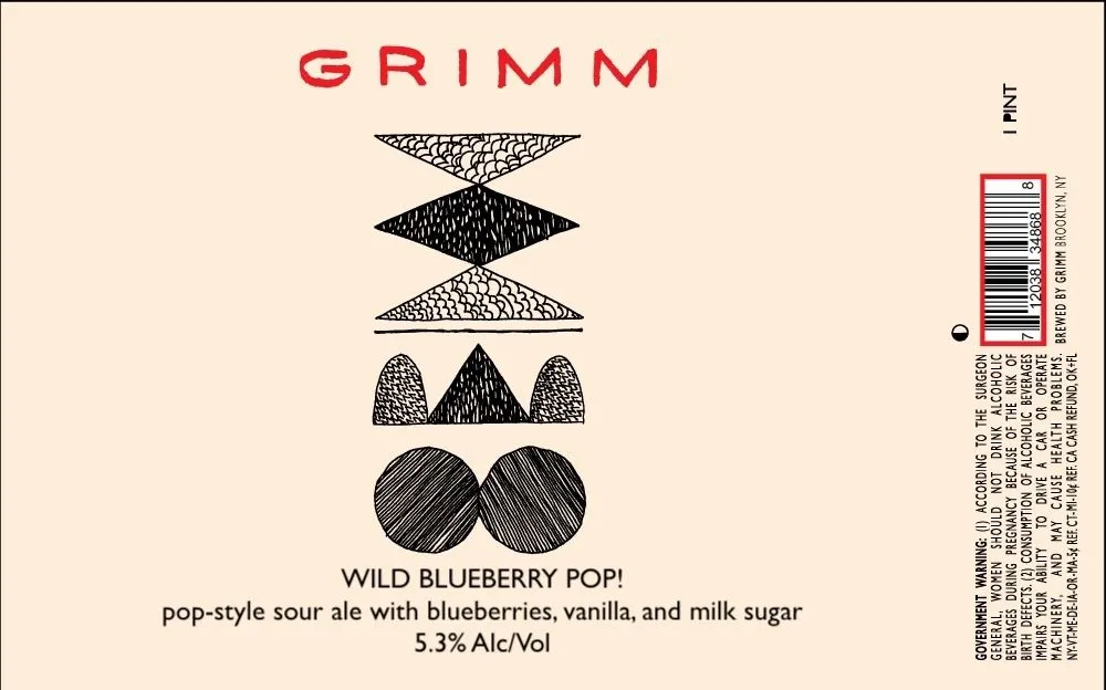 Wild Blueberry Pop!GRIMMA vertically stacked composition of five geometric shapes rendered in pen-and-ink cross-hatching sits centered on a cream field. From top to bottom: a textured diamond, a solid black diamond, a stippled triangle, three curved dome forms (two outlined, one solid), and two large circles with diagonal line-fill. The brewery name GRIMM appears in red sans-serif capitals at the top; below the illustration, the beer name and style description are set in black type. The label employs minimal colour throughout — red, black, and cream only.cream · red · black
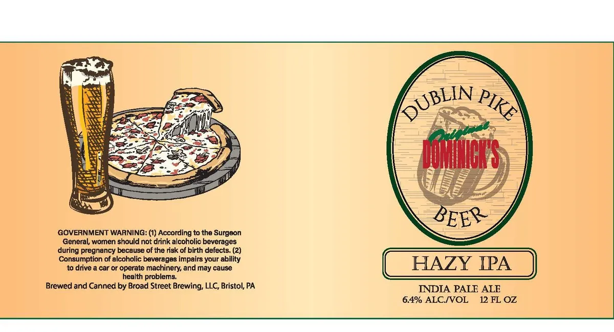 Dublin Pike Original Dominick's Beer Hazy IPADOMINICKS BEERA full-bleed illustration occupies the left side, showing a tall glass of golden beer beside a pizza on a dark plate, rendered in pen-and-ink crosshatching with hand-drawn linework. The right side features an oval emblem framed in dark green, with a wooden-barrel motif and the brewery name in red serif lettering, set against a wood-grain texture background. The entire label sits on a warm peachy-tan ground with a dark border frame.peachy-tan · dark green · red · cream
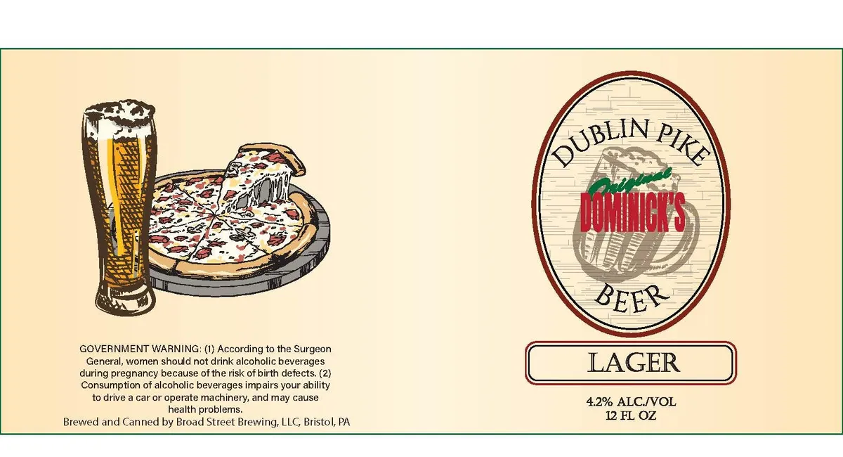 Dublin Pike Original Dominick's BeerDOMINICKS BEERA split-field label divided into a left side depicting a pint glass overflowing with foam beside a pizza on a black pan, both rendered in pen-and-ink crosshatching, and a right side featuring an oval emblem with a barrel and hop cone in the centre, framed by the brewery name in red and green script lettering. The left illustration anchors the beer-and-food pairing theme in a casual tavern register, while the right emblem presents the brand identity with a cream ground, horizontal wood-grain hatching, and a burgundy oval border.cream · burgundy · forest-green · gold
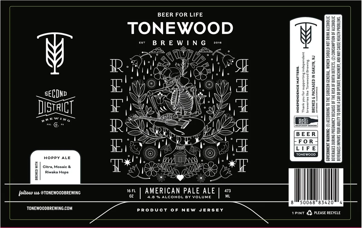 RefretA detailed pen-and-ink illustration dominates the centre, depicting a skeletal hand holding a trowel surrounded by botanical elements — flowering plants, wheat, and radiating geometric ornaments — enclosed within a rectangular frame built from stacked letters spelling 'REFRET'. The composition is symmetrical and densely patterned, printed in white linework against a black ground. Wheat-stalk emblems appear in the upper corners and along the left edge; the brewery's 'Second District' logotype and 'Beer for Life' tagline anchor the composition at top and sides.black · white
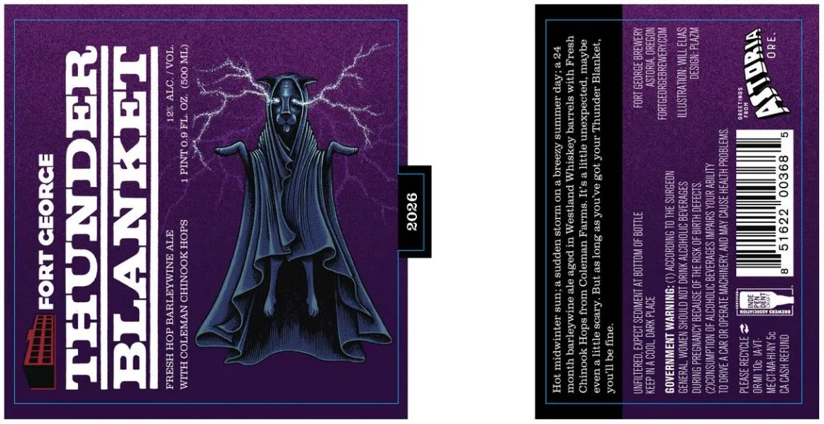 Thunder BlanketFORT GEORGEA robed figure in dark blue-grey stands centrally with arms outstretched, surrounded by jagged lightning bolts rendered in pale violet against a deep purple ground. The composition is vertically oriented with the brewery name and beer name stacked in large white sans-serif caps to the left of the figure, and a small red brick icon marking the brewery's location at the bottom left corner. The label employs a matte finish with no visible special treatment.purple · white · blue-grey · pale violet
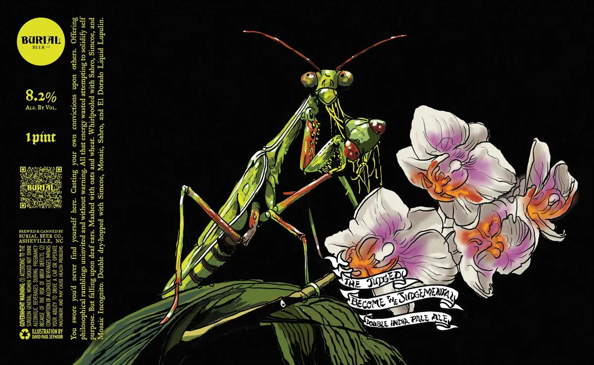 The Judged Become The JudgementalBURIAL BEER CO.A praying mantis rendered in pen-and-ink with watercolour sits atop a green leaf against a black ground, its raptorial head turned toward white flowers with purple and orange watercolour washes. The mantis is depicted in yellow-green with rust and red accents, its pose alert and predatory. Hand-lettered banners unfurl below the insects bearing the beer name in white serif type. The left edge carries a yellow circular brand mark, ABV, volume, and regulatory text in yellow type.black · yellow-green · white · purple
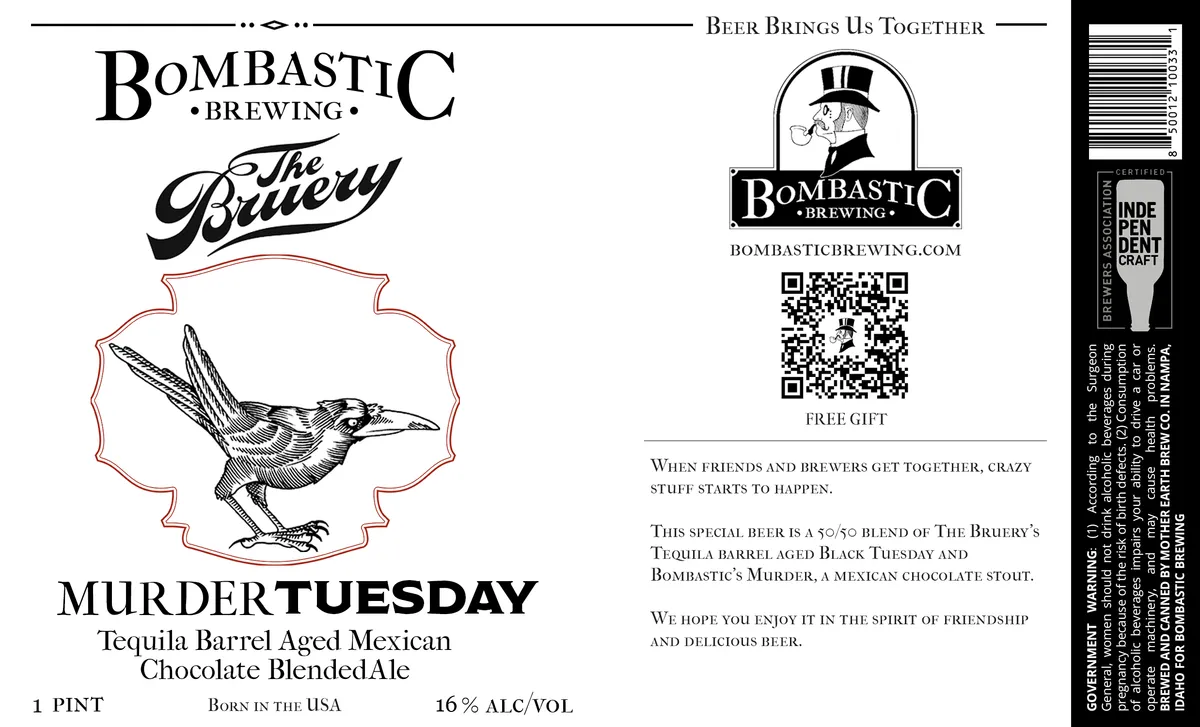 Murder TuesdayBOMBASTIC BREWINGA pen-and-ink engraving of a stylized bird in flight dominates the centre, enclosed within a baroque cartouche outlined in rust red. The bird appears mid-stride with detailed cross-hatching throughout its form. The composition is anchored by the beer name 'Murder Tuesday' in bold serif capitals below, with 'The Bruery' in flowing script above the cartouche and 'Bombastic Brewing' integrated into the masthead at top. The label employs a cream ground with black line-work and rust-red accents on the frame and decorative flourishes.cream · black · rust-red
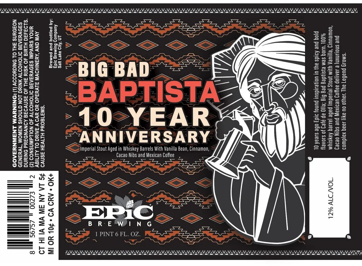 Big Bad Baptista 10 Year AnniversaryEPIC BREWINGA line-drawn portrait of a bearded man in colonial dress dominates the right side of the label, rendered in white and black against a dark ground. The beer name and anniversary callout are set in a mix of sans-serif fonts—cream and burnt-orange—positioned left of center, with a Southwestern geometric border pattern in orange and cream framing the entire composition. The backdrop is charcoal black with repeating diamond and zigzag motifs that suggest textile or architectural ornament.charcoal · cream · burnt-orange · white
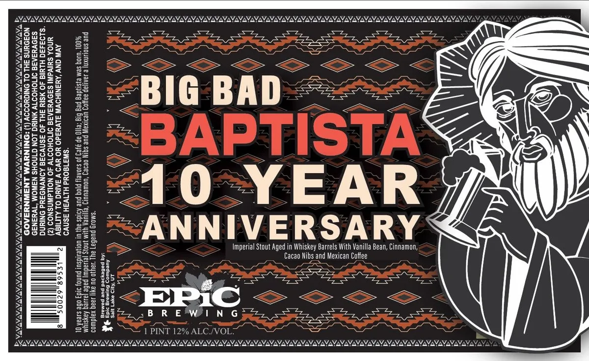 Big Bad Baptista 10 Year AnniversaryEPIC BREWINGA pen-and-ink portrait of a bearded man with long hair and headwrap occupies the right half of the label in white line work against the black ground. The left side features the beer name in large slab-serif type—cream and red letters stacked vertically—set over a repeating geometric pattern in cream and burnt orange. A triangular border pattern frames the entire label edge. Small regulatory text runs along the left margin and bottom.black · cream · burnt orange · red
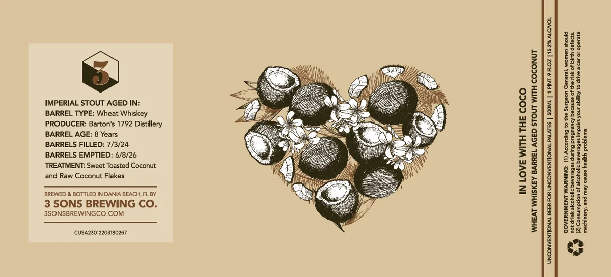 In Love With The Coco3 SONS BREWING COA pen-and-ink illustration of coconuts arranged in a heart shape dominates the center of the label, rendered with cross-hatching and fine linework showing whole coconuts and opened halves with fibrous husks. The composition places this central motif against a cream field, with beer specifications and producer details in sans-serif type on the left panel and regulatory text running vertically down the right margin. The palette is restricted to cream, black, and tan, with no visible special finish.cream · black · tan
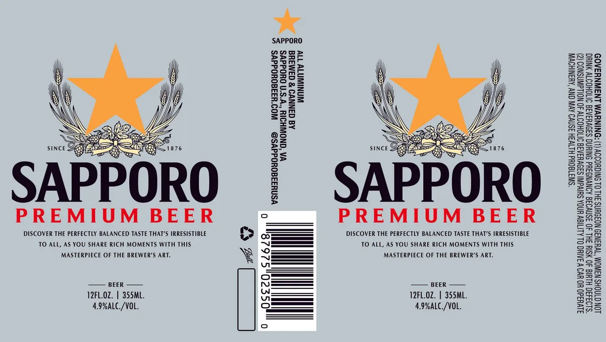 Sapporo Premium BeerSAPPORO PREMIUMA large orange star dominates the upper centre of the label, flanked on either side by a pen-and-ink engraving of wheat stalks and a hop garland below. The composition is symmetrical and framed, with the brewery name in heavy sans-serif capitals beneath the heraldic emblem, the dating line "SINCE 1876" set to either side of the hop motif, and marketing copy in smaller type below. The label is printed in orange, black, and cream on a grey ground.orange · black · grey · cream
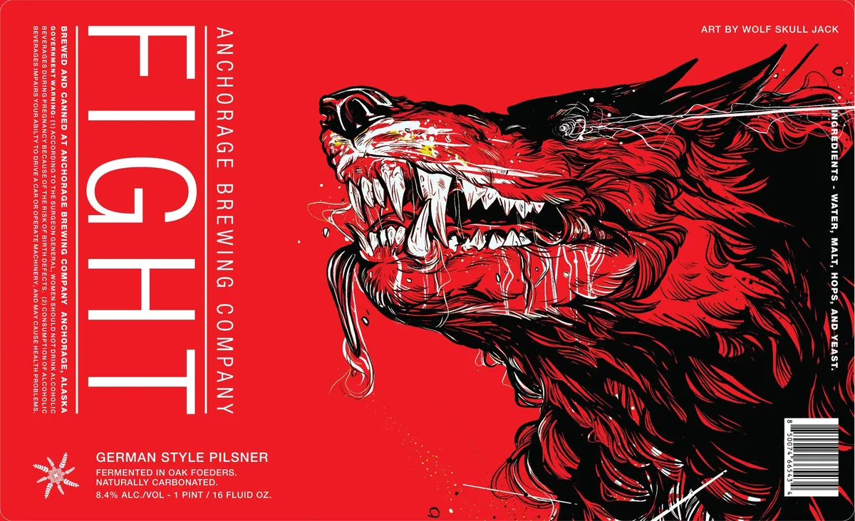 FightA menacing wolf's head with bared fangs and windswept fur dominates the right half of the label, rendered in black ink with dynamic hatching and line work against the red field. The beast's mouth is open in an aggressive snarl, with white teeth and red tongue accents cutting through the black linework. The beer name appears in large, block sans-serif capitals aligned vertically along the left edge in white, with smaller text identifying the brewery and style stacked vertically on the right margin in white type.red · black · white
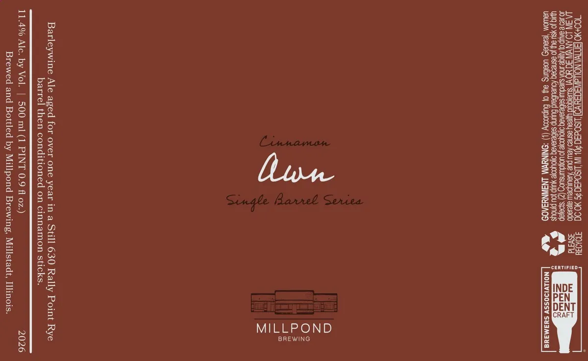 Cinnamon AwnMILLPOND BREWINGA single-label design with the beer name "Awn" rendered in a large, flowing brush-script typeface in white, preceded by the word "Cinnamon" in smaller script above it. Below sits "Single Barrel Series" in a lighter hand-lettered style. The label features a small line-drawn illustration of a brewery building at the base, printed in a darker shade of the same oxblood ground. The composition is vertically centered, with regulatory text running down the left edge and brewery information along the right, all on a uniform oxblood field.oxblood · cream · white
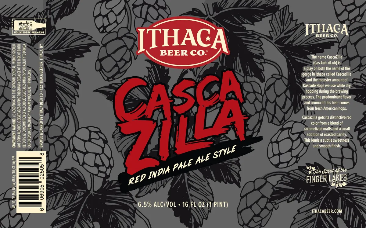 CascazillaA full-bleed pattern of hop cones and leaves rendered in pen-and-ink line work fills the background in black and grey. The beer name "CASCAZILLA" dominates the centre in large red hand-lettered capitals with a rough, gestural stroke, overlaid on the hop illustration. Above it sits the Ithaca Beer Co. shield badge in red and cream, and below the name runs a black banner with "RED INDIA PALE ALE STYLE" in white sans-serif type.grey · red · black · cream
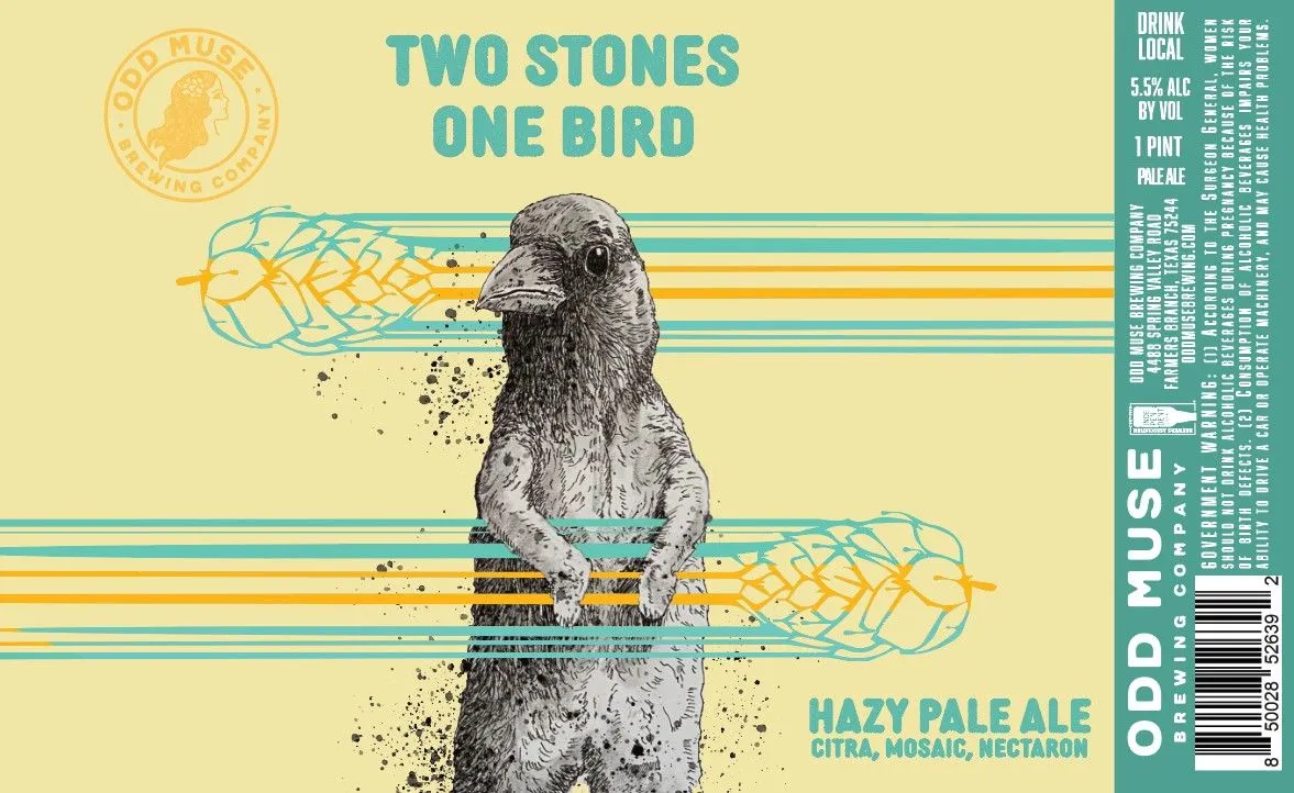 Two Stones One BirdTWO BIRDS ONE STONEA ground squirrel or meerkat stands upright in the center of the label, rendered in detailed pen-and-ink crosshatching, facing left with its head slightly raised. Geometric hop cone illustrations in turquoise and gold radiate horizontally from the animal's body, intersecting with horizontal stripes in the same colours, while scattered dots suggest movement or texture. The beer name appears in large turquoise sans-serif capitals above the figure, with style and ingredient information in smaller turquoise type at the bottom; a circular emblem in the upper left corner contains a classical profile and "Odd Muse Brewing Company" text in gold.cream · turquoise · gold · gray
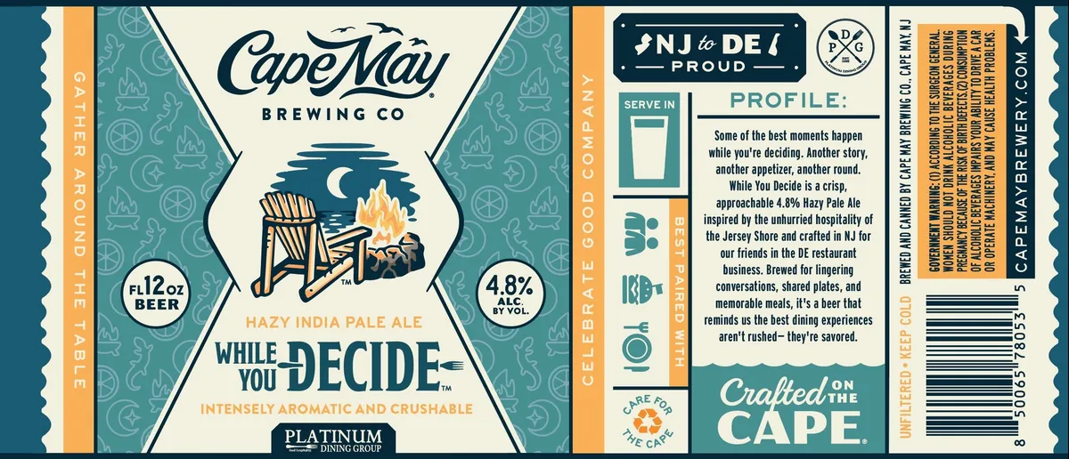 While You DecideCAPE MAY BREWING CO.A nighttime campfire scene anchors the central label, rendered in pen-and-ink style with a Adirondack chair facing flames under a crescent moon, flanked by geometric compass-rose and citrus-wheel patterns that repeat across the teal side panels. The composition is symmetrical, with the beer name split across the central vignette in condensed sans-serif caps, and product details—style, ABV, serving suggestion—positioned in discrete blocks at the edges. The palette is teal, cream, dark navy, and warm gold-orange for the flames and side borders.teal · cream · navy · gold
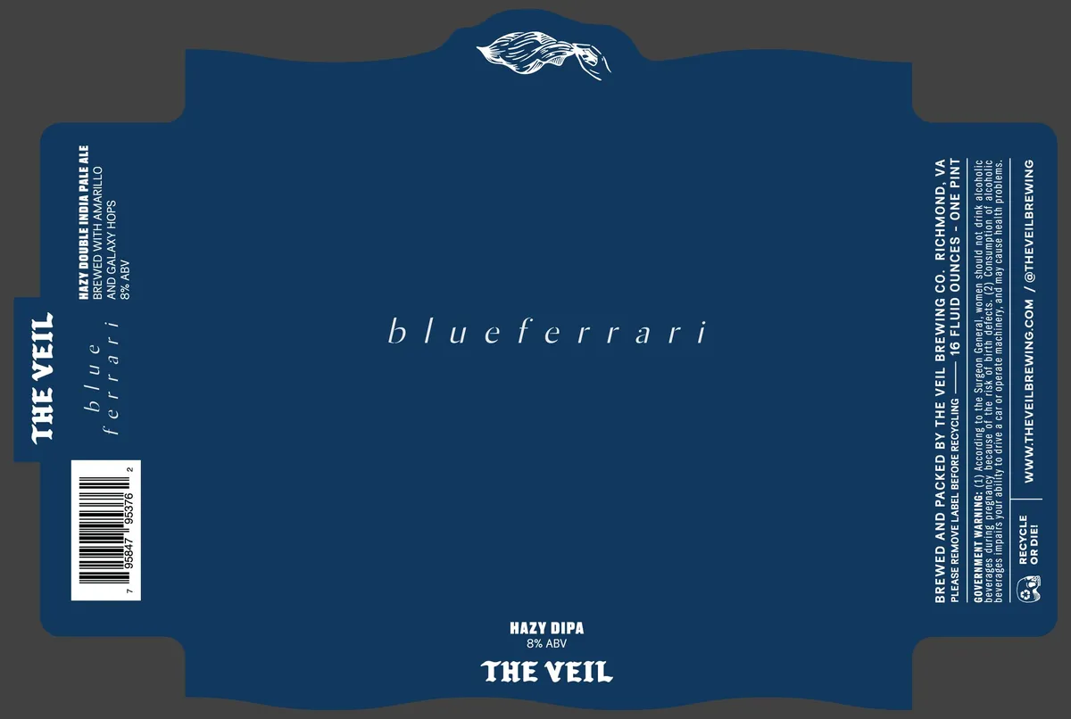 BlueferrariTHE VEIL BREWING CO.A white line-drawn Ferrari sports car, shown in profile with motion lines suggesting speed, occupies the top-center of the label above the beer name set in spaced italic lowercase. The composition is anchored by the car emblem and the central "blueferrari" text in serif italics, with regulatory text and the style designation "HAZY DIPA" positioned toward the bottom. The label is printed on a deep cobalt ground with cream and white accents, using clean sans-serif and serif typography throughout.cobalt · cream · white
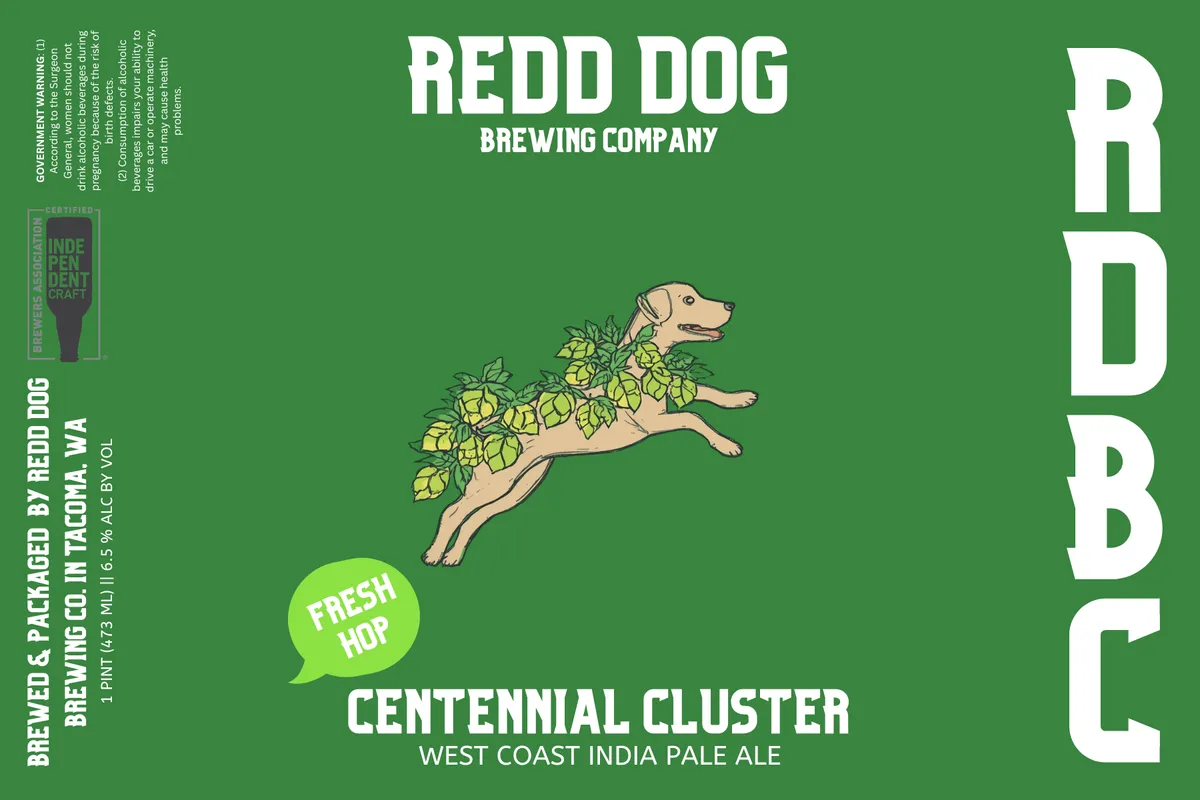 Centennial ClusterA tan dog leaps horizontally across the label, its body trailing into a spray of yellow-green hop cones and leaves that fill the upper third of the composition. The dog's head points left in profile, ears alert, against a solid kelly green field. A bright lime-green speech bubble reading "FRESH HOP" floats below the dog's rear legs. The brewery name and beer style appear in sans-serif capitals: "REDD DOG BREWING COMPANY" at the top in white, and "CENTENNIAL CLUSTER / WEST COAST INDIA PALE ALE" at the bottom, with a large white "RDB" monogram stacked vertically along the right edge.kelly green · white · yellow-green · tan
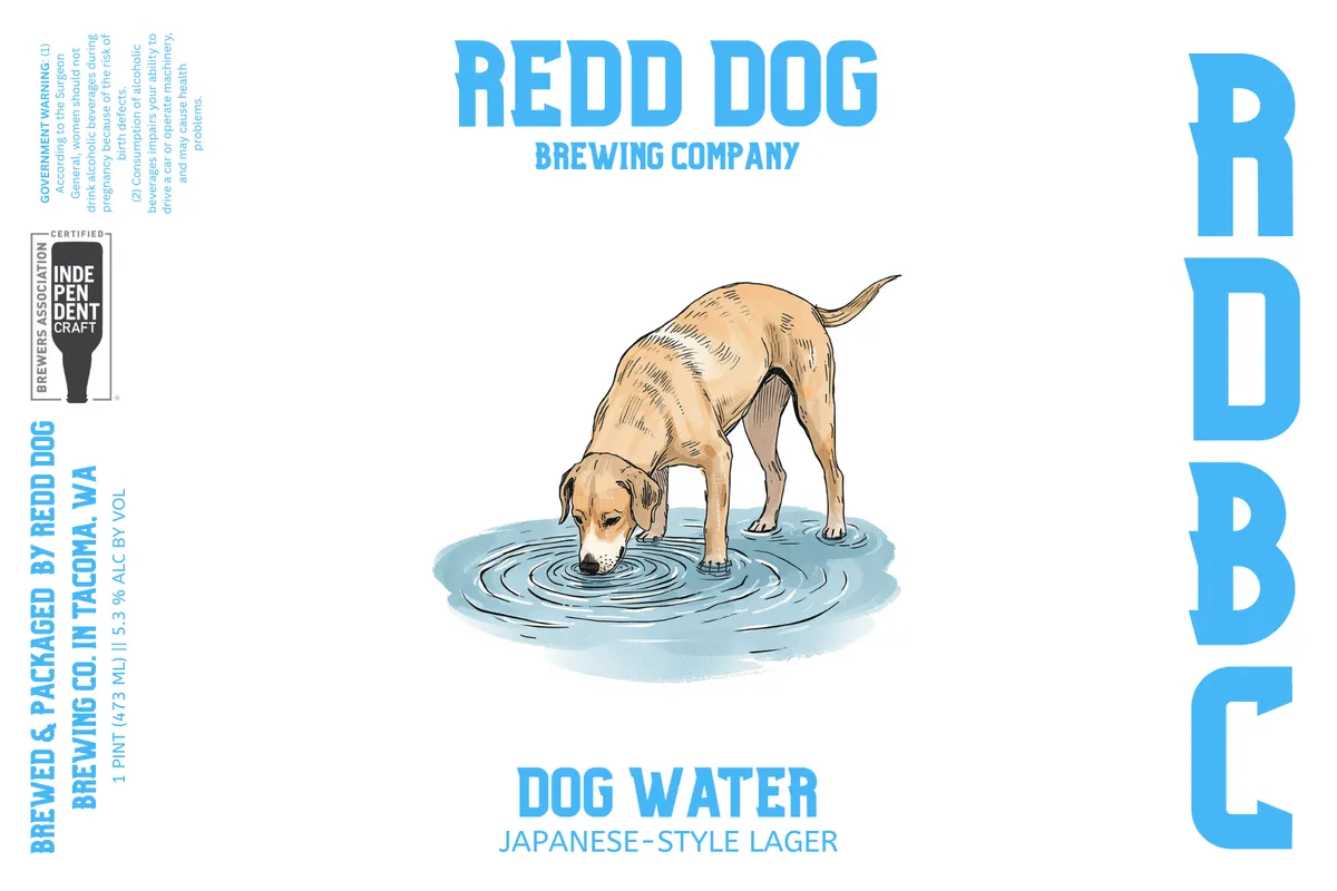 Dog WaterA tan-coloured dog lowers its head to drink from a circular pool of blue water rendered with concentric ripples, occupying the centre of a white label. The illustration uses pen-and-ink linework with watercolour wash in tan and light blue. Text runs across the top in bold blue sans-serif capitals and vertically down the right edge, with a Brewers Association Independent Craft badge and regulatory information along the left.blue · tan · white · light blue
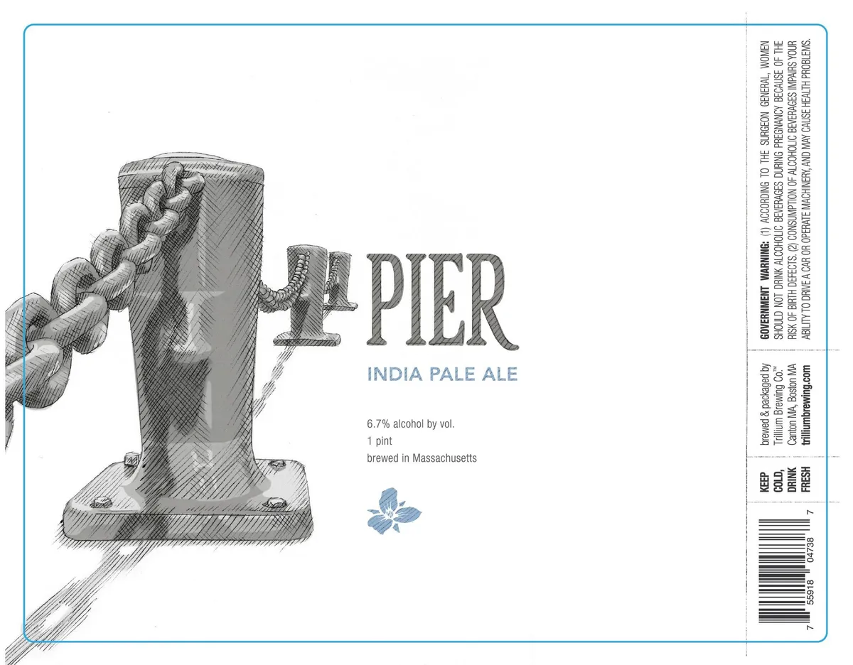 PierA pen-and-ink drawing of a wooden pier piling dominates the left side of the label, rendered in crosshatching with a coiled rope wrapped around its upper section. The beer name "PIER" is integrated into the composition in large serif capitals, with the style and substyle text positioned below in smaller type. A small blue hop leaf graphic sits beneath the descriptive text, centered on the lower half of the label. The field is white with a blue-ruled border frame.white · grey · blue
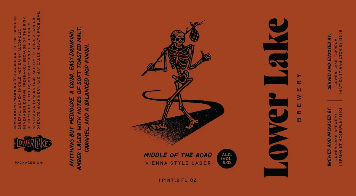 Middle of the RoadLOWER LAKE BREWERYA skeleton in a jaunty pose holds a spear and a bunch of grapes aloft while balancing on a stylized black teardrop or seed shape that occupies the center of the label. The skeleton is rendered in black line work with crosshatched shading on the ground beneath it, set against the burnt orange field. The beer name and style sit below the figure in italic script, flanked by regulatory and brewery information in various weights of sans-serif type arranged vertically along both edges.burnt orange · black · cream
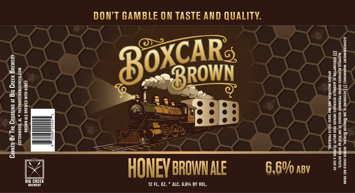 Boxcar BrownA steam locomotive rendered in sepia and cream tones dominates the centre of the label, pulling a cargo car marked with dice, set against a honeycomb pattern that fills the dark brown background. The beer name appears in ornate gold serif lettering with decorative flourishes above and below the locomotive. Typography is arranged vertically along both side edges, with the tagline 'Don't Gamble on Taste and Quality' in gold caps at the top and 'Honey Brown Ale' in gold caps at the bottom.brown · gold · cream · sepia
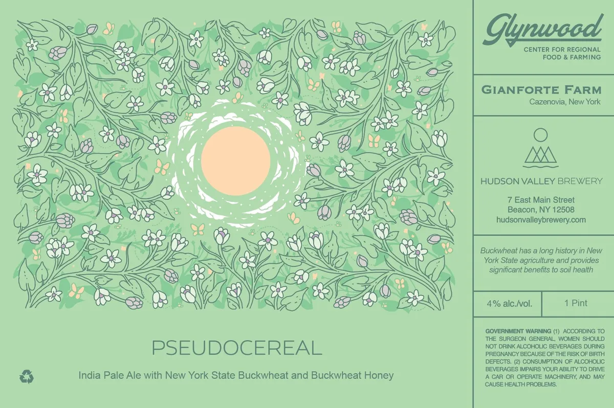 PseudocerealPSEDOUCEREALA pen-and-ink floral pattern fills the full front in shades of sage and pale green, depicting flowering plants with small white blossoms, buds, and delicate leaves scattered across the entire field. At the centre, a cream circle sits within a white wreath motif, creating a focal emblem. The beer name appears in lowercase sans-serif type at the bottom in a muted green that echoes the background.sage green · cream · white · pale green
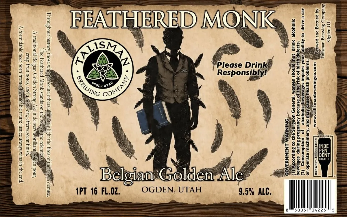 Feathered MonkTALISMAN BREWING COA silhouetted figure in monastic robes and winged harness stands centered against a cream background, holding a blue book, surrounded by scattered feathers rendered in pen-and-ink style. The Talisman Brewing Company circular emblem—featuring interlocking trinity knots and hop cones on a black ground—anchors the upper left, while the beer name frames the figure in outlined serif capitals. Typography, feather motifs, and regulatory panels are distributed across the full label on a textured, aged-paper ground.cream · black · blue
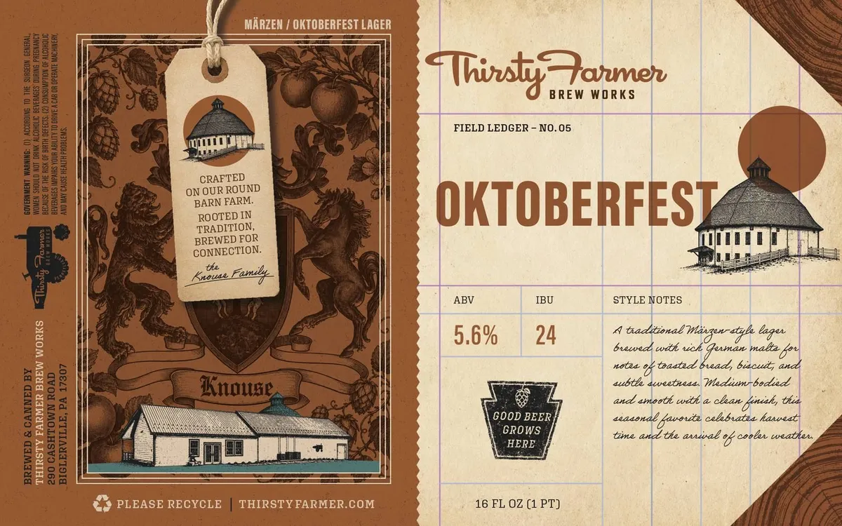 OktoberfestThe front label features a classical heraldic crest in brown and cream, centered within an ornate frame; the crest displays a barn building at its base, crowned by a domed agricultural structure, flanked by leafy botanical ornaments and seated lions in a symmetrical arrangement. A hanging tag illustrated in pen-and-ink lines the architectural elements in black against cream, anchored by rope. The back panel presents a second barn structure rendered in fine line-work, positioned beside a large rust circle, on a gridded cream field with hand-lettered script text. The palette throughout is oxblood, cream, and black on kraft brown stock.oxblood · cream · black
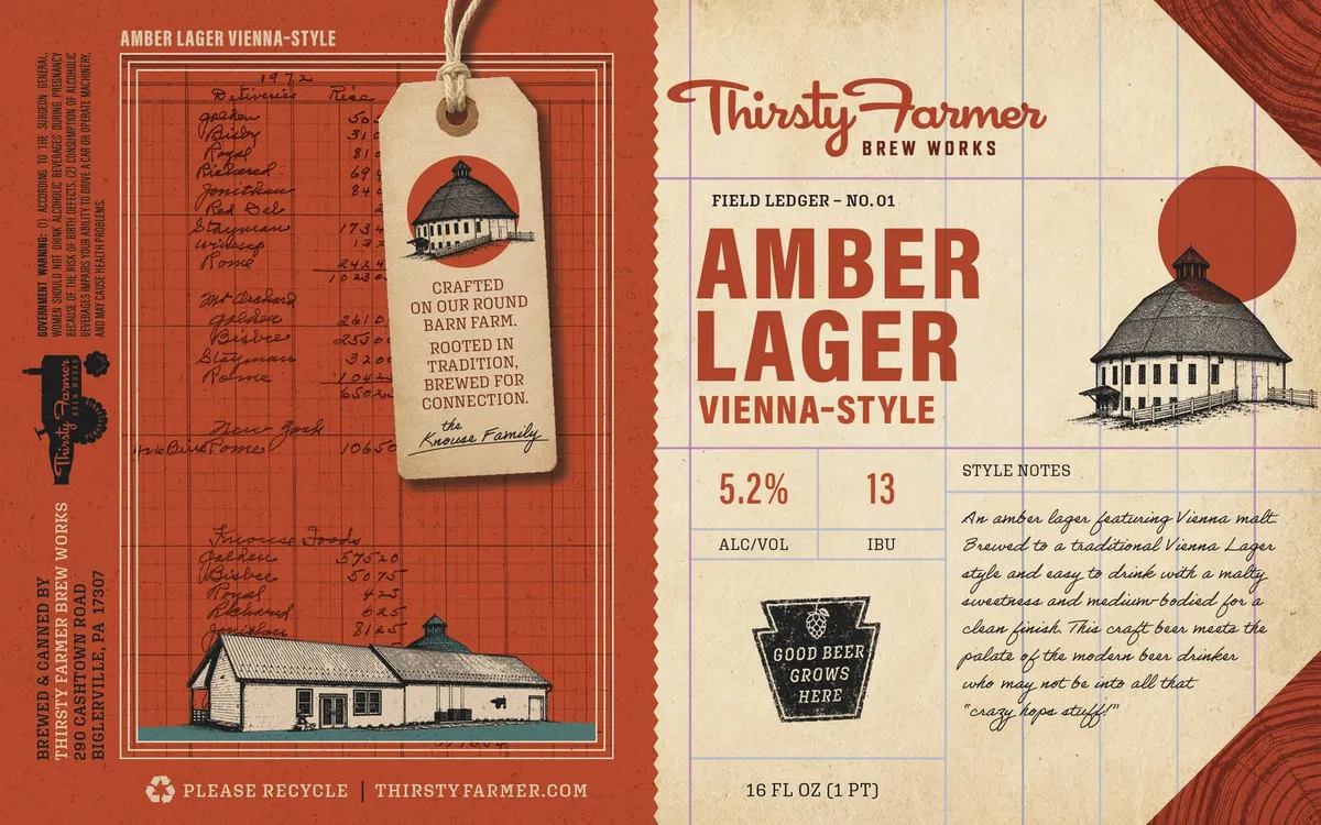 Amber Lager Vienna-StyleAMBER LAGERThe front panel features a cream-colored field ledger sheet with the beer name in large oxblood letters; a round barn with a domed roof rendered in pen-and-ink sits at top right, with a solid oxblood circle behind it suggesting a sun. The back panel shows a red grid background with handwritten ledger notations, a wooden barn structure in the lower half, and a hanging tag illustration at top center depicting the same round barn. Typography mixes a hand-lettered script for the brewery name with slab-serif numerals and caps for style information, all set against horizontal ledger lines.cream · oxblood · black · white
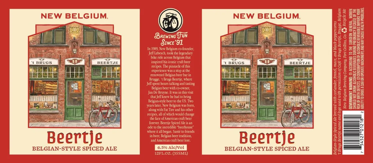 BeertjeNEW BELGIUMA detailed illustration of a narrow brick storefront with green shutters and doors dominates the front label, depicting the Belgian beer bar 't Brugs Beertje in Bruges with a bicycle parked outside and lit window displays showing beer bottles and patrons within. The building is rendered in warm terracotta and green tones with architectural detail, framed by a red border and the beer name set in large serif capitals below. The back label contains the brand history in cream type on the red ground, with a circular bicycle emblem at top centre.red · cream · terracotta · sage-green
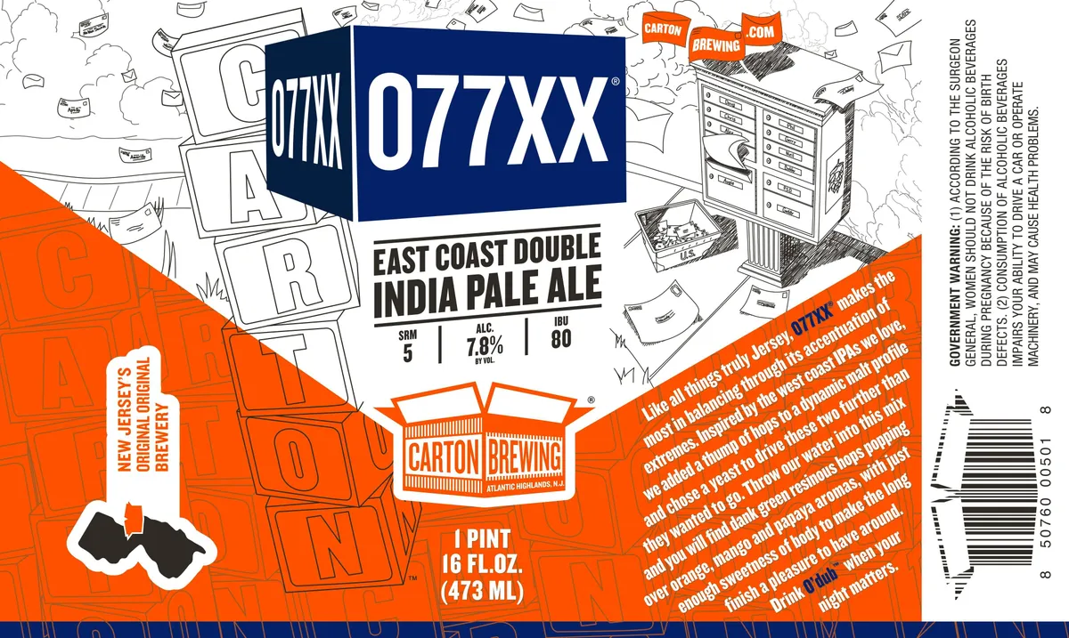 077XXA pen-and-ink map of an urban street grid, rendered in white line-work on navy and orange split-field backgrounds, dominates the upper two-thirds of the label. The brewery's shield logo and the beer name 077XX appear centrally in white sans-serif type on the navy field, with the style name EAST COAST DOUBLE INDIA PALE ALE below in bold condensed caps. The lower third shifts to bright orange, carrying the Carton Brewing shield badge, volume statement, and marketing copy in black and white type. Large translucent letter fragments spell out partial words across both fields as a pattern accent.navy · orange · white · black
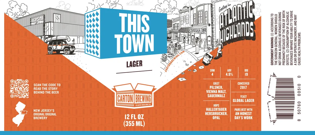 This TownA split-composition label dominated by a pen-and-ink illustration of a downtown street scene rendered in black line work across the upper half, with stylised buildings, street lamps, and a vintage car. A bright blue diamond-patterned panel overlays the centre bearing the beer name in condensed sans-serif caps. The lower half is solid burnt orange, housing the brewery emblem and spec sheet in white and black type. The entire composition is framed by a blue band at the foot.burnt orange · bright blue · white · black
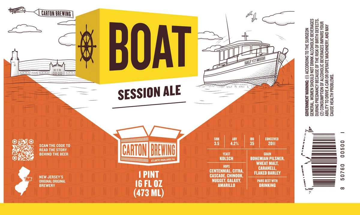 BoatA split-field composition divides the label horizontally into white upper and burnt-orange lower sections, with a bold yellow box containing the beer name dominating the upper third. The upper half features pen-and-ink line illustrations of a coastal landscape—a lighthouse, sailing boat, clouds, and ship's wheel—rendered in monochrome against the white ground. The lower section shows a stylized brick-pattern texture in burnt orange, interrupted by a framed badge shape containing the brewery logo. A detailed sailing vessel rendered in pen-and-ink sits beached on orange terrain in the upper-right corner.yellow · burnt-orange · white · dark-brown
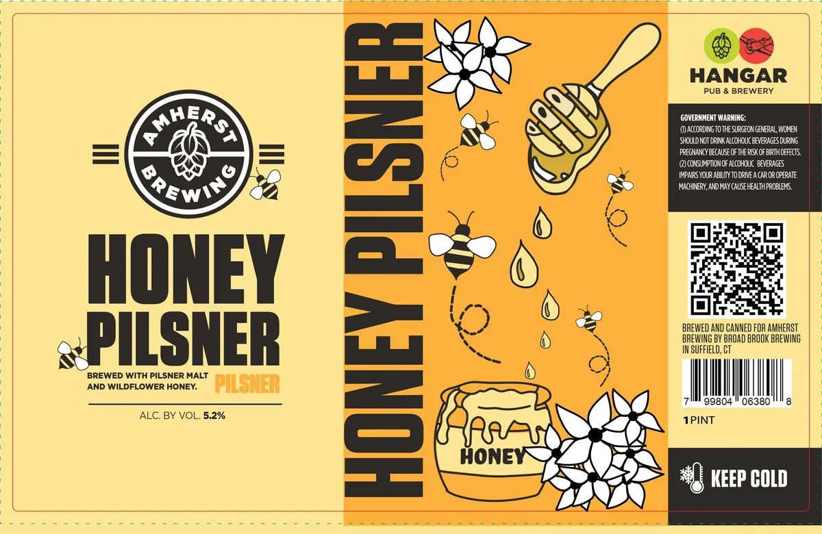 Honey PilsnerThe label splits into two fields: a cream left panel with the Amherst Brewing circular logo and bold black sans-serif type announcing "HONEY PILSNER"; a golden-orange right panel dominated by large black sans-serif type reading "HONEY PILSNER" vertically, with pen-and-ink illustrations of honeybees, white wildflowers, water droplets, and a honey jar scattered across the field. The palette is cream, gold, black, and white, rendered in a clean, linear hand-drawn style with no fill.gold · cream · black · white
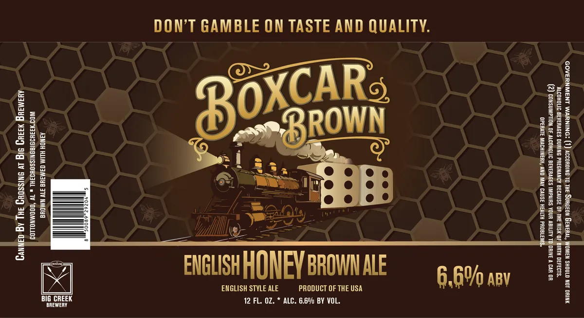 Boxcar BrownA steam locomotive in sepia and ochre tones dominates the centre of the label, pulling a white boxcar against a honeycomb-patterned dark brown background. The beer name appears in ornamental serif lettering with decorative flourishes above the engine, while regulatory text and tagline occupy the top and bottom edges. The finish is matte with no visible special treatment.dark brown · gold · sepia · cream
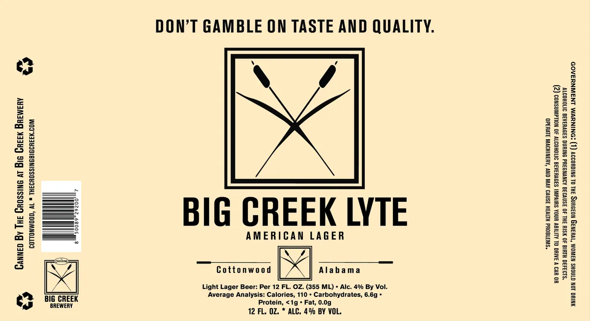 Big Creek LyteFour oars cross in an X formation within a double-lined square frame, rendered in solid black lines against the cream label. The compositional emblem sits centered above the beer name in heavy sans-serif caps, with the location and style specifications positioned below. The entire label is cream-coloured with black typography and illustration, spare and geometric in execution.cream · black