A cut through the label corpus
Pen and ink beer labels
370 labels in the register read as pen and ink. Every one was described by us from the filed artwork — the TTB records what a label says, never what it looks like.
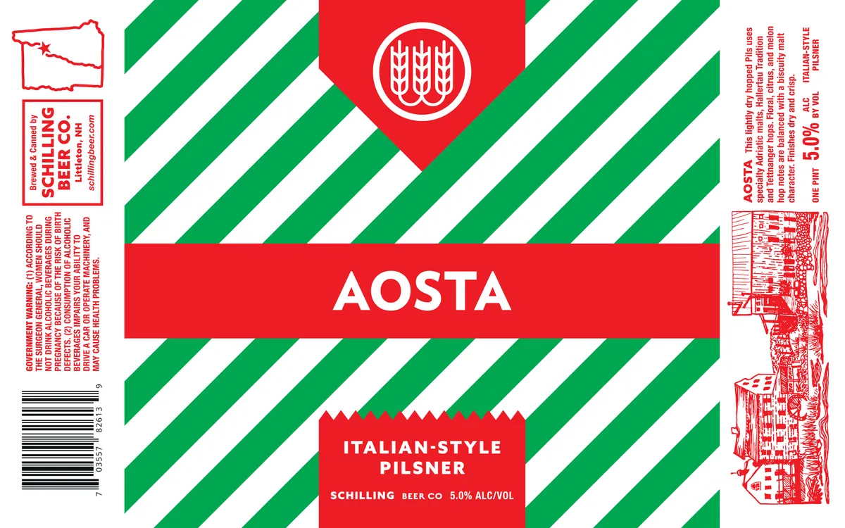 AostaSCHILLING BEER CO.A bold diagonal-stripe field of kelly green and white covers the entire label, anchored by three red banner sections — a small circular emblem at the top centre displaying a stylized wheat sheaf in white outline, a large horizontal band across the middle bearing the beer name in white sans-serif caps, and a lower red panel with the style and brewery information in white type. The right edge features a detailed line-art illustration in red of an Italian alpine village nestled against mountains, rendered in a fine crosshatch technique.red · kelly green · white
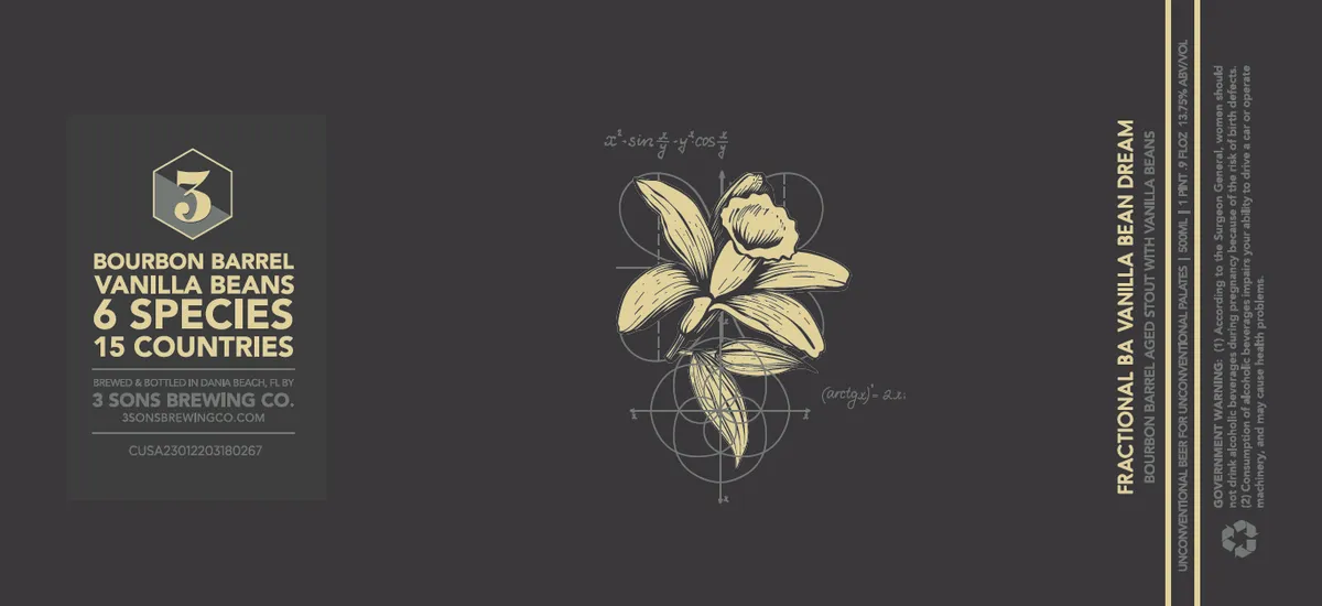 Fractional BA Vanilla Bean Dream3 SONS BREWING COA detailed botanical illustration of vanilla orchid blossoms dominates the center, rendered in line-art style with geometric construction guides and mathematical annotations overlaid across the composition. The flowers are depicted in cream against a charcoal ground, surrounded by circular and linear scaffolding that suggests scientific or technical precision. At left, a hexagonal emblem frames the numeral "3" in gold, with cream-colored text below stating the beer's name and ingredient sourcing across multiple lines; regulatory text and brewery information occupy the lower left in small sans-serif type.charcoal · cream · gold
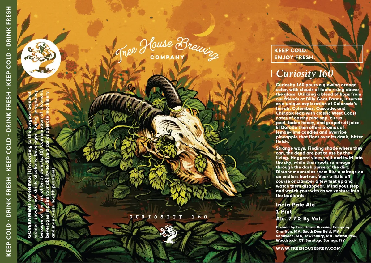 Curiosity 160A horned skull crowned with hop vines and flowering plants dominates the centre of the label, rendered in pen-and-ink cross-hatching and line work against a graduated orange-to-amber background scattered with organic brush marks. Dense foliage—hop leaves and wild grasses—frames the skull in dark forest green, creating a full-bleed botanical surround. The colour field shifts from bright golden yellow at the top through rust and amber to deep brown at the bottom, establishing depth behind the central memento mori motif.amber · forest green · cream · black
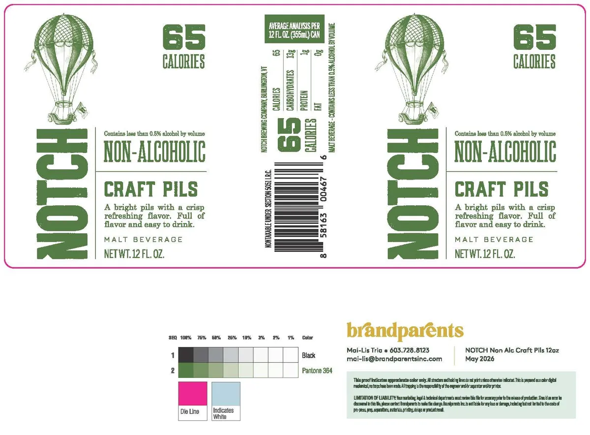 Craft PilsNOTCHA hot-air balloon rendered in pen-and-ink linework occupies the upper third of the label, its envelope patterned with a crosshatch grid and suspended above a wicker basket. The branding "NOTCH" runs vertically in bold sans-serif down the left edge, with "65 CALORIES" and "NON-ALCOHOLIC" / "CRAFT PILS" stacked to its right. The composition is symmetrical, with the balloon and type arrangement mirrored across a central vertical axis, all printed in forest green on a white field with a bright magenta border.green · white · magenta
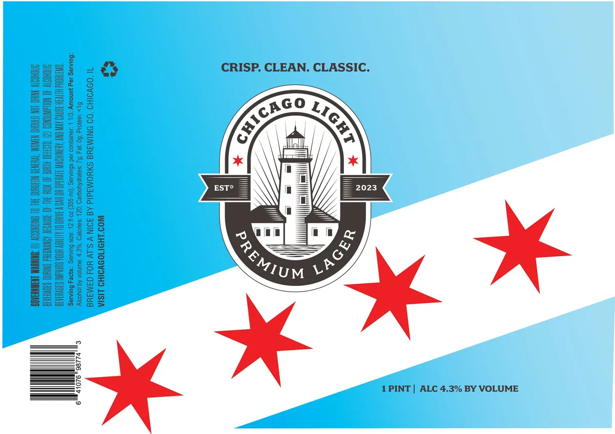 Chicago LightA central emblem depicts Chicago's lighthouse rendered in pen-and-ink style with radiating lines, flanked by two banners inscribed "EST°" and "2023", and encircled by text reading "CHICAGO LIGHT" and "PREMIUM LAGER". Four red stars of varying sizes are scattered across a split-field composition of sky blue and cream, with the brewery's tagline "CRISP. CLEAN. CLASSIC." anchoring the top in heavy sans-serif capitals. The regulatory panel runs vertically along the left edge in small type.sky blue · cream · red · black
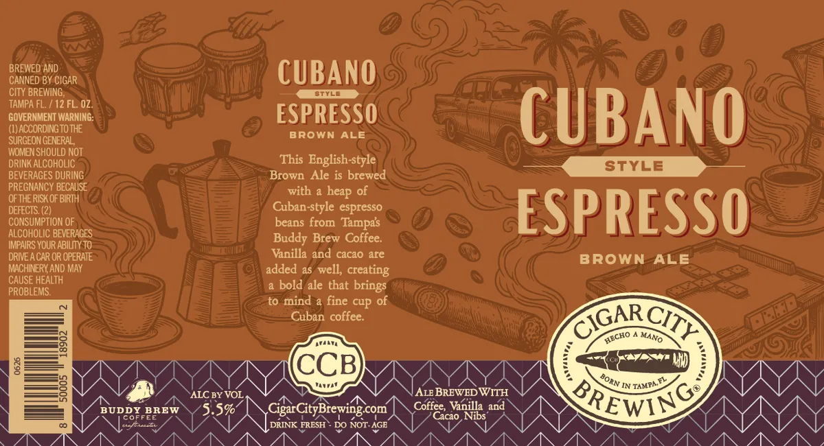 Cubano Style EspressoCIGAR CITY BREWINGThe label depicts a sprawling scene of Cuban imagery rendered in pen-and-ink style across a warm ochre ground: a classic 1950s sedan, palm trees, coffee cups, a traditional moka pot, scattered coffee beans, and decorative flourishes fill the composition. Large cream-coloured serif capitals announce "CUBANO" and "ESPRESSO" in the upper right, with smaller type describing the beer's character. A purple-brown horizontal band at the bottom contains the brewery's circular badge and ingredient callouts, anchoring the design.ochre · cream · purple-brown · tan
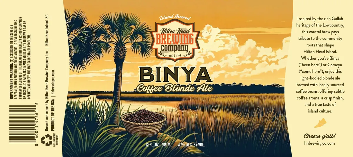 Binya Coffee Blonde AleHILTON HEAD BREWING COMPANY, INC.A lowcountry landscape dominates the label, with a lone palmetto tree rising from marshland in the foreground, a woven basket of coffee beans nestled in the marsh grasses below, and a golden sky with cumulus clouds stretching across the upper register. The scene is rendered in a detailed pen-and-ink style with hand-drawn linework defining the vegetation, water, and sky gradations. The beer name appears in bold sans-serif capitals across the centre, with the descriptor 'Coffee Blonde Ale' set in a flowing script below, while the brewery shield sits at top centre in a shield cartouche.golden yellow · navy · cream · tan
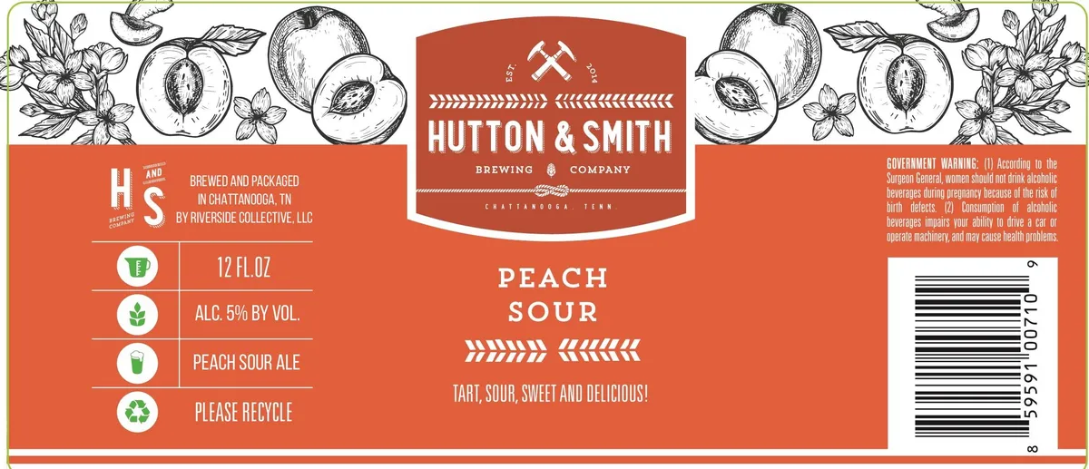 Peach SourHUTTON & SMITHA pen-and-ink border of peaches, blossoms, and sliced fruit runs across the top and bottom edges of the label in a horizontal band composition. The central field is a solid burnt orange ground with white sans-serif typography announcing the beer name "PEACH SOUR" in large caps, flanked by arrow ornaments. The brewery name and location appear in a white banner at the top, with crossed pickaxes as a logo mark, against the same orange field.burnt orange · white · cream
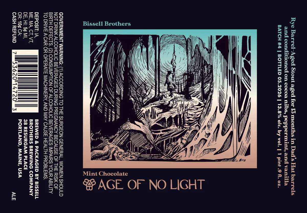 Mint Chocolate Age of No LightA pen-and-ink engraving dominates the upper two-thirds of the label, depicting a figure exploring a cavern lit by a glowing orb, surrounded by dramatic cross-hatched rock formations and dripping stalactites. The composition is rendered in linear white strokes on a dark ground, creating deep shadow and geological texture throughout the scene. Below the illustration, the beer name appears in copper serif capitals against the navy background. The entire label is framed by a turquoise horizontal band that contains the central image, creating a vignette effect.navy · turquoise · copper · cream
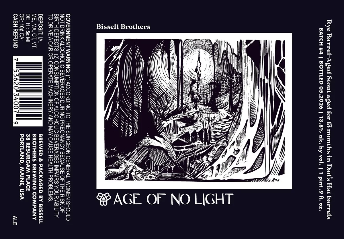 Age of No LightA pen-and-ink illustration occupies the center of the label, depicting a figure standing in a cavernous underground space surrounded by dramatic rocky outcrops and stratified walls rendered in sharp cross-hatching. The scene is framed in a white border and positioned above the beer name in a geometric serif typeface. The entire composition sits on a navy background with regulatory text and a barcode vertically aligned on the left and right edges.navy · white · black
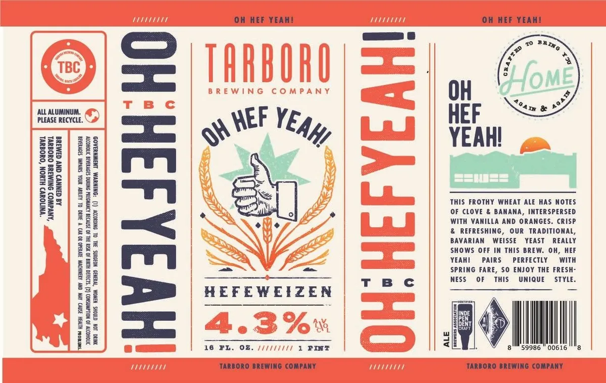 Oh Hef Yeah!TARBORO BREWING COMPANYA thumbs-up gesture wrapped in wheat stalks and framed by a mint-green star occupies the centre of the label, rendered in pen-and-ink line work. The composition is symmetrical, with the beer name "OH HEF YEAH!" arching above in navy caps and "HEFEWEIZEN" anchored below. The palette is coral-red, navy, cream, and gold wheat, printed across a vertical format with the brewery name and ABV positioned at the base.coral · navy · cream · gold
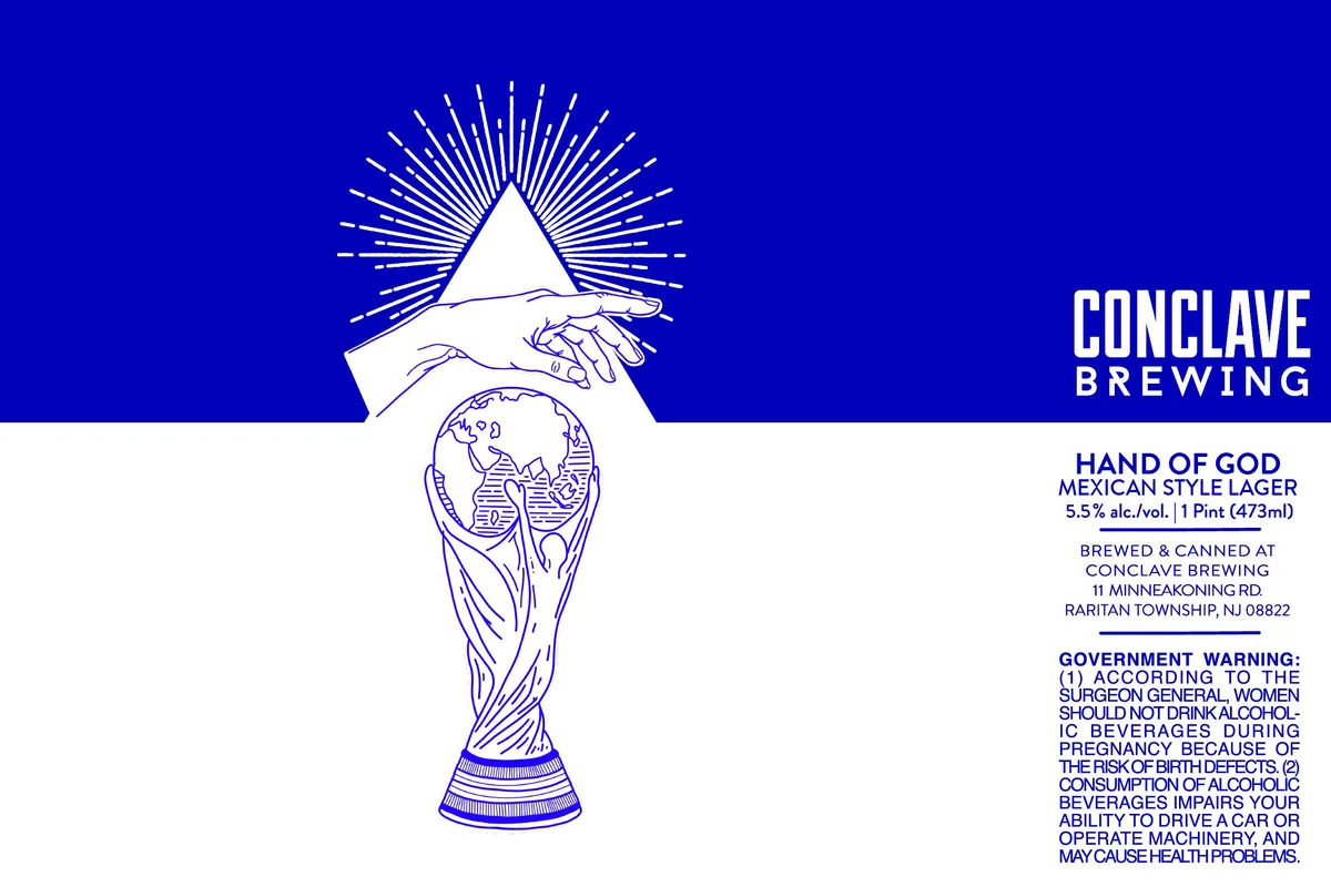 Hand of GodCONCLAVE BREWINGA pen-and-ink illustration of a hand emerging from a cloud, fingers extended downward in blessing over a World Cup trophy rendered in fine line work. The composition is vertically centered across the upper half of the label, with a radiating sunburst of dashed lines behind the hand. The entire image is rendered in royal blue ink on a solid bright blue ground, with the brewery name positioned in the upper right in condensed sans-serif capitals and the beer name below the illustration in the same typeface.royal blue · bright blue · white
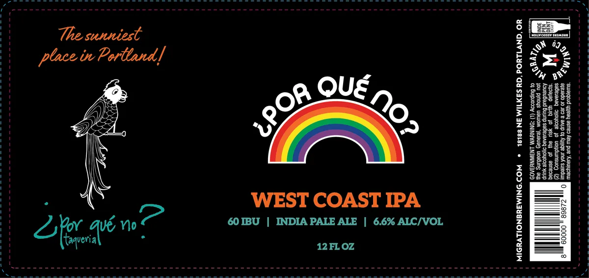 ¿Por Qué No?POR QUE NO INDIA PALE ALEA white-line engraved parrot perches on the left side of a black field, paired with hand-lettered Spanish text in teal and burnt orange below. The composition centers on a bright rainbow arc spanning the upper-middle area, rendered in full spectrum with a bold geometric semicircle. Type in white and teal announces the beer name and style across the lower half, with regulatory information stacked vertically along the right edge.black · white · orange · rainbow
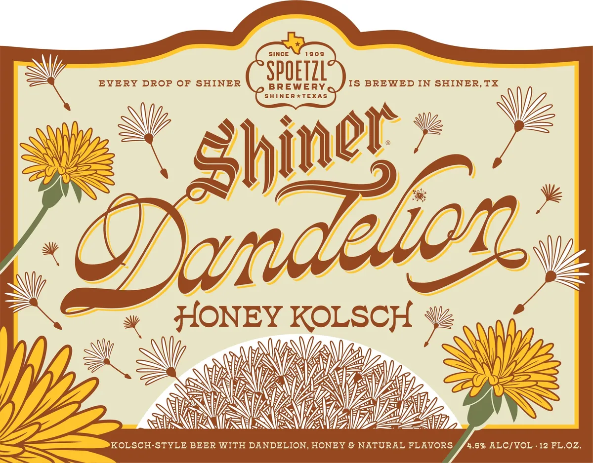 Ella Langley Dandelion Honey KolschSHINERA scattered pattern of dandelion flowers and seed heads in yellow and brown ink fills the cream-coloured label, with two full blooms anchoring the left and right edges and smaller botanical line drawings scattered across the field. The beer name 'Shiner Dandelion' dominates the centre in large decorative serif capitals with gold outlines and brown fill, positioned above 'HONEY KOLSCH' in smaller sans-serif type. The entire design is framed by a scalloped brown and gold border, and the Spoetzl Brewery mark with Texas motif sits at the top. A hand-lettered script attribution to Ella Langley appears below the main illustration on the back, accompanied by a short lyrical quote.cream · brown · yellow · gold
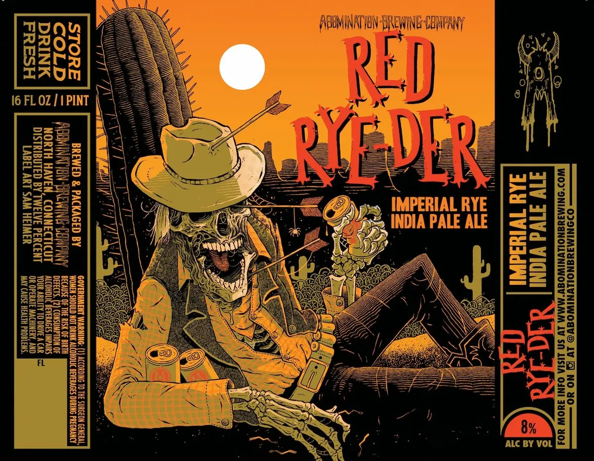 Red Rye-DerABOMINATION BREWING COMPANYA skeletal cowboy figure dominates the center of the label, rendered in pen-and-ink crosshatching and seated against a desert landscape with saguaro cactus and low hills. The skeleton wears a wide-brimmed hat skewered by a large saguaro arm, a patterned shirt, and holds an arrow and a mug of golden beer. The composition is anchored by bold red lettering for the beer name overlaid across the upper half of the orange sky, with the sun rendered as a solid white circle behind the figure. The palette is orange, black, cream, and red, with fine linear detailing throughout the illustration.orange · black · cream · red
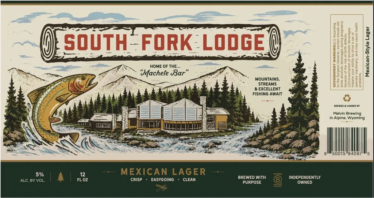 South Fork LodgeMELVIN BREWING COA landscape scene dominates the label: a large trout leaps from a rushing stream on the left, while a mid-century lodge with corrugated metal siding sits nestled among coniferous forest and mountains in the background. The composition is framed by a log-style banner bearing the beer name in red slab-serif capitals at the top, with blue-tinted clouds rendered in horizontal bands across the upper third. The palette is ochre and gold for the trout, forest green and tan for the conifers, and cream for the buildings, set against a pale background with blue water and sky.cream · olive-green · gold · blue
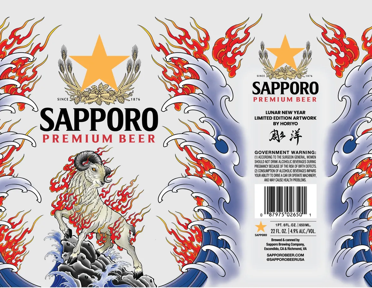 Sapporo Premium BeerSAPPORO PREMIUMA white rat or mouse stands on rocky ground amid stylised waves, surrounded by red and gold flames that rise across the full composition. Orange stars float above wheat sheaves at top, while blue and white water swirls occupy the lower third. The illustration renders in pen-and-ink with watercolour, employing a Japanese aesthetic that echoes ukiyo-e woodblock prints. Type sits centre-left in bold sans-serif, with "SINCE 1876" and a decorative emblem anchoring the design.cream · red · orange · blue
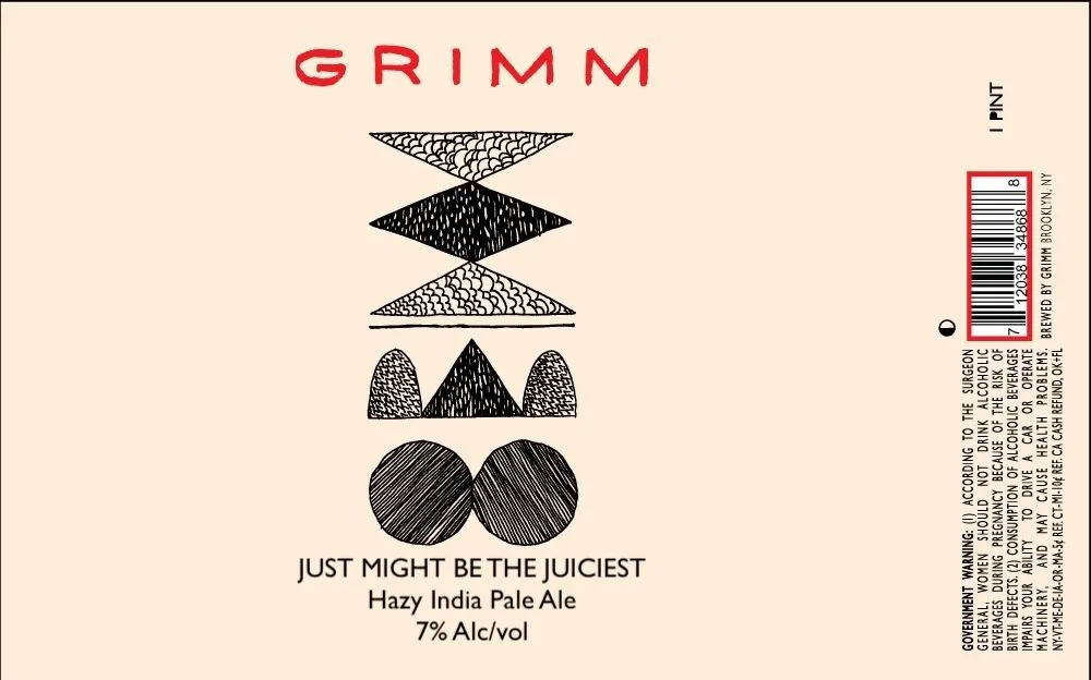 Just Might Be The JuiciestGRIMMThe label centers on a vertical stack of five geometric shapes rendered in pen-and-ink cross-hatching and stipple: a textured diamond, a solid black diamond, a textured triangle, three hop cones (two textured, one solid), and two overlapping circles with radiating lines suggesting citrus fruit. The brewery name GRIMM appears in red sans-serif capitals at the top, with the beer name and style centered below the illustration in dark type.cream · red · black
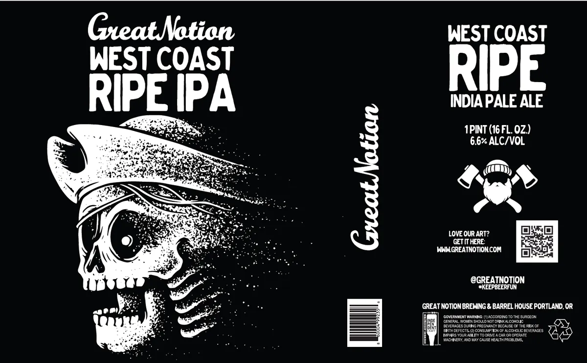 West Coast RipeGREAT NOTIONA human skull wearing a wide-brimmed hat fills the left third of the label, rendered in white line-work against black with stippled texture across the cranium and jaw. The skull's eye socket is hollow and dark, the teeth are prominent, and two crossed axes protrude from behind the hat's band. Vertical text reading "Great Notion" curves along the spine on the right side. The composition is split-field, with the skull occupying most of the left panel and brewery and beer name stacked in sans-serif caps on the upper right; regulatory and social-media information anchors the lower right.black · white
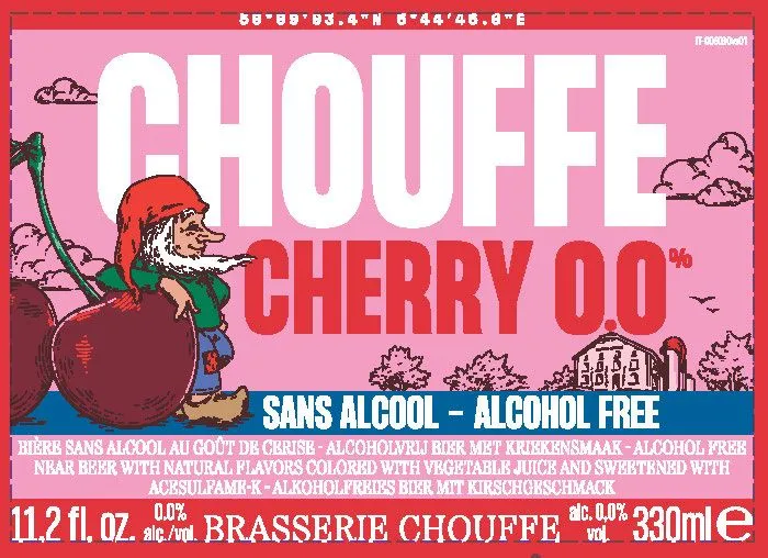 Chouffe Cherry 0.0CHOUFFEA gnome in a red cap and green jacket stands atop an oversized cherry, holding a long pipe, set against a pink sky dotted with fluffy clouds and a farmhouse in the distance. The composition is a full-bleed illustration with the beer name in large white capitals across the upper half and the subtitle in red below. Colour palette is dominated by pink, red, cream, and deep burgundy, with the gnome rendered in pen-and-ink line work.pink · red · cream · burgundy
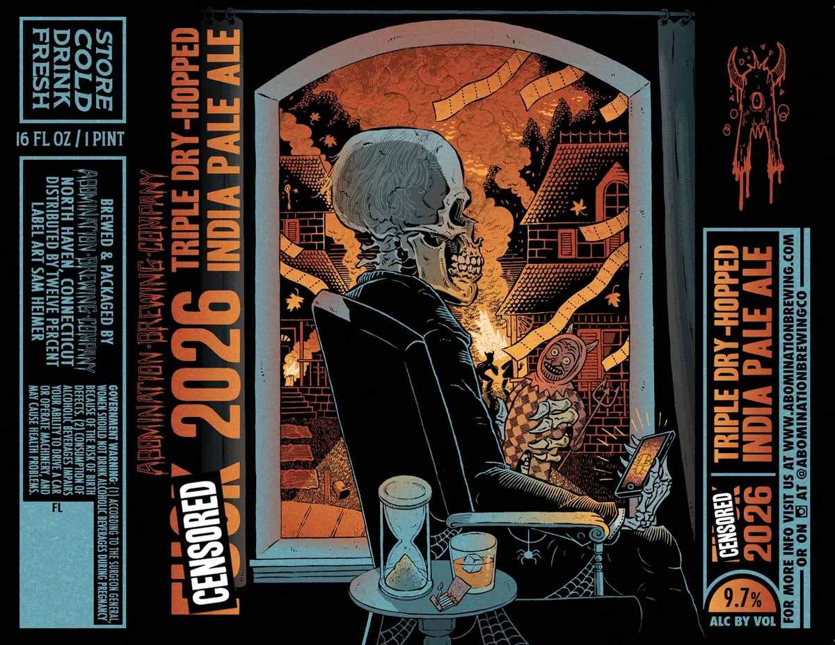 Censored 2026ABOMINATION BREWING COMPANYA skeleton in a black coat sits at a table with an hourglass and glass, framed within an arched doorway that opens onto an ornate, architecturally complex interior rendered in orange and black. The background features intricately detailed buildings with patterned brick, windows, and decorative elements suggesting a fantastical or hellish landscape. The composition uses bold pen-and-ink linework throughout, with cross-hatching and stippling creating tonal variation across the orange ground.orange · black · pale blue · cream
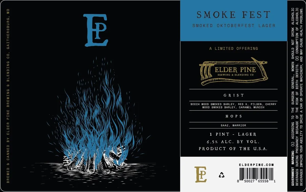 Smoke FestELDER PINE BREWING & BLENDING COThe left panel features a campfire rendered in pen-and-ink linework, its flames rendered in blue and white against a black ground, with logs at the base and sparks rising upward. The Elder Pine monogram in blue caps floats above the fire. The right panel shifts to a teal background with the beer name in spaced caps, a banner-framed brewery logo in gold, and ingredient and specification text in all-caps sans-serif. The label is predominantly black and teal with gold accents.black · teal · gold · white
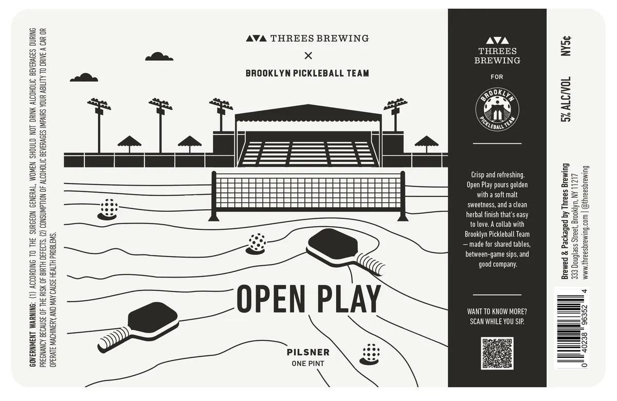 Open Play PilsnerA line-drawn pickleball court occupies the central field, viewed from above with paddles and balls scattered across the playing surface and surrounding area; a stadium structure with floodlights and umbrellas frames the top half in simplified geometric forms. The entire composition is rendered in black line art on a cream ground, with the beer name set in heavy sans-serif capitals across the middle of the court. A dark charcoal panel on the right edge contains the brewery branding, regulatory information, and a QR code.cream · black
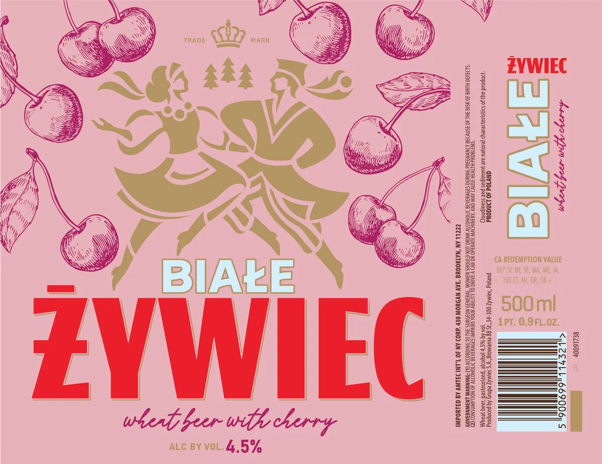 Białe ŻywiecZYWIEC BIALE CHERRYA heraldic figure in gold silhouette—a seated jester or nobleman in ornate dress, flanked by evergreen trees and a crown—occupies the upper centre of a pink field. The figure is surrounded by pen-and-ink rendered cherries with stems scattered across the label. Large sans-serif lettering in red anchors the lower half, with smaller cursive script below and the beer name in blocky turquoise caps to the right. The composition balances the ornamental crest against the fruit motif and typography with gold foil detailing visible on the heraldic emblem.pink · red · gold · turquoise
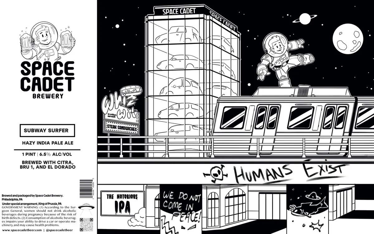 Subway SurferSPACE CADETA pen-and-ink comic illustration dominates the label, rendered in black line on a white ground with a starfield background. The scene shows a retro-futuristic apartment building interior with a suited astronaut leaping from a rooftop across a futuristic train car, holding beer mugs aloft, while planets and stars scatter across a black sky. Below, a secondary comic panel depicts an interior room with the hand-lettered text 'HUMANS EXIST' and 'WE DO NOT COME IN PEACE,' establishing a deadpan sci-fi narrative across the full front and wrapping to the back.black · white · cream
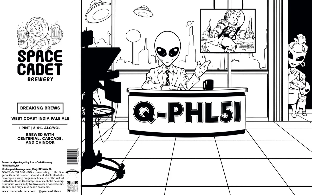 Breaking BrewsSPACE CADETAn alien figure in a business suit sits at a desk in a retro-futuristic office, signing documents with flying saucers visible through the window behind; the scene occupies the full front in pen-and-ink cartoon style, rendered in black line on white with silhouetted details. The composition frames the alien centrally at the desk, with framed pictures and alien visitors arranged to the sides, and a cityscape with rockets visible through the background windows. The beer name Q-PHL51 appears in bold black sans-serif lettering across a band at the desk level, while the Space Cadet Brewery name and Breaking Brews sub-label sit in smaller type to the upper left.black · white
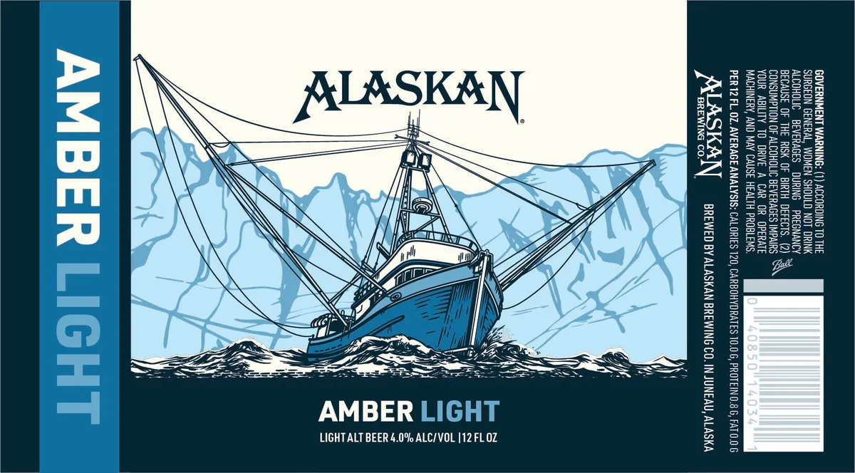 Amber LightALASKANA fishing vessel with rigging and masts dominates the central panel, rendered in pen-and-ink style with the hull coloured in blue and the ropes and superstructure in black line-work, set against a light blue background with stylized mountainous peaks. The boat sits in churning white water at the composition's base. The beer name and style sit below in sans-serif type on a dark teal band that spans the label width.teal · blue · cream · black
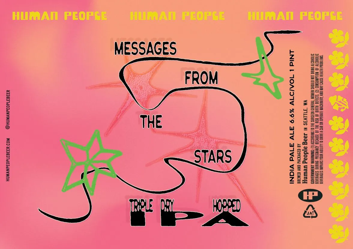 Messages From The StarsHUMAN PEOPLE BEERA gradient background shifts from hot pink to peachy orange across the label. Overlaid in the center are faint, large hand-drawn figures rendered in a salmon-red tone, with bold black outlines forming organic, curved shapes that frame the beer name and style. Bright lime-green stars punctuate the composition—one on the left side and another on the upper right—while a vertical column of yellow hop illustrations runs down the right edge. The text "MESSAGES FROM THE STARS" sits in thick black lettering within the outlined forms, with "TRIPLE DRY HOPPED" below in solid black blocks.hot pink · peach · lime green · yellow
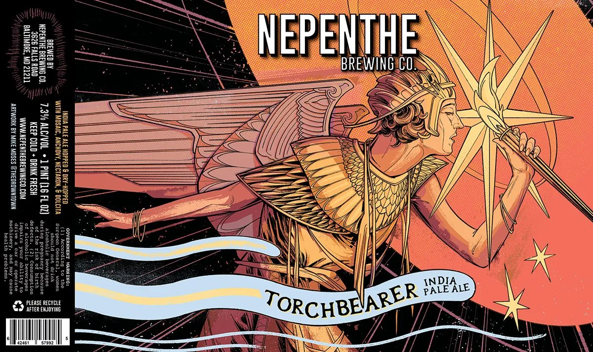 Torchbearer India Pale AleNEPENTHE BREWING CO.A winged mythological figure in profile, rendered in pen-and-ink linework with hand-applied watercolour washes, dominates the composition across the full front. The figure holds aloft a star-tipped torch against a gradient sky shifting from orange to deep red, with geometric linear elements suggesting radiating light or energy across a black field. The beer name curves along a blue-and-white ribbon banner across the lower third, while the brewery name sits centred at the top in bold sans-serif capitals. The entire illustration is contained within a frame of fine parallel lines and cosmic scatter.orange · red · black · cream
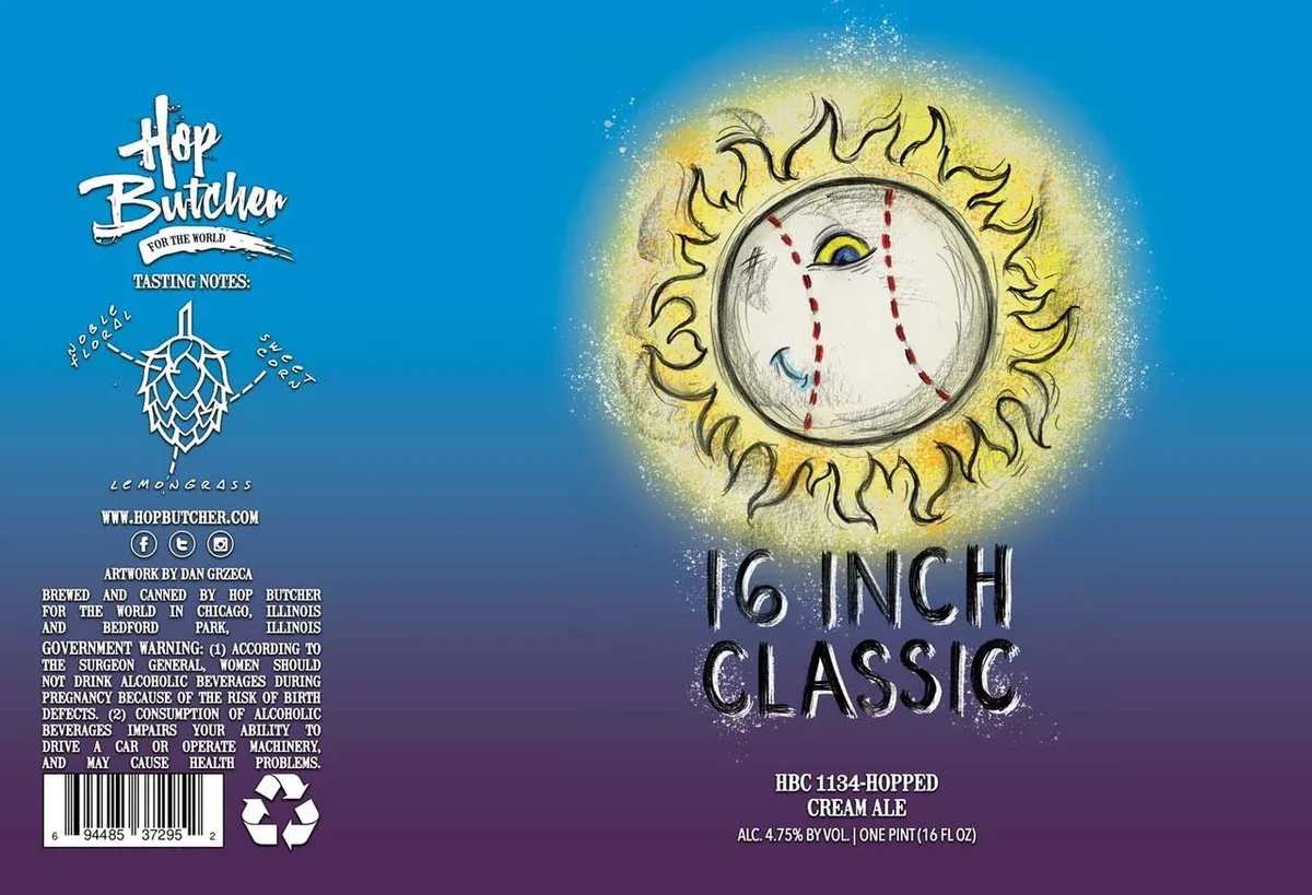 16 Inch ClassicHOP BUTCHER FOR THE WORLDA stylized sun face dominates the right side of the label, rendered in pen-and-ink with a circular white face marked by dashed red lines radiating outward, a single yellow eye, and yellow flame-like rays surrounding it against a glowing yellow halo. The background transitions from bright blue at the top to deep purple at the bottom, creating a gradient sky. On the left, a hop cone and tasting notes appear in white type, while the beer name "16 INCH CLASSIC" is set in large metallic lettering across the lower right, with brewery information and regulatory text occupying the bottom left corner.blue · yellow · white · purple
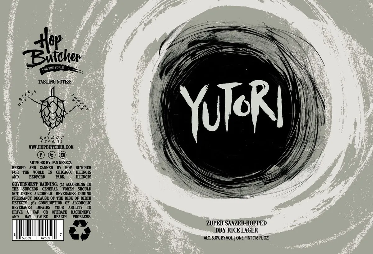 YutoriHOP BUTCHER FOR THE WORLDThe label centers on a large black circle with concentric brushstroke rings rendered in ink, containing the beer name "YUTORI" in white metal-style lettering. Behind and around this circle sits a pale grey-green field with organic white and grey brushwork suggesting movement or energy. The brewery's hop-cone logo and tasting-notes panel occupy the upper left, while regulatory and production information runs along the bottom and lower left edge.grey-green · black · white · cream
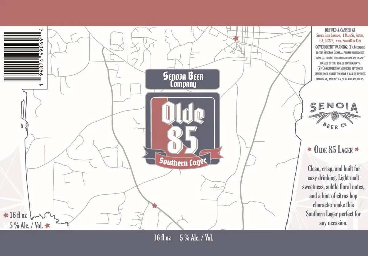 Olde 85 Southern LagerA street map of Senoia, Georgia fills the background in fine tan linework, anchoring the label's regional identity. Centered is a shield-shaped badge in navy and oxblood containing the words "Olde 85" in bold white Art Deco capitals, with "Southern Lager" on a banner below. The Senoia Beer Company name and logo appear above the shield, rendered in period lettering with a wheat sheaf motif. Type and regulatory information occupy the right and left edges.cream · navy · oxblood · tan
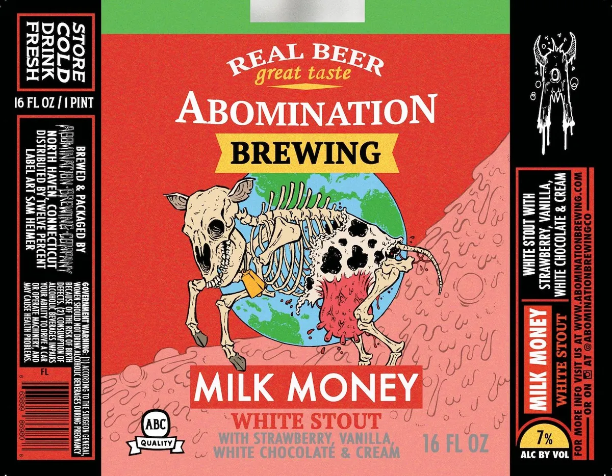 Milk MoneyABOMINATION BREWING COMPANYA skeletal cow stands centered on the label, its ribcage rendered in pen-and-ink linework and filled with a green landscape and blue sky, while its body is dressed in a red garment with black spots. The composition extends across the full front against a bright red background, with a pink textured ground plane behind the figure and an angelic winged creature sketched in white on the right edge. The label uses a split-field palette of red, cream, and dusty rose, set beneath a gold banner containing the brewery name and above white serif capitals for the beer name.red · cream · dusty-rose · gold
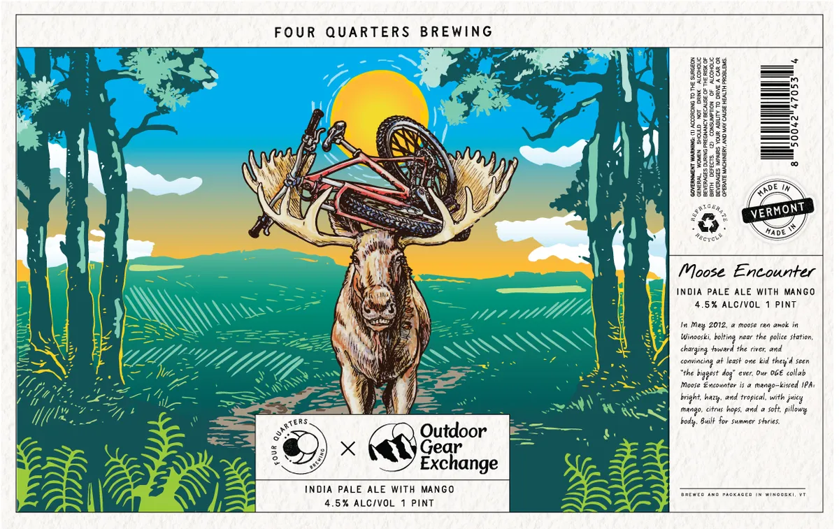 Moose EncounterFOUR QUARTERS BREWINGA moose with elaborate antlers holding a locust and a grasshopper stands centered in a landscape of coniferous forest and open meadow, with a rising sun behind its head. The scene employs a full-bleed illustration rendered in pen-and-ink linework with hand-applied color in blue sky, yellow sun, tan and brown tones on the animal, and green field and foliage. The beer name and collaborative branding appear on a white banner at the bottom of the composition.blue · yellow · green · tan
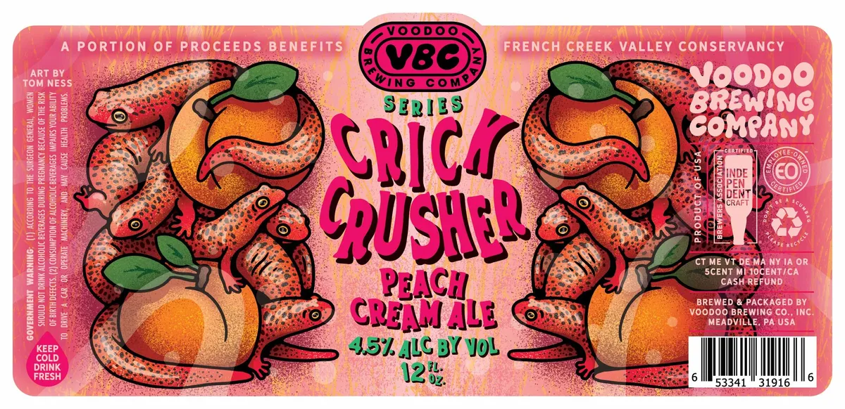 Crick Crusher Peach Cream AleCRICK CRUSHER SERIESStylized red crawfish with spotted bodies and raised claws frame the central magenta lettering spelling "CRICK CRUSHER PEACH CREAM ALE" across a full-bleed illustration. The crawfish are rendered in pen-and-ink with thick black outlines, their bodies in red-orange with darker stippled shading, holding whole peaches in bright orange and green leaves in their claws. The label background is a warm peachy-pink gradient, and the Voodoo Brewing Company logo anchors the top in a magenta oval.peach-pink · magenta · red-orange · green
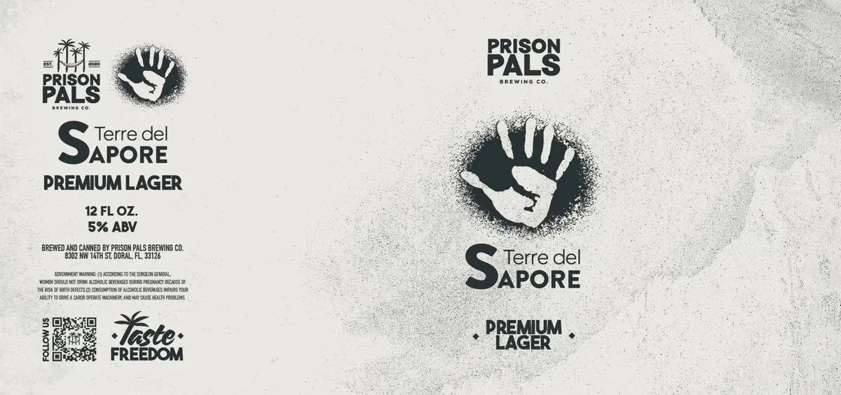 Terre del Sapore Premium LagerTERRE DEL SAPOREA raised open hand rendered in stark black and white occupies the center of the label, surrounded by a diffuse dark halo that fades into the cream background. The hand appears twice—smaller in the upper left corner as part of the brewery mark, and larger in the center as the dominant compositional element. Typography is set in heavy sans-serif capitals, with 'Terre del Sapore' split across two lines flanking the central hand, and regulatory information positioned in the lower left.cream · black
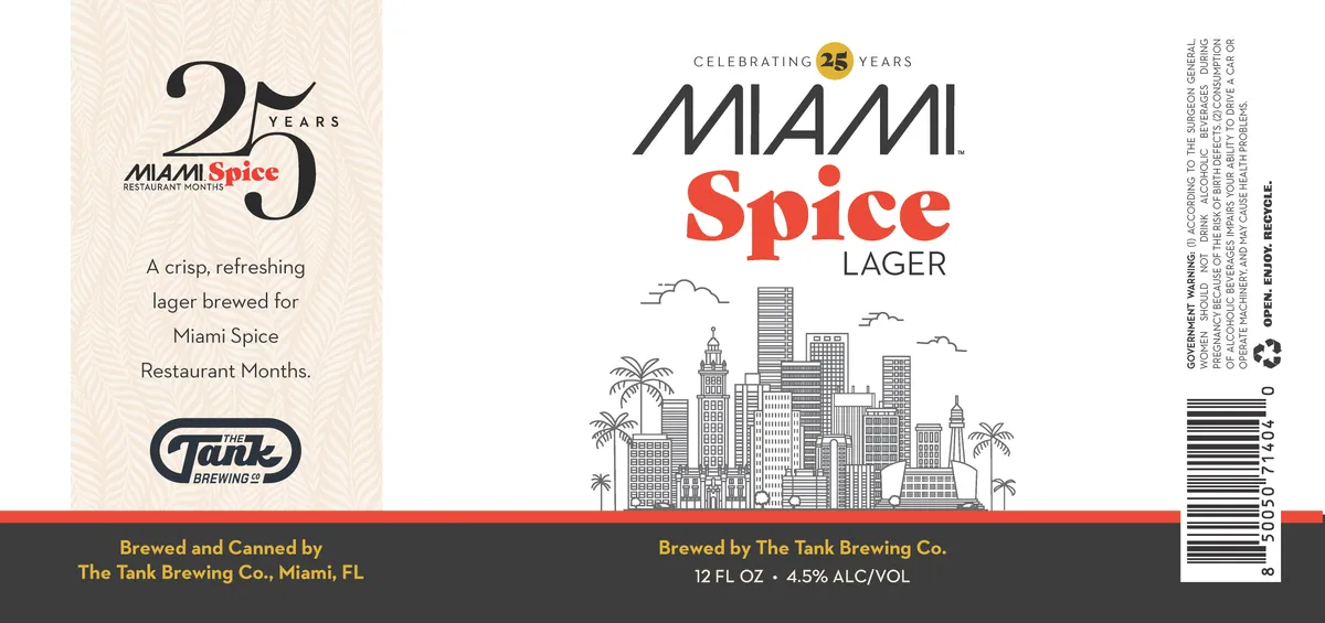 Miami Spice LagerTHE TANK BREWING CO.A pen-and-ink line drawing of a Miami skyline fills the centre of the label, showing a cluster of art-deco and mid-century office towers interspersed with palm trees, all rendered in black linework against cream. The beer name "MIAMI Spice LAGER" appears above in a mix of sans-serif styles, with "Spice" in bold red. A commemorative "25 YEARS" badge sits at top, and a narrow red band runs horizontally across the lower third, anchoring the composition.cream · black · red · gold
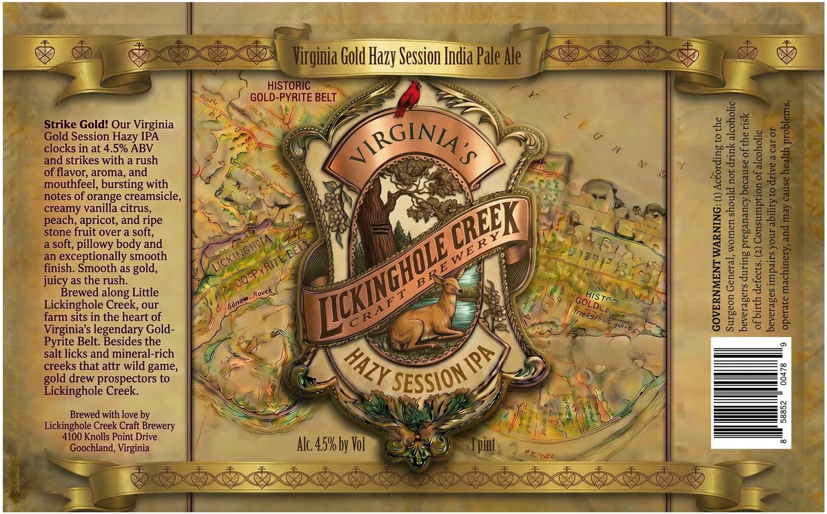 Virginia Gold Hazy Session India Pale AleA heraldic cartouche anchors the centre of the label, framed by ornamental scrollwork and featuring a cardinal perched above the brewery name in an oval shield. Behind this centrepiece, a hand-drawn map of Virginia's Gold-Pyrite Belt fills the background in ochre and sage tones, annotated with place names and geographic details. The entire composition is enclosed in a gold-ribbon banner at top and bottom, with a repeating heart-and-crown motif along the borders. The label employs a palette dominated by aged gold and cream with burgundy accents, creating a colonial-cartographic aesthetic.gold · cream · sage · ochre
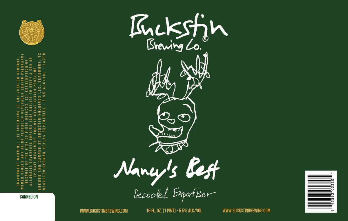 Nancy's BestA pen-and-ink line drawing of a grinning skull with thorny plant stems sprouting from the crown occupies the center of a dark forest-green field. The brewery name appears in loose, gestural brush script above the motif, with the beer name and style—Nancy's Best, Decocted Espartier—hand-lettered below in matching informal script. The label is anchored by a gold circular seal in the upper left and regulatory text running vertically down the left edge in small gold capitals.forest green · cream · gold
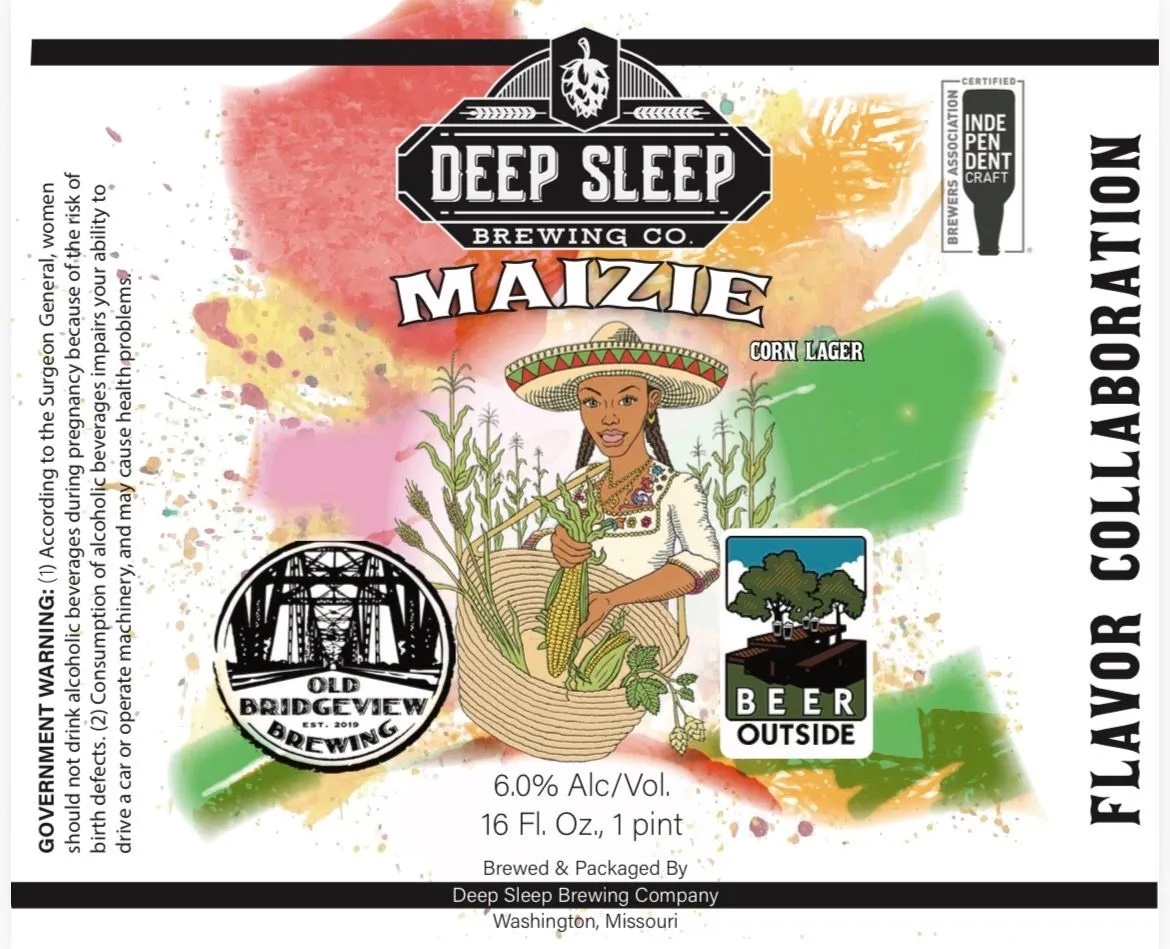 MaizieA pen-and-ink illustration of a woman in a wide-brimmed sombrero and white blouse holds a bundle of corn and maize stalks at the centre of the label, rendered in sepia line work with hand-coloured washes of red, pink, yellow, orange, and green. A hop cone and wheat emblem crown the Deep Sleep Brewing Co. nameplate above, while a circular Old Bridgeview Brewing seal and a Beer Outside badge sit to the sides. The composition floats on a loose watercolour wash that bleeds across the full front, creating an organic, splashed background in warm and cool tones.red · pink · yellow · orange
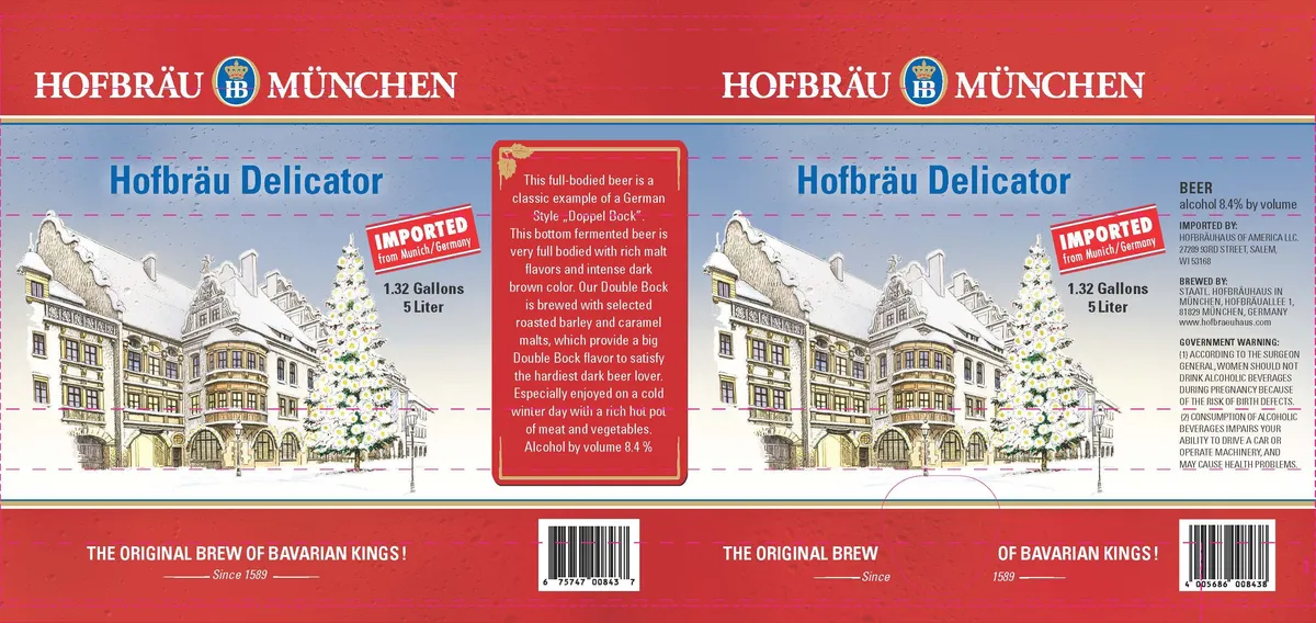 Hofbräu DelicatorHOFBRAU DELICATORA hand-drawn illustration of a traditional Bavarian townhouse with steep roofs, shuttered windows, and snow-laden evergreens occupies the centre of the label, rendered in pen-and-ink with watercolour wash in cream, grey, and pale blue tones. The building is flanked by the beer name in large condensed sans-serif capitals and framed by a horizontal band of red at top and bottom. A red cartouche at centre contains marketing copy. The overall composition is split across two panels, with identical illustrations and typography repeated symmetrically.red · cream · blue-grey · gold
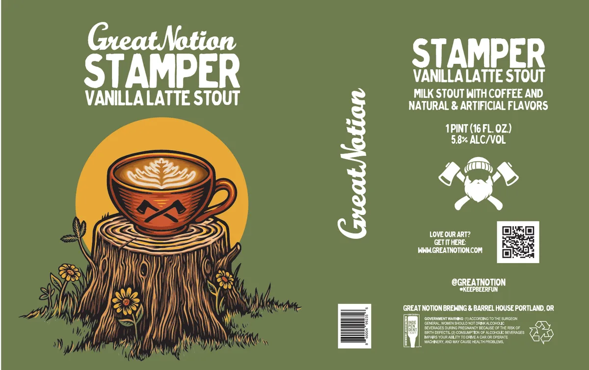 Stamper Vanilla Latte StoutGREAT NOTIONA coffee cup with latte-art foam sits atop a tree stump, rendered in pen-and-ink line work with selective colour fills. The cup features a geometric pattern in oxblood and orange tones, and rests against a large golden circle that frames the composition. Grass, wildflowers, and a single leaf surround the base of the stump in the foreground, all rendered in warm earth tones against a sage-green background. Typography in white script and sans-serif caps frames the image, with the brewery name in a casual brush script along the left edge and product details in block lettering on the right panel.sage green · golden yellow · oxblood · cream
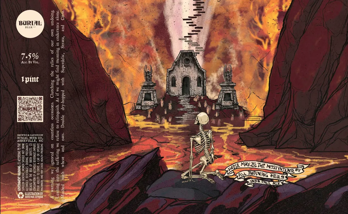 These May Be The Most Intense Of All Burning HellsBURIAL BEER CO.A skeleton stands upright in a hellscape, facing a central ruined chapel with two flanking stone monuments, all surrounded by jagged black rock formations and an orange-and-yellow inferno in the sky above. The scene is rendered in pen-and-ink with hand-drawn hatching and line work across the full front label, executed in black ink over a watercolour wash of flame yellows, oranges, deep reds, and purple-greys. Text appears in gothic caps and a hand-lettered banner at the lower right with the beer name; the brewery's cream circle logo anchors the upper left, with regulatory type running vertically down the left edge.orange · red · yellow · black
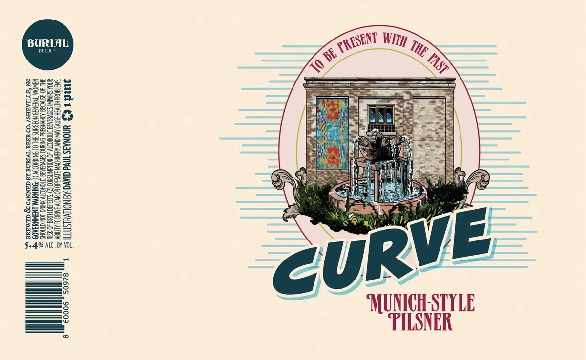 CurveBURIAL BEER CO.A vignette framed by a pink oval shows a classical stone storefront with a central doorway and flanking windows, the door painted in weathered turquoise and rust, flanked by scrolled urns spilling green foliage. Horizontal blue lines radiate behind the scene. The word "CURVE" arcs across the lower half in chunky teal lettering with a light outline, below which "MUNICH-STYLE PILSNER" sits in burgundy serif capitals. The palette is cream, teal, burgundy, and grey-tan stone tones.cream · teal · burgundy · grey
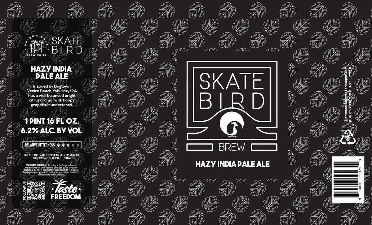 Skatebird HazyThe label is dominated by a scattered all-over pattern of line-drawn hop leaves in cream against a charcoal background, creating a continuous texture across the full field. A central white-outlined rectangular frame contains the beer name "SKATE BIRD" in geometric sans-serif capitals with a stylized bird icon below, flanked by horizontal bars; the composition is symmetrical and emblem-like. The brewery's circular logo appears in the upper left corner, and descriptive text for the beer sits below the frame in white sans-serif type. The finish is matte with no visible gloss or foil treatment.charcoal · cream · white
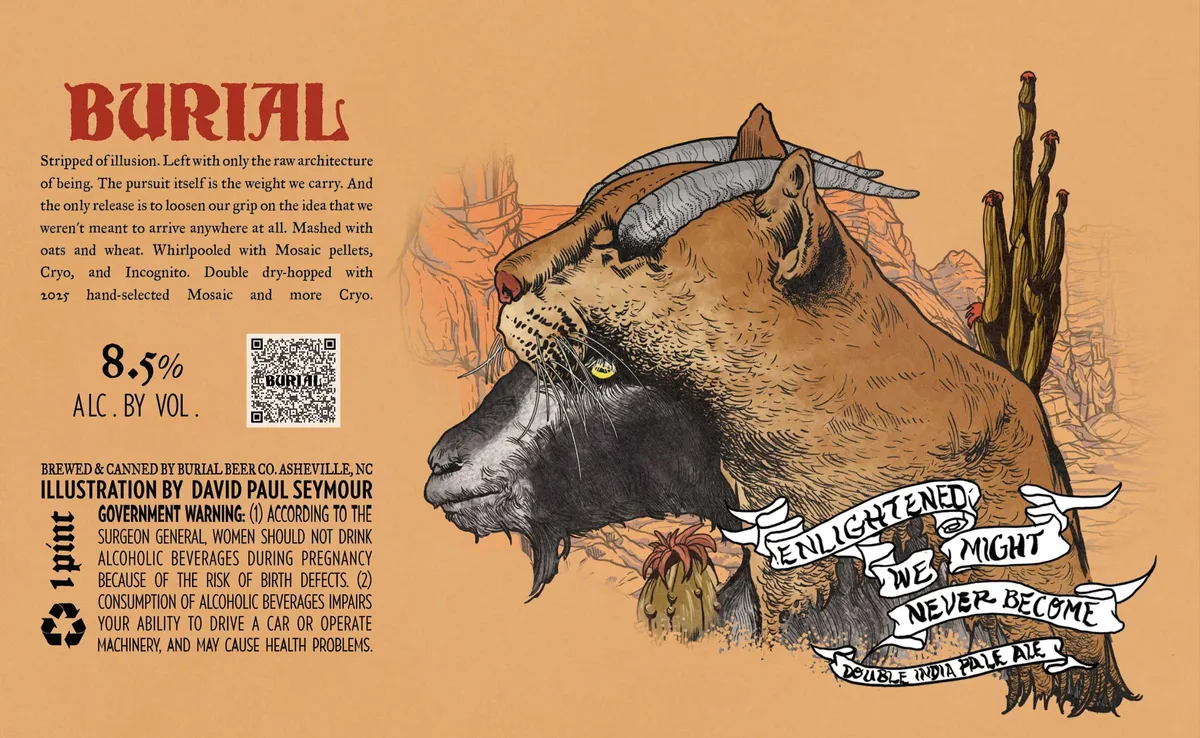 Enlightened We Might Never BecomeBURIAL BEER CO.A pen-and-ink drawing of a horned beast's head dominates the right two-thirds of the label, rendered in crosshatching and fine line work against a warm tan ground. The creature has a bovine snout, curved horns, and a yellow eye, set within a sparse desert landscape of cacti and rocky terrain. A ribbon banner wrapped across the lower jaw carries the beer name in hand-lettered capitals. The left third holds the beer name in oxblood caps at top, followed by descriptive text in a small serif typeface, with ABV, QR code, and regulatory information clustered below.tan · oxblood · black · cream
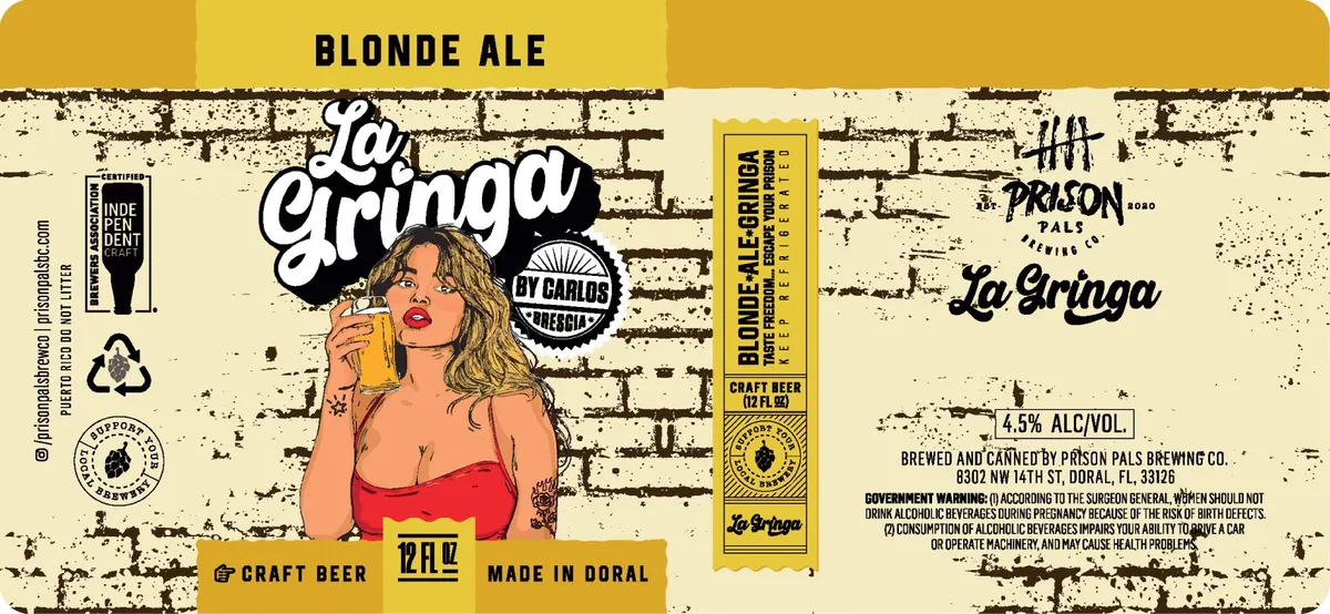 La GringaA portrait of a woman with shoulder-length brown hair and red lipstick, holding a glass of beer, dominates the center of the label against a distressed cream brick wall rendered in pen-and-ink line work. The figure wears a red bandeau top and displays a small star tattoo on her upper arm. The composition is split between the illustrated portrait on the left and a vertical panel on the right containing regulatory and brand information, with a horizontal gold band running across the top and bottom bearing the beer name and brewery details.cream · gold · red · black
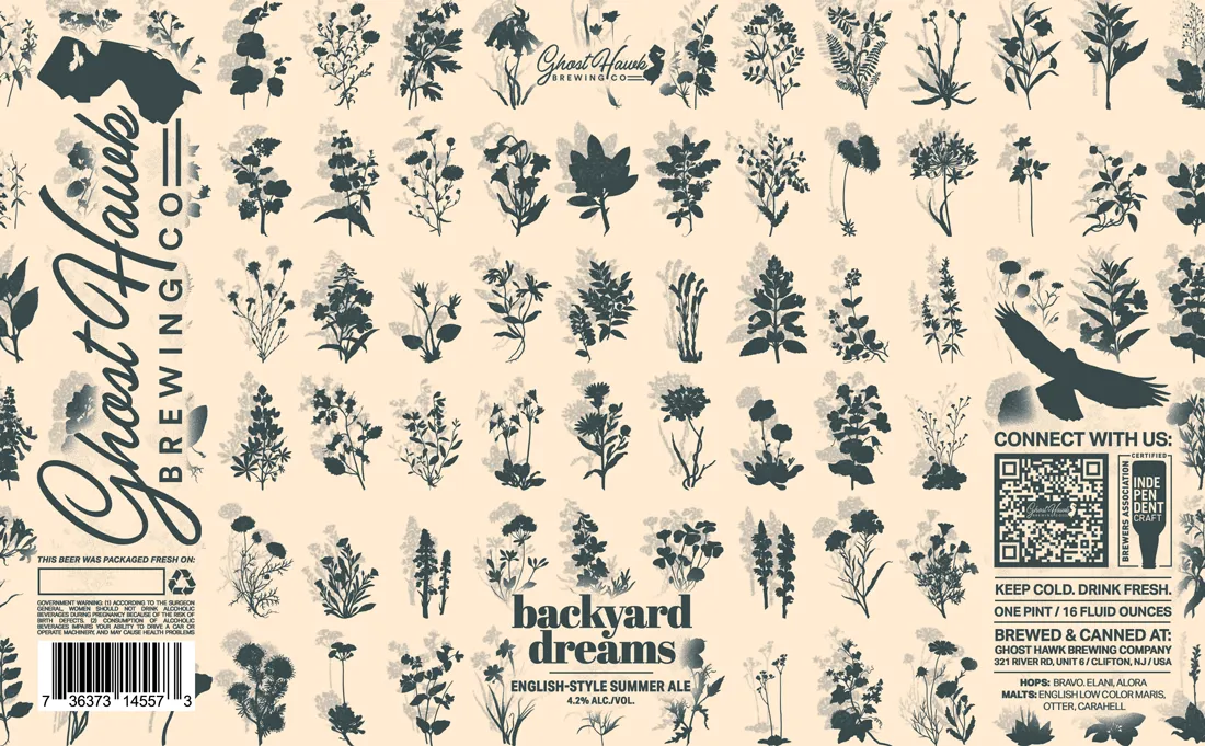 Backyard DreamsA scattered pattern of hand-drawn botanical illustrations in dark navy fills the cream label—wildflowers, herbs, and garden plants rendered in pen-and-ink style with varying levels of detail and tonal shading. The beer name sits centred in bold serif capitals, with 'Ghost Hawk' and 'Brewing Co.' positioned in the upper left in italic script and 'English-Style Summer Ale' below the main title in smaller serif type. A silhouetted bird in flight appears on the right side, and regulatory and social-media information occupy the lower right corner.cream · navy