A cut through the label corpus
Art deco beer labels
16 labels on Hop Grail read as art deco. Every one was described by us from the approved artwork — the federal approval records what a label says, never what it looks like.
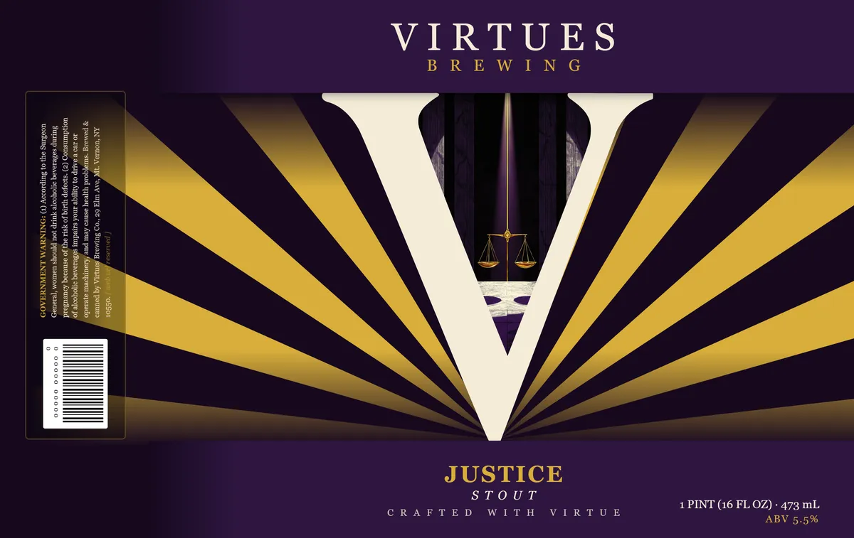 Justice StoutJUSTICE STOUT (PINT)A radiating sunburst of gold and cream rays bursts outward from a central white V-shape, which frames a pair of brass scales suspended against a dark wood-grain background. The composition is symmetrical and geometric, with the scales centred within the V and surrounded by alternating wedges of gold and deep purple. The brewery name appears in spaced capitals at the top in cream and gold, with the beer name and descriptor set in serif type at the bottom.purple · gold · cream · black
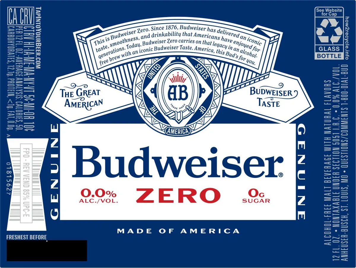 Budweiser ZeroBUDWEISERA centred shield emblem in art-deco style dominates the upper half, featuring the Budweiser AB monogram in navy and cream within a geometric diamond frame, flanked by two cream banner wings reading navy · cream · red
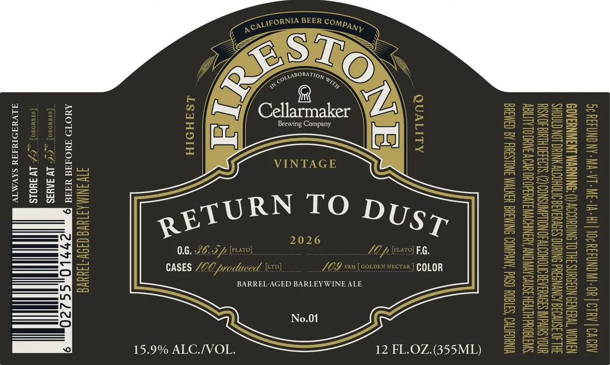 Return To DustFIRESTONE WALKER BREWING COMPANYAn arched label with a dark ground features a cream-coloured banner across the upper half containing the beer name in serif capitals, flanked by ornamental flourishes and crossed by a gold-ruled central cartouche. Below, a cream panel reads "VINTAGE" above a larger cream-bordered shield stating "RETURN TO DUST" with production details in mixed serif and script type. The lower half of the label is dark with gold rules, brewery attribution, and regulatory text. A Brewer's Guild–style seal marking "No.01" sits at the bottom of the shield.charcoal · cream · gold
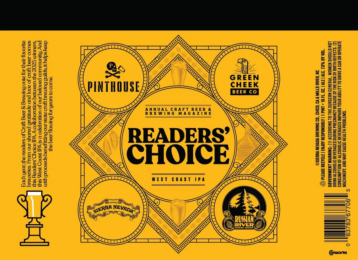 Readers' ChoiceSIERRA NEVADAA symmetrical geometric emblem dominates the label, composed of four circles and a central diamond linked by an Art Deco border of nested diamonds and beaded lines. Four breweries' logos occupy the outer circles—Pinthouse, Green Creek Beer Co, Sierra Nevada, and Russian River—while the center diamond holds the beer name in bold block capitals. The entire composition sits on a bright yellow ground with black line work and accents, evoking vintage beer awards or commemorative medals.gold · black · white
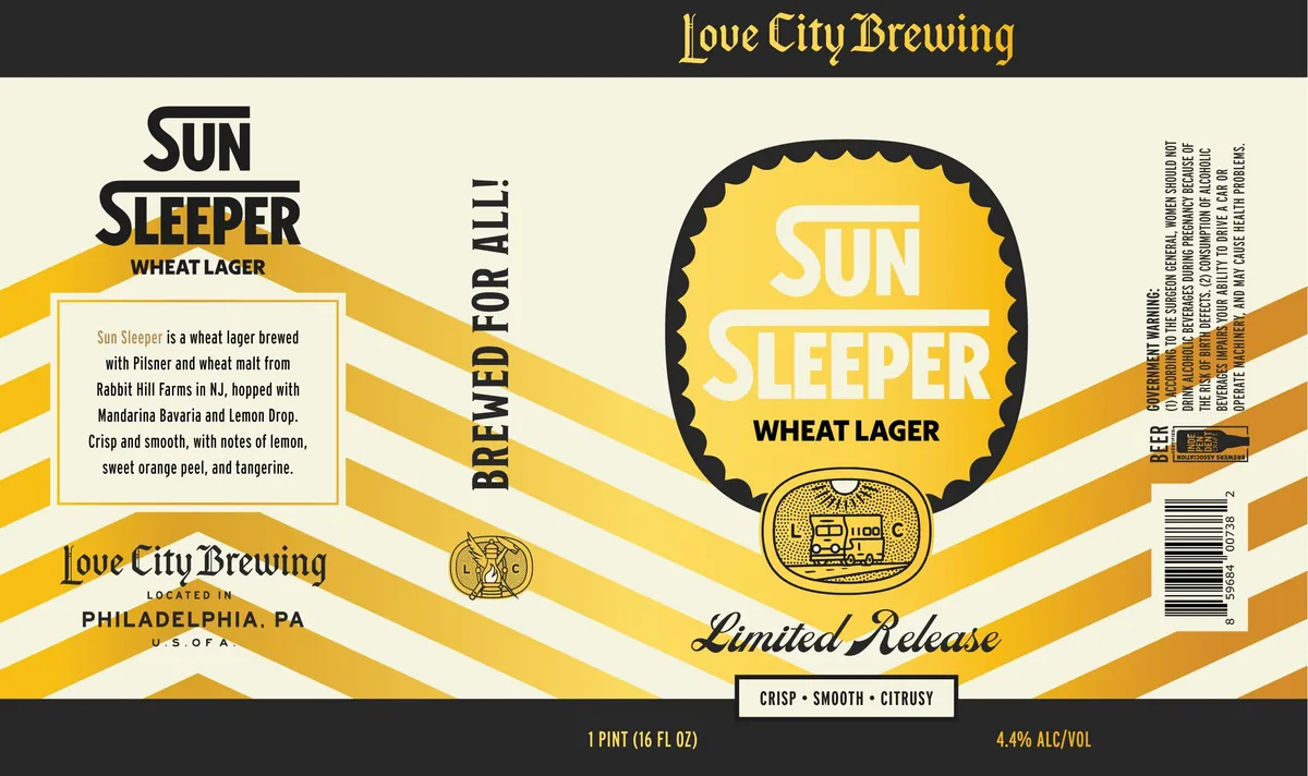 Sun Sleeper Wheat LagerSUN SLEEPERA geometric composition of stacked golden-yellow and cream horizontal bands radiates outward from a central scalloped shield emblem containing the beer name in white sans-serif capitals. Below the shield sits a small woodcut-style illustration of a vintage delivery truck framed in an oval cartouche. The label employs art-deco geometry throughout, with diagonal striping in the side panels and strict symmetry anchoring the central nameplate. Type is set in a mix of bold geometric sans-serif and script lettering across cream and black fields.gold · cream · black · white
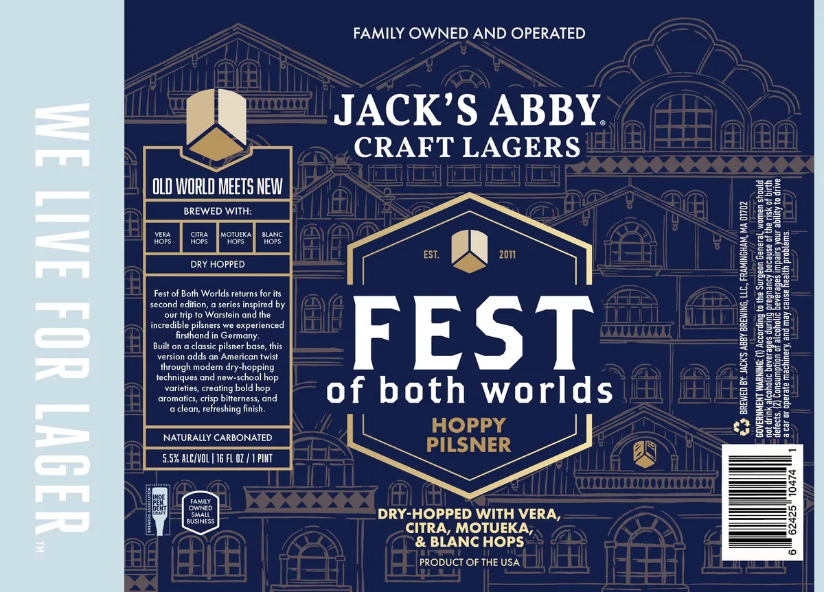 Fest of Both Worlds Hoppy PilsnerAn ornate European brewery building rendered in art-deco style fills the full background in tan line-work against a deep navy field. A large gold-outlined hexagonal badge dominates the centre, framing the beer name in white serif caps with 'HOPPY PILSNER' in smaller gold lettering below. The composition is symmetrical and architectural, with smaller geometric hop emblems and heraldic shields distributed across the label, all rendered in a consistent tan and gold palette against the navy ground.navy · gold · cream · white
 American CommonAn American flag waves across the upper third of the label against a distressed cream and oxblood background, flanked by a circular 250th-anniversary seal. Below, a decorative ribbon banner in deep red and gold holds the beer name in cream capitals, with ornamental stars and scrollwork on either side. A landscape vignette occupies the lower half—a colonial-era house and sailboat on water rendered in muted blues, greens, and earth tones beneath a clouded sky. The entire composition is framed by a thick border in burnt orange and gold, with visible aging and texture throughout suggesting an antique broadside or historical advertisement.cream · oxblood · navy · gold
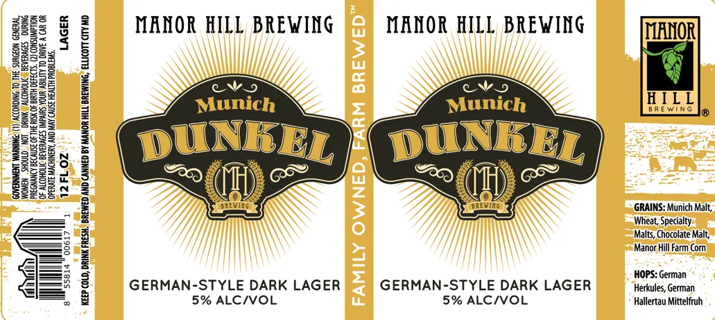 Munich DunkelMANOR HILL BREWINGA radiating sunburst in gold fills the upper half of the label, framing a black ornamental shield with gold lettering reading "Munich DUNKEL" and a wheat sprig and monogrammed crest below. The composition is vertically centred on a cream field, with "GERMAN-STYLE DARK LAGER" in serif capitals below the emblem. Cream, gold, and black dominate; the finish shows a matte or uncoated surface typical of standard label stock.cream · gold · black
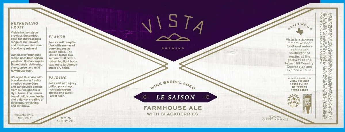 Le Saison BlackberriesLE SAISONA geometric Art Deco band dominates the label, with a central diamond formed by interlocking cream and tan lines against deep purple. The Vista Brewing name and logo sit in the upper portion, with the beer style — Le Saison Farmhouse Ale with Blackberries — displayed on a dark banner at the centre. Marketing copy for Flavor, Pairing, and Refreshing Fruit fills the left and right wings in serif type, while regulatory information and address block occupy the right edge.purple · cream · tan · gold
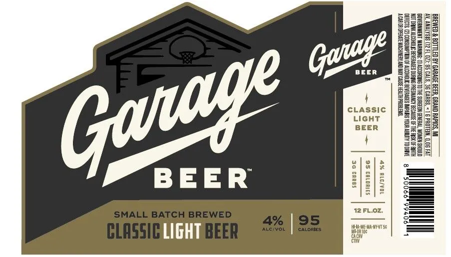 Classic Light BeerGARAGE BEERA stylized garage structure with a pitched roof and basketball hoop anchors the upper left corner, rendered in black linework against the dark field. The label employs a mid-century beer-hall aesthetic, with 'Garage' in a broad italicised script across the upper two-thirds and 'Beer' in solid sans-serif caps below, both in cream. The composition splits horizontally: a deep charcoal upper section with the garage emblem and main type, and a tan band across the bottom carrying secondary information and alcohol content. Gold trim lines the perimeter and edges of the garage motif.charcoal · cream · tan · gold
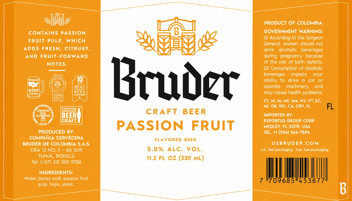 Bruder Passion FruitBRUDERThe front panel is divided into three vertical sections on a split orange and cream field. A geometric brewery emblem in orange—a stylized barn or agricultural structure flanked by wheat sheaves—sits centered at the top of the cream panel. Below it, the beer name orange · cream · black
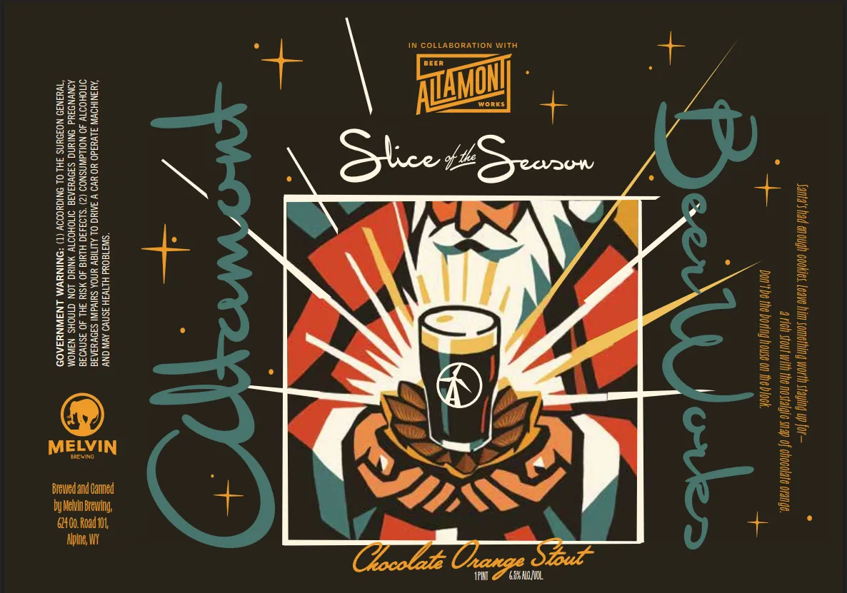 Slice of the Season Chocolate Orange StoutMELVIN BREWINGA bold art-deco poster composition centers on a beer glass radiating light rays, cradled by a stylized brown eagle or phoenix with outstretched wings rendered in saturated orange and tan. The central vignette is framed by a white rectangle and surrounded by a geometric sunburst of red, yellow, and black wedges. Teal decorative script swirls flow vertically down both sides of the design, anchoring the dark charcoal background punctuated with gold and white stars and cross shapes. The beer name appears in script above the central image, with style and type information in script below.charcoal · red · orange · gold
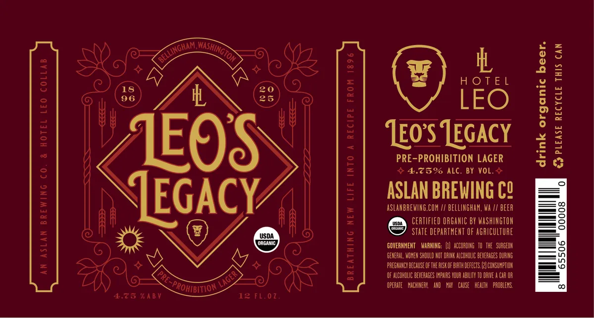 Leo's LegacyA symmetrical art-deco label centered on a large gold diamond containing the beer name in ornate serif lettering, set against a deep burgundy ground. The diamond is framed by geometric borders, flanked by vertical panels with decorative elements including stylized wheat sheaves, sun and moon motifs, and botanical line drawings. Decorative scrollwork, banners, and corner emblems in gold complete the composition, with the Hotel Leo shield crest and brewery information positioned on the right side panel.burgundy · gold · cream
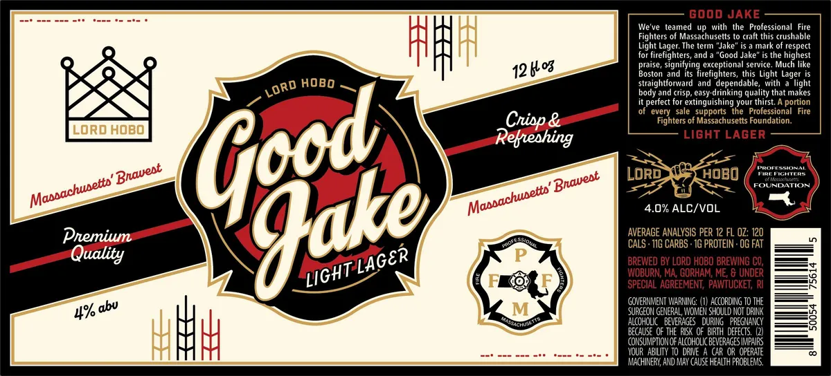 Good JakeA large shield-shaped emblem dominates the centre, featuring the script logotype "Good Jake" in cream italic lettering set against a bold red circle, enclosed by a black ornamental shield with gold borders. Flanking the shield are geometric art-deco crown and fire-department insignia motifs in cream and gold, with radiating line patterns above and below; the composition sits on a cream field with black diagonal accent bands bearing the brewery name and descriptor text in script and sans-serif faces. The palette is cream, black, red, and gold throughout, with a consistent linear art-deco vocabulary of shields, crowns, and geometric ornament.cream · black · red · gold
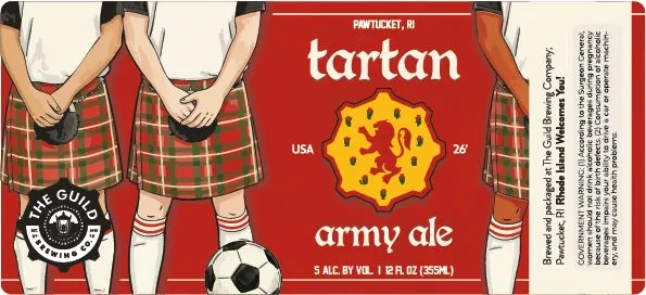 Tartan Army AleTARTAN ARMYTwo figures in Scottish tartan kilts, shown from waist down with bare legs and black shoes, stand side by side on a bright red field flanking a gold star-burst medallion. A soccer ball rests at their feet. The composition is rendered in a retro illustration style with bold outlines and flat colour, evoking mid-20th-century graphic design. The beer name appears in lowercase sans serif above the emblem, with 'army ale' and alcohol content below.red · gold · cream · black
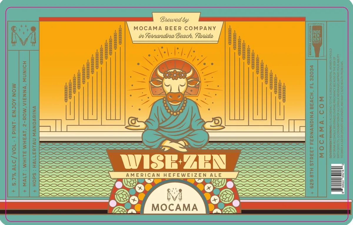 Wise ZenA stylized bull deity sits cross-legged in meditation at the center of the label, rendered in art-deco idiom with a cream face, rust halo, and turquoise robes draped across its body. Behind the figure stands a symmetrical row of wheat stalks flanking radiating sunburst lines, all in gold and cream against a bright yellow ground. The composition is divided horizontally: the upper half holds the architectural wheat-and-sun motif, the lower half shows a water-pattern band in teal with a decorative hop-and-star roundel in rust and cream framing the brewery name. The beer name appears in a bold rust banner across the figure's lap, with smaller type below describing the beer style.yellow · turquoise · rust · cream