A cut through the label corpus
Watercolour beer labels
52 labels in the register read as watercolour. Every one was described by us from the filed artwork — the TTB records what a label says, never what it looks like.
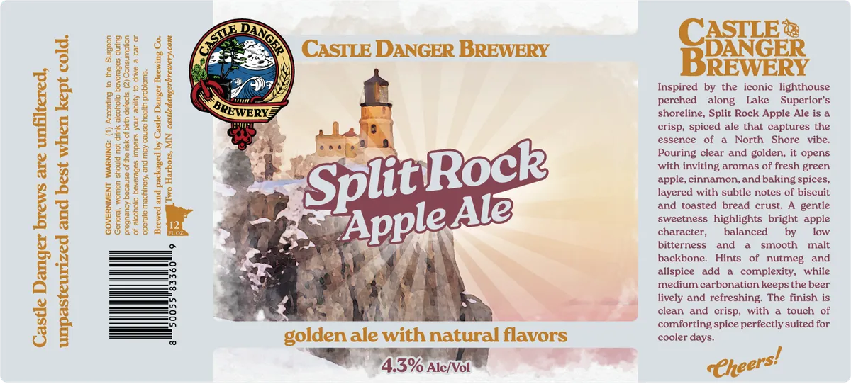 Split Rock Apple AleCASTLE DANGER BREWERYA watercolour landscape dominates the front label, depicting a lighthouse and castle structure perched atop rocky cliffs overlooking Lake Superior, rendered in warm ochre, grey, and dusty pink tones. The beer name appears in bold script lettering across the centre of the illustration in maroon and white. At the top left, a circular emblem shows the Castle Danger Brewery logo with a lighthouse, waves, and decorative border in gold, maroon, and cream. The composition balances the expansive landscape illustration with the brewery name in serif type at the top and descriptive text in maroon type at the bottom.ochre · cream · maroon · grey
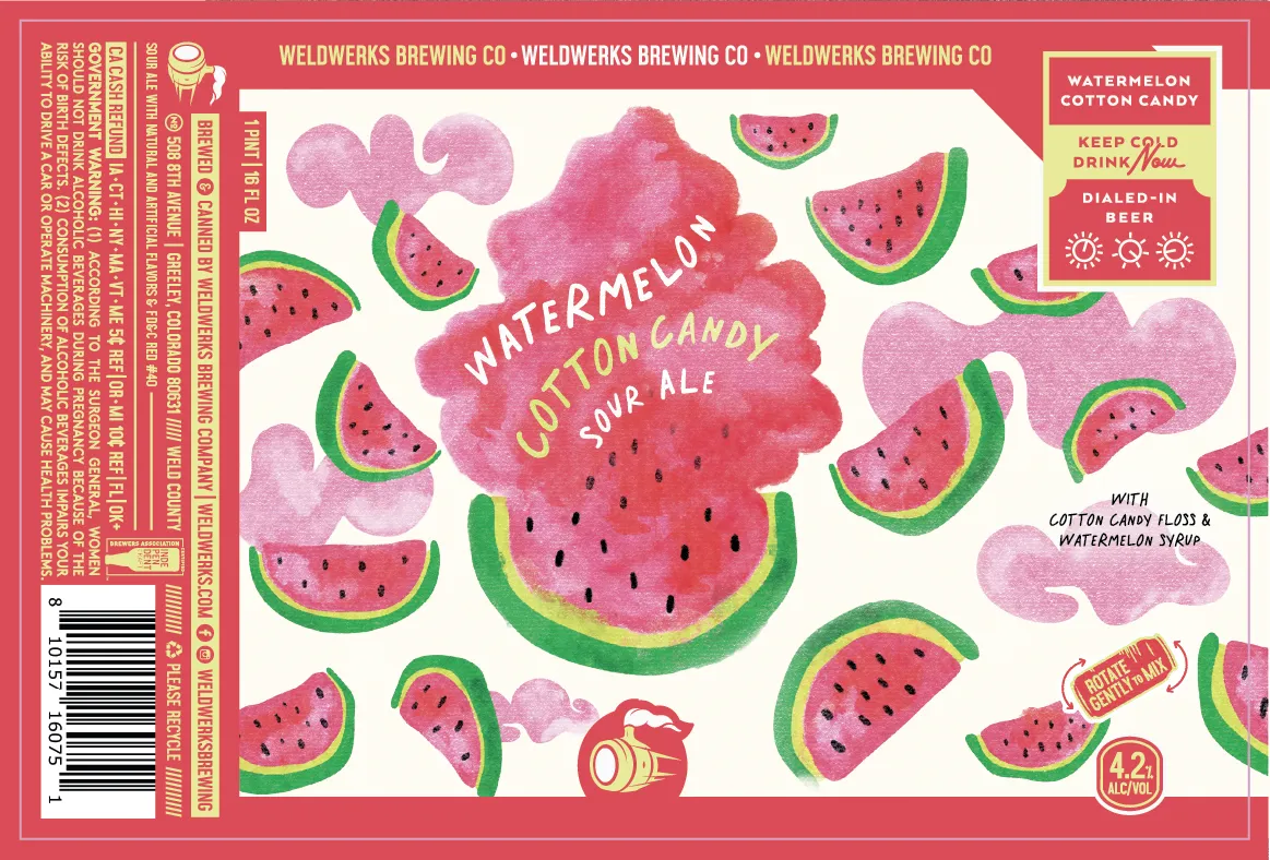 Watermelon Cotton CandyWELDWERKSA scattered field of watermelon slices and cotton-candy clouds dominates the full front label in bright pinks and greens against cream. The beer name curves across a large central watermelon painted in soft pinkish-red watercolour with visible darker shading, surrounded by smaller melon wedges with green rinds and seed details. The loose, organic brushwork gives the fruit a hand-painted quality, with cotton-candy puffs in pale pink floating between the melons across the label.hot pink · cream · green · yellow
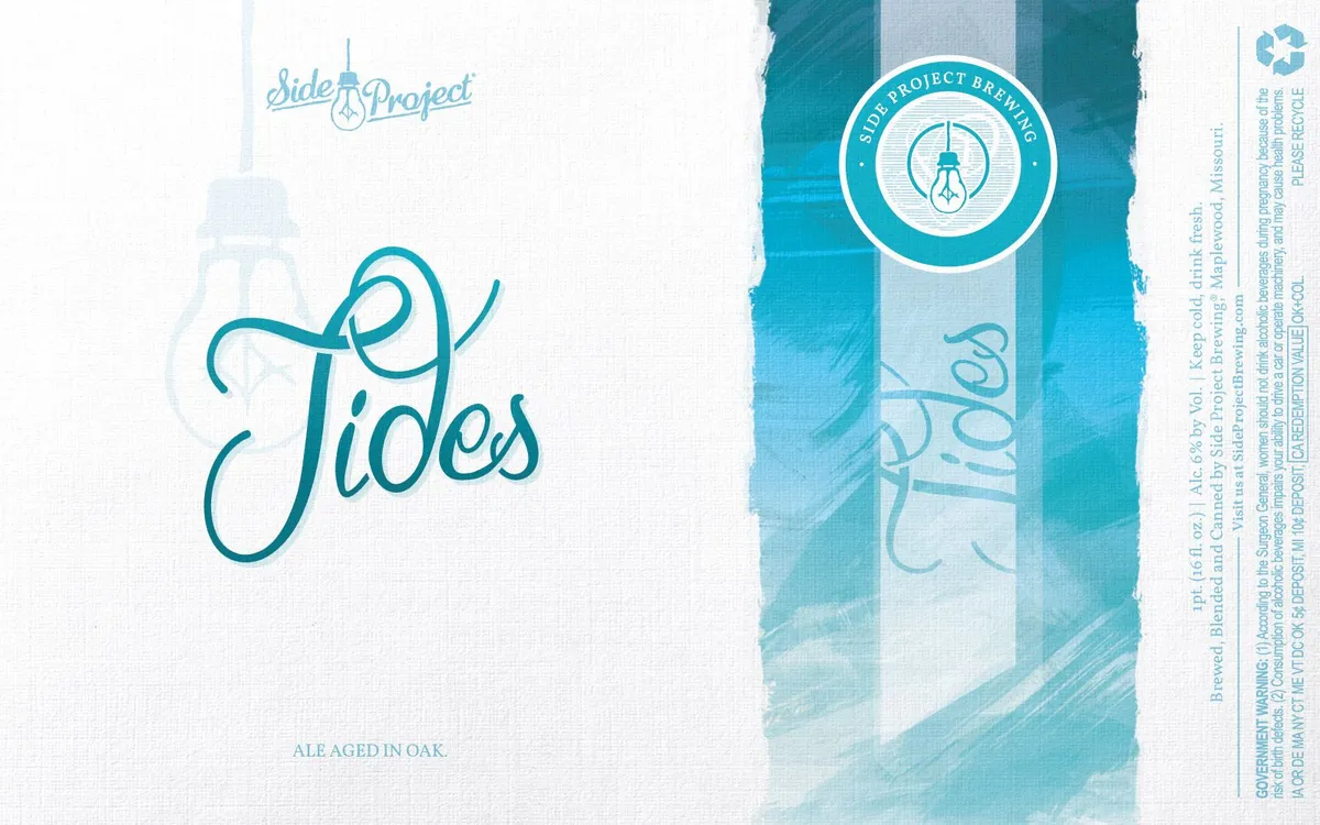 TidesA stylized lightbulb rendered in flowing, continuous line-art sits within a circular badge at the top center, surrounded by concentric rings and the text "SIDE PROJECT BREWING" in a serif typeface. The word "Tides" dominates the left panel in a looping, hand-lettered script set against a white ground, while the right panel features soft, layered watercolour washes in graduated teal and cream tones that evoke water or sky. The Side Project logotype appears in script at the upper left corner, and regulatory text runs down the right edge; the overall composition splits the label into a stark left section and a atmospheric, painterly right section.teal · cream · white
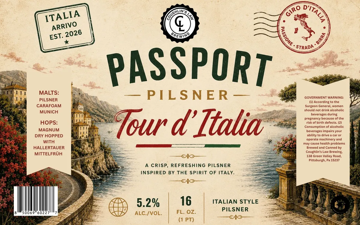 Tour d'ItaliaPASSPORT PILSNERA romantic European landscape dominates the label, depicting a riverside villa with terracotta buildings and a stone bridge overlooking what appears to be an Italian waterway, flanked by flowering red vines and foliage on either side. The scene is rendered in a classical travel-poster style with soft watercolour tones of cream, ochre, and dusty green. The beer name 'Tour d'Italia' appears in flowing script across the centre in deep red, with 'PASSPORT' and 'PILSNER' set above and below in a sturdy slab serif. Decorative ornaments and a tricolour stripe accent the composition, while passport-style stamps and brewery insignia frame the upper corners.cream · ochre · sage · red