A cut through the label corpus
Minimal geometric beer labels
25 labels in the register read as minimal geometric. Every one was described by us from the filed artwork — the TTB records what a label says, never what it looks like.
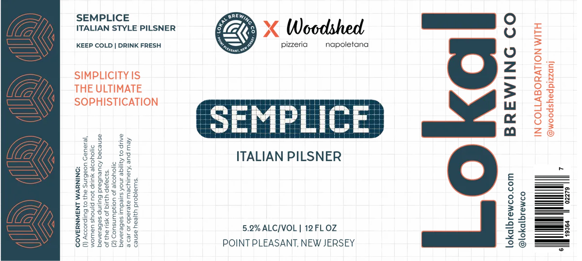 SempliceA vertical label with a dark teal background and charcoal grid pattern. Down the left edge, four repeated geometric emblems in orange line-work form a vertical stripe; the centre holds the beer name teal · charcoal · orange · white
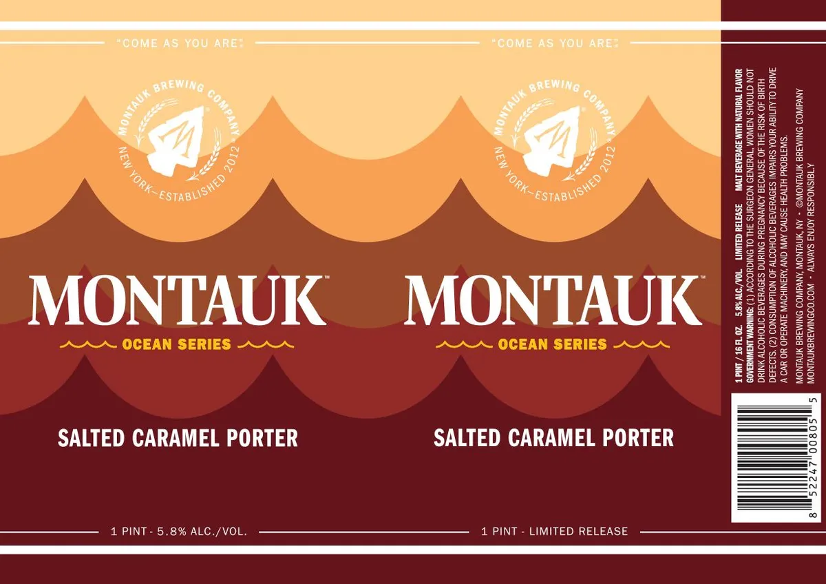 Ocean Series Salted Caramel PorterMONTUAK BREWING COMPANYA stylized mountain landscape dominates the label, rendered as layered undulating peaks in cream, orange, and oxblood that transition from light at the top to deep burgundy at the base. The Montauk Brewing Company circular emblem with a sailboat motif sits centered in the upper portion on the cream background. Below, the beer name "SALTED CARAMEL PORTER" appears in white sans-serif capitals against the dark burgundy lower section, with "OCEAN SERIES" in gold capitals above it. The phrase "Come as you are" repeats across the top in small cream type.cream · orange · oxblood · burgundy
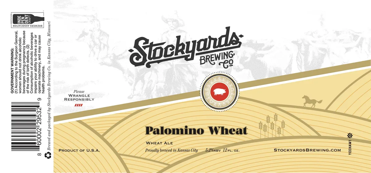 Palomino WheatPALOMINO WHEAT ALEThe label features a stylized wheat field rendered in parallel horizontal lines across a cream background, with a single silhouetted horse figure visible in the upper right distance. A diagonal gold band anchored by a circular red-and-cream crest bearing a pig emblem bisects the composition, establishing a split-field layout. The brewery name appears in a thick, italicized serif script at the top, with the beer style and origin information positioned centrally in serif type across the field.cream · gold · black · red
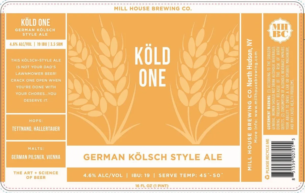 Kold OneMILL HOUSE BREWINGA golden-orange label dominated by a symmetrical pair of stylized wheat or barley sheaves rendered in a lighter tone, flanking the large white sans-serif wordmark gold · cream · white
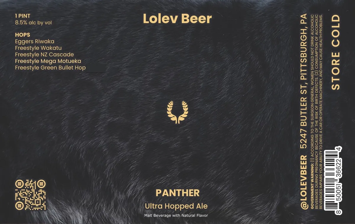 PantherLOLEV BEERA textured dark field, suggesting fur or rough stone, dominates the front label. Centred near the middle is a gold laurel wreath emblem, with the beer name "Lolev Beer" in large gold sans-serif capitals above it and the style designation "Panther" and "Ultra Hopped Ale" in smaller gold type below. The left side carries hop variety information in gold text, while the right edge features vertical gold lettering and regulatory details. A small pixelated QR code in gold appears at bottom left.charcoal · gold · white
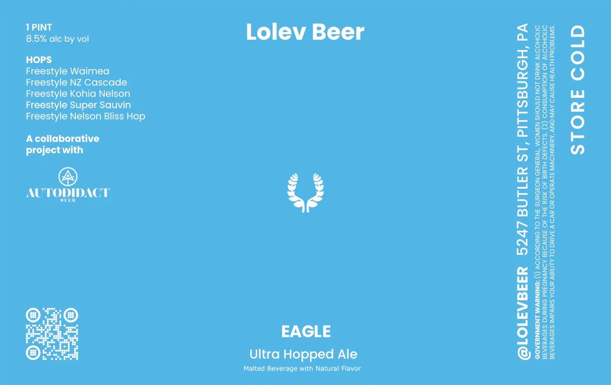 EagleLOLEV BEERA minimalist label on a solid sky-blue ground, dominated by a single white laurel wreath centred in the upper-middle section. The beer name "Lolev Beer" appears in white sans-serif caps across the top, with "Eagle" and the style "Ultra Hopped Ale" set below the wreath in white. Regulatory information and brewery details run vertically down the right edge. A small Autodiact Beer logo and QR code anchor the lower left.sky-blue · white
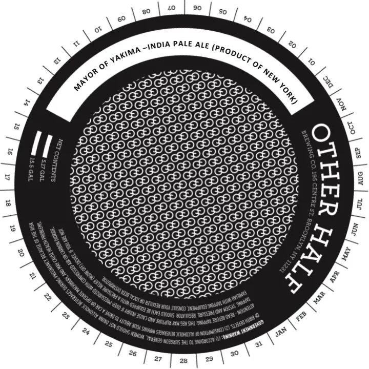 Mayor of YakimaOTHER HALF BREWING CO.A circular keg collar with a black band surrounding a cream-coloured central field. The centre is filled with a dense geometric pattern of interlocking circles and lines arranged in a regular grid. The beer name black · cream
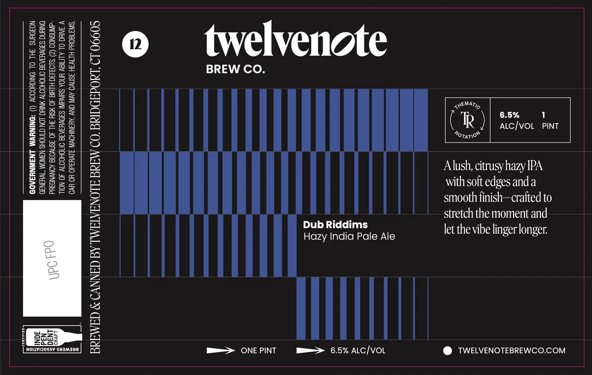 Dub RiddimsDUB RIDDUMSA geometric pattern of vertical blue stripes in varying widths occupies the centre of a black label, creating a rhythmic, wave-like visual effect. The beer name "Dub Riddims" appears centred in white sans-serif type against the stripe pattern, with the brewery name "twelvenote BREW CO." positioned above in large geometric sans-serif capitals. The label employs a minimalist split-field composition with the striped motif dominating the upper two-thirds and a solid black lower section, punctuated by regulatory information and brewery details in white type aligned to the right and bottom edges.black · blue · white
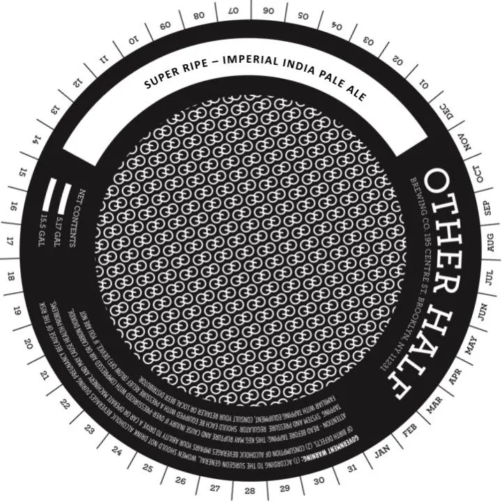 Super RipeOTHER HALF BREWING CO.A keg collar with concentric circular bands in black and cream. The centre holds a dense repeating pattern of interlocking geometric shapes in white on black. The beer name and style appear in the outer white band; a date wheel and regulatory text occupy the outer black ring.black · cream · white
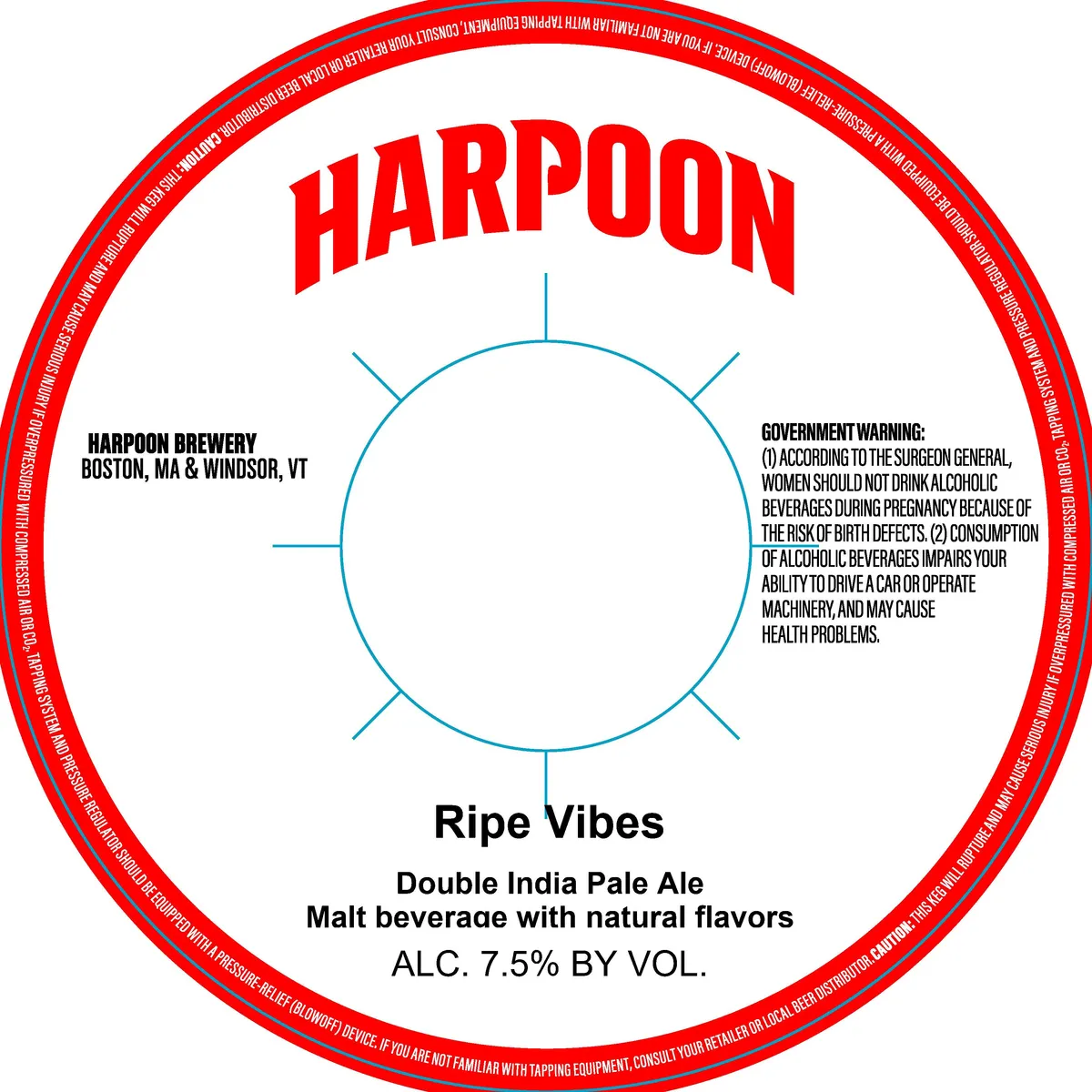 Ripe VibesHARPOONThe label centers on a simple geometric circle drawn in light blue with four equidistant radial lines extending outward, suggesting a sun or compass rose. The brewery name "HARPOON" appears in bold red caps at the top of the label, while "Ripe Vibes" and beer designation sit below the circle in black sans-serif type. The composition is austere and minimal, with a red circular border containing small white type around the perimeter and regulatory information positioned to either side of the central motif.red · white · blue · black
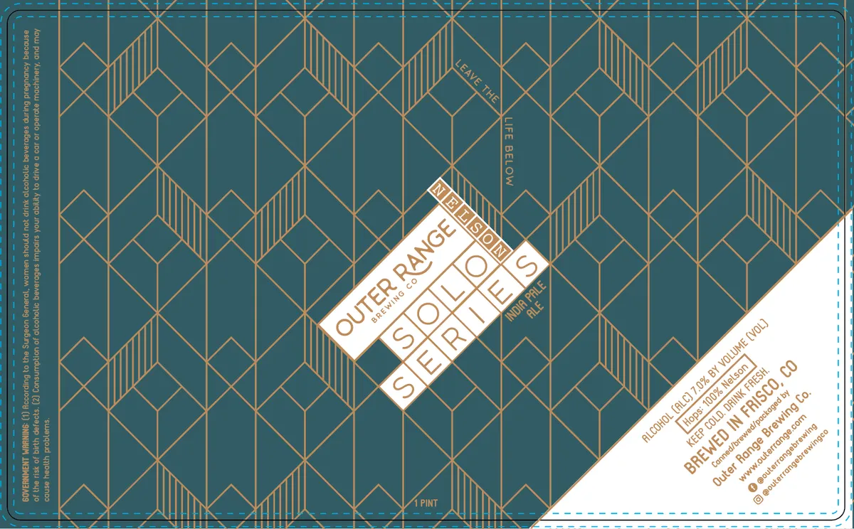 Solo Series NelsonA geometric diamond-and-line pattern in gold fills the entire teal background, creating an interlocking art-deco lattice. The beer name is set in a rotated white banner across the upper centre in spaced sans-serif caps, with the brewery name and secondary text positioned along the angled right edge in the same typeface.teal · gold · white · cream
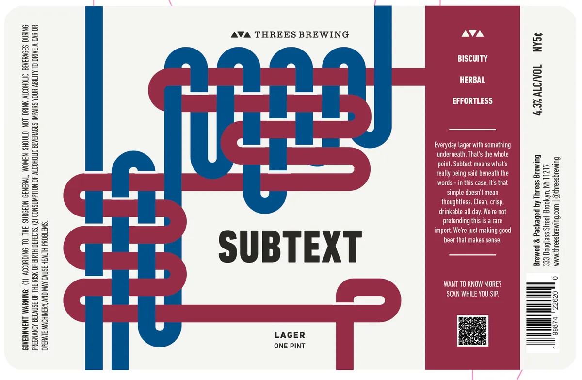 Subtext LagerAn interlocking geometric pattern dominates the front label—thick navy and burgundy bands weaving through each other in a grid-like arrangement, creating a visual puzzle of horizontal and vertical strokes that overlap and interlock across the full width of the composition. The beer name 'SUBTEXT' appears in bold black sans-serif below the pattern, with 'LAGER' and 'ONE PINT' in smaller type beneath. The weaving pattern fills most of the cream-coloured ground, with the brewery mark—three small triangles—positioned at the top centre in navy.cream · navy · burgundy
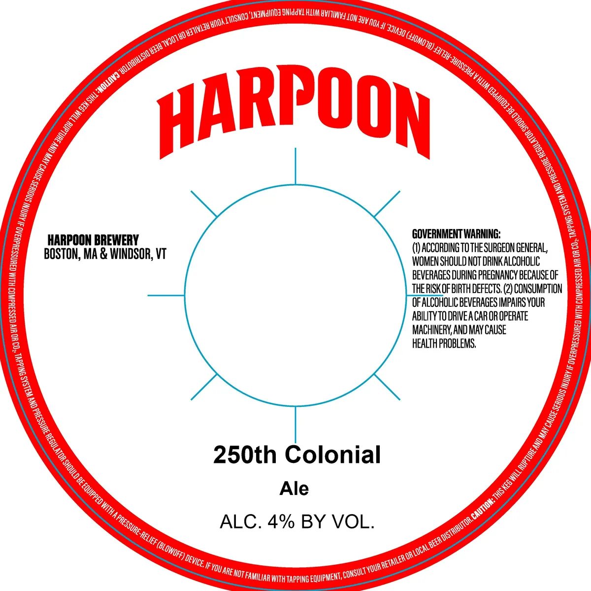 250th ColonialHARPOONThe label centres a simplified circle drawn in light blue with four outward-pointing lines at cardinal positions, resembling a compass rose or sun symbol. Above sits "HARPOON" in bold red sans-serif caps; below, "250th Colonial Ale" and alcohol content in black serif and sans-serif type. The field is cream-coloured, bordered by a thick red band that runs the full perimeter and contains small white regulatory text. The brewery location, government warning, and ABV panel occupy the interior without illustration.red · cream · light blue · black
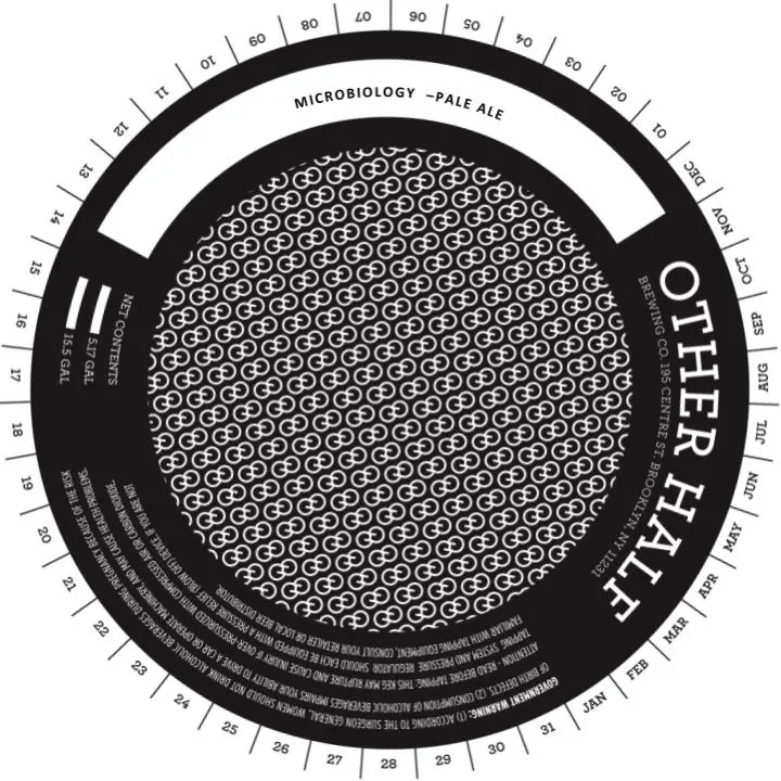 MicrobiologyOTHER HALF BREWING CO.A circular keg collar featuring a densely packed repeating pattern of microscopic organisms (appearing as small circular motifs with internal detail) filling the central field in white against black. The beer name "Microbiology – Pale Ale" arcs across the top in sans-serif capitals, while "Other Half" runs vertically down the right side. A numbered degree wheel in increments of 10 occupies the outer ring, with regulatory text and production information stacked in small type around the bottom and sides.black · white
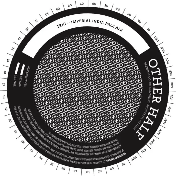 TrigOTHER HALF BREWING CO.A circular keg collar with concentric bands: a cream-coloured ring at top bearing the beer name and style in sans-serif caps, a dense repeating geometric pattern in the centre field rendered as interlocking rings or gear teeth in cream against black, and a black outer rim featuring the brewery name vertically and numbered degree markers around the perimeter. Regulatory text is set in small sans-serif type around the bottom inner band.black · cream
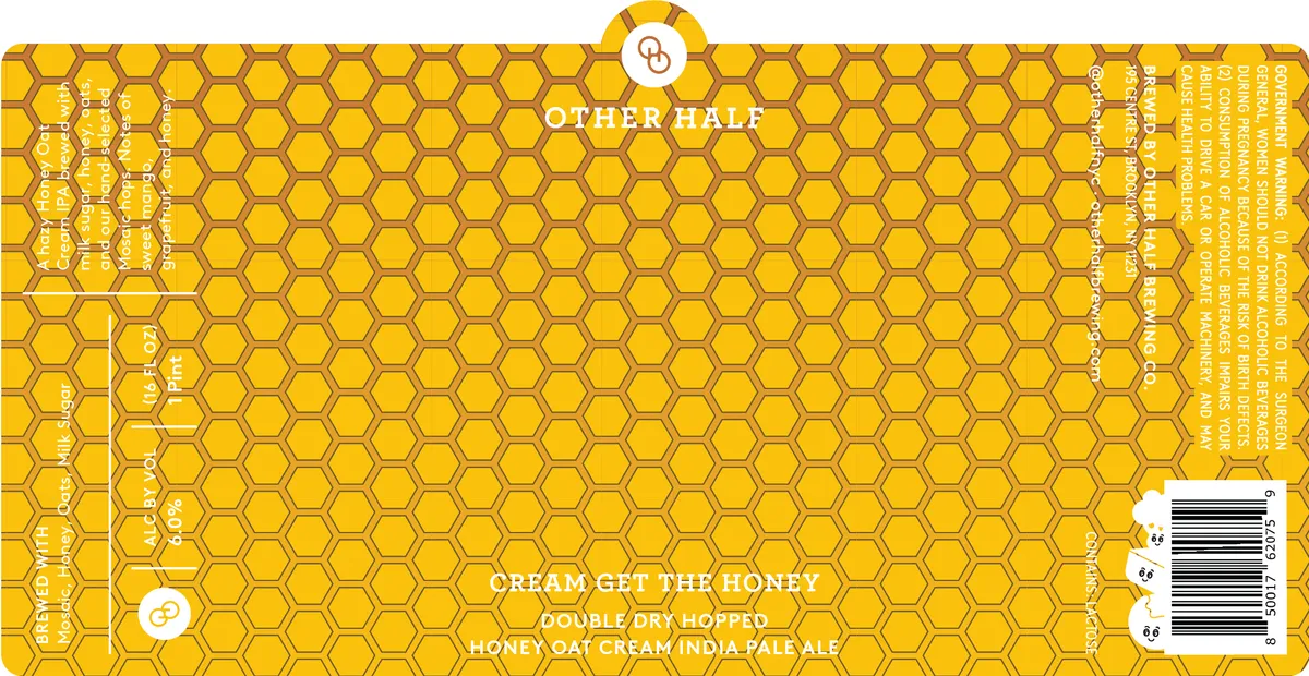 Cream Get The HoneyOTHER HALF BREWING CO.A dense honeycomb pattern in golden yellow with darker ochre outlines fills the entire label. The beer name "CREAM GET THE HONEY" and style descriptors appear in white sans-serif type across the lower centre, with the Other Half logo—a circular emblem containing an ampersand—positioned at top centre. The design is a full-bleed geometric repeat with no representational imagery, creating a uniform texture across the surface.gold · ochre · white
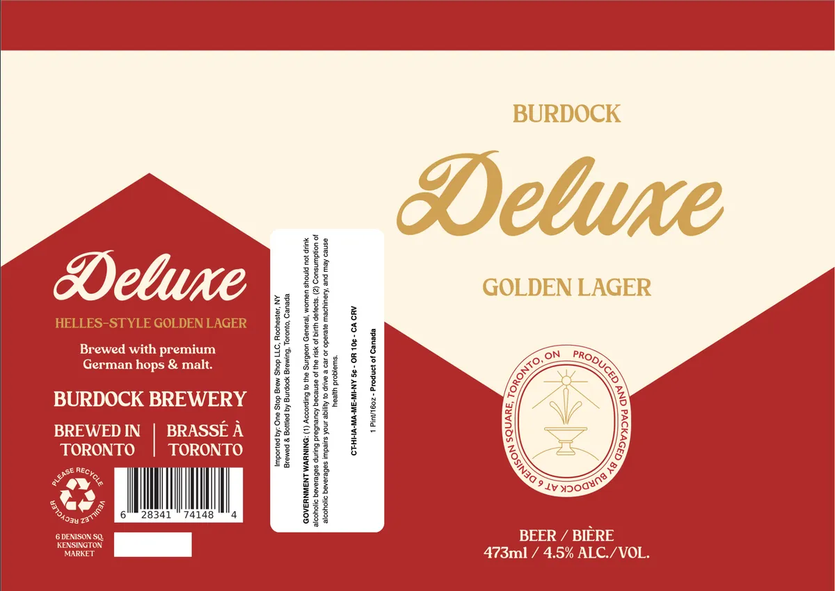 Deluxe Golden LagerBURDOCK BREWINGA geometric composition divides the label into red and cream fields, with a large red chevron or house shape anchoring the left side. The word 'Deluxe' appears in flowing script across the upper right in gold, repeated in smaller capitals below as 'GOLDEN LAGER'. At centre is a circular emblem depicting a sunburst rising from a classical urn, outlined in gold on cream. The left panel carries brewery information and product details in white and gold type on the red ground; the right side is dominated by cream with gold lettering.red · cream · gold
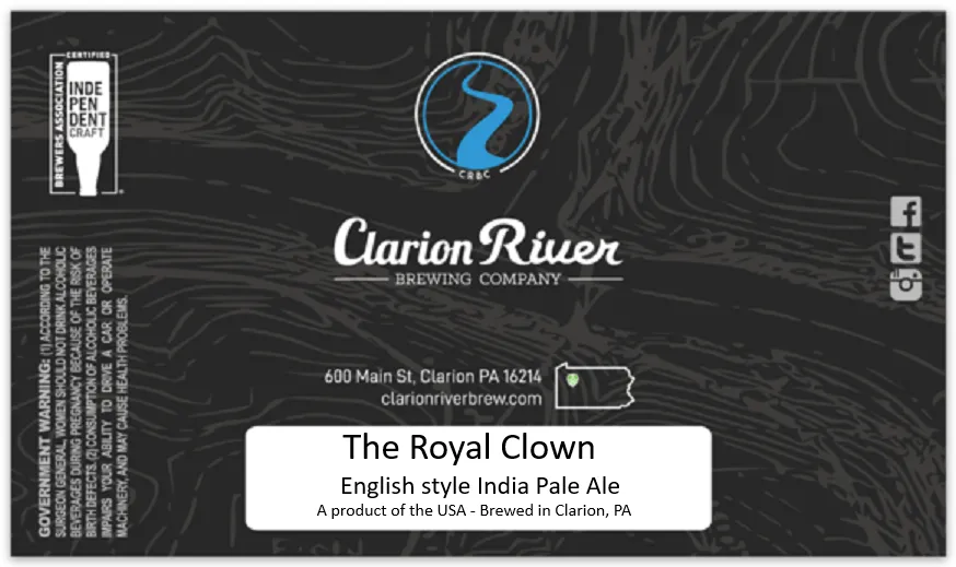 The Royal ClownA topographic-map texture in dark grey covers the full background, with a blue stylized numeral or symbol in a circle at the top centre. The brewery name appears in white script lettering across the upper-middle, flanked by a Pennsylvania state outline and social-media icons on the right. A horizontal white band in the lower half contains the beer name and style in serif and sans-serif type. Regulatory text runs down the left edge in small type.charcoal · white · cyan
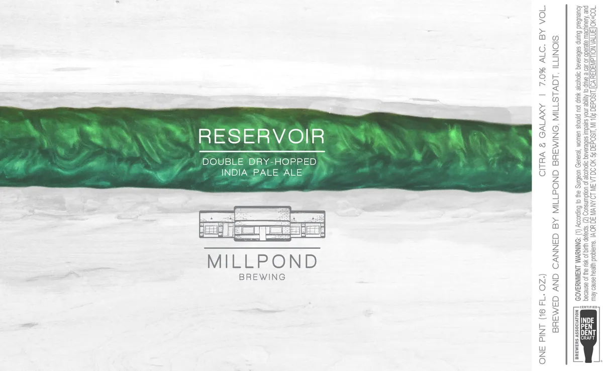 ReservoirMILLPOND BREWINGA horizontal band of deep emerald green occupies the upper third of the label, filled with a fluid, organic marbling or swirl pattern in darker and lighter green tones. Below this, a simplified line-drawn illustration of a single-story industrial or commercial building with a peaked roof sits centered on the pale background. The beer name "RESERVOIR" and style descriptor "DOUBLE DRY-HOPPED INDIA PALE ALE" are set in clean sans-serif capitals within the green band, while "MILLPOND BREWING" and the building graphic anchor the lower composition.cream · emerald · grey
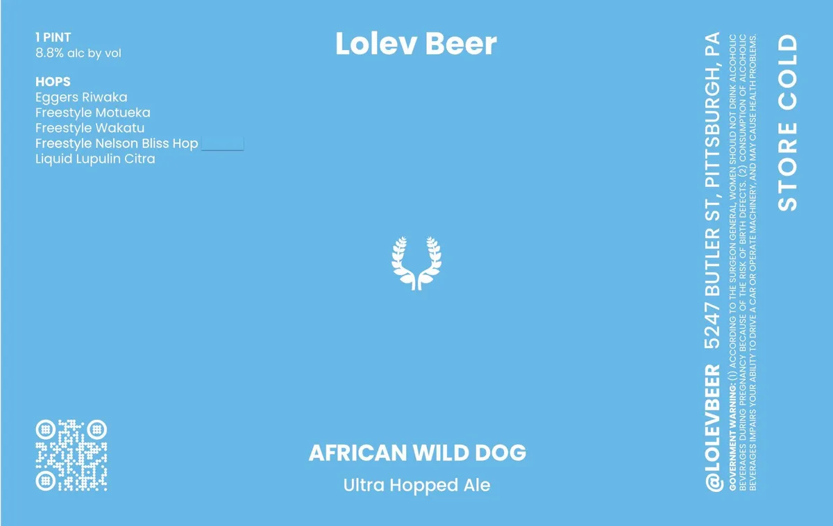 African Wild DogLOLEV BEERA stylized white laurel wreath sits centered on a bright blue field, with the beer name and brewery branding set in white sans-serif type above and below. The label is minimal and geometric, featuring only the wreath emblem as illustration against the monochromatic background, with regulatory text and a QR code positioned along the left and right edges.sky blue · white
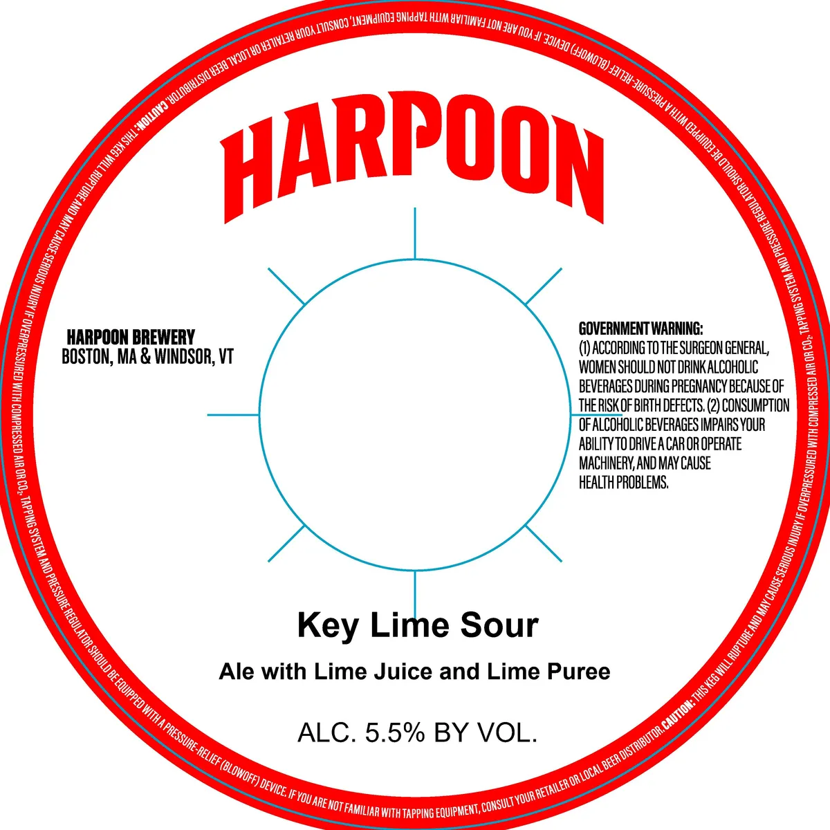 Key Lime SourHARPOONThe label is a near-empty field design: a simple blue-line circle with four short perpendicular marks at cardinal points occupies the centre of a white ground, flanked by the brewery name "HARPOON" in red caps above and the beer style "Key Lime Sour" in black below. The entire composition sits within a red circular border printed with regulatory text, creating a keg-collar format. No illustration; the design is geometric and minimal.red · white · blue · black
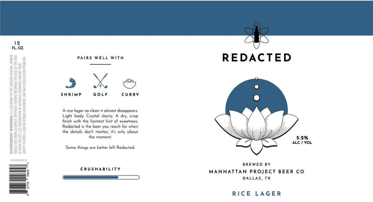 RedactedA stylized lotus flower in outline sits centered on the right side of the label, rendered in white with a filled teal circle behind its bloom; above it floats a simple atomic symbol in black line work. The left panel contains a teal · white · cream · black
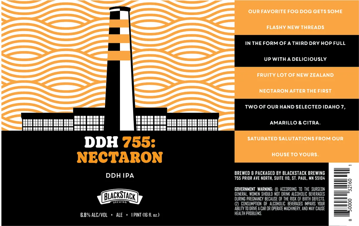 DDH 755: NectaronBLACKSTACK BREWINGA stylized lighthouse with black and white striped tower and horizontal building wings occupies the center-left of the label, rendered as a minimal geometric silhouette against a full-bleed background of undulating orange and white wavy lines. The beer name appears in bold sans-serif caps split across two lines—white and orange—on a black ground below the lighthouse. Marketing copy runs in alternating orange and black horizontal bands down the right side in condensed sans-serif type, while brewery details and regulatory information occupy the black footer.orange · black · white
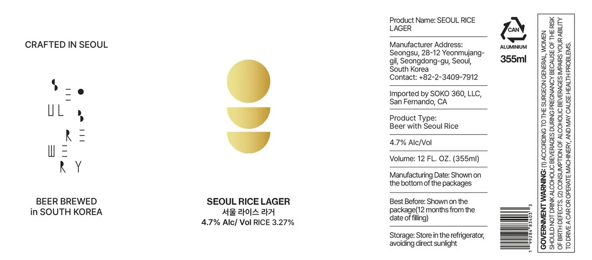 Seoul Rice LagerThree stacked golden circles in graduated sizes form the central motif, positioned vertically in the upper-middle field of a white label. To the left, stylized characters assembled from linear strokes spell out "SEOUL RICE" in a minimal geometric style. The palette is cream and soft gold, with all regulatory and product text set in sans-serif type.cream · gold
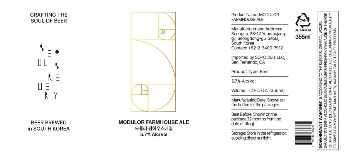 Modulor Farmhouse AleA geometric composition centered on the label features a Fibonacci spiral rendered in gold outlines, forming nested rectangles and circular arcs within a rectangular frame. The spiral is accompanied by minimal typographic elements in the upper left corner—stylized marks reading "SILL" and "RILY" in a geometric sans-serif—against a white ground. The design is vertically oriented, occupying the front panel of a 355ml aluminium can, with regulatory text and brewery information positioned on the right side.white · gold · black